Note: the following, similar to my post on the Louvre,
has to do with techniques from 20 years ago.
It could be categorized as “history” rather than “demonstration”, but
the reader can take it for what it is worth, and use it in any way they wish.
Early August 1992, while I was summering in the Adirondacks
I got a call from Jon Pickard at Cesar Pelli’s offices in New Haven. He needed a rendering of a project in Kuala
Lumpur, Malaysia. I had already worked
on a job in Kuala Lumpur, so I knew the city (vaguely), but the project that
Jon outlined over the phone was well beyond anything I’d ever seen.
It was a twin tower skyscraper that would eventually become
the tallest building in the world. And,
the rendering needed to be finished in 10 days!
Kuala Lumpur is the capitol and largest city of Malaysia. It began as a boom town based on tin mining
in the 1850’s, but quickly grew into a multicultural metropolis, with Malay,
Chinese, Muslims from India, and British citizens all mixed together. In spite of civil war, riots, flood and fire,
not to mention World War II, Kuala Lumpur continued to expand dramatically, until
today it has 1.6 million people in the city itself, and 7.2 million in the
suburbs surrounding it.
Oil was discovered late in the 1800’s, and the first well
was drilled in 1910. The national
petroleum company, called Petronas (or Petroliam Nasional Berhad) was
established in 1974, and immediately became a world player in oil
production. With massive, steady
profits, the company diversified into refining and transport, and in addition, decided
to build a world class headquarters tower.
The rendering of this massive headquarters would have to be
completed in a manner as quick and practical as the building of Kuala Lumpur
itself. As I said, ten days!
The old race course used by the colonial Brits was chosen as
the site, and Cesar Pelli was picked to design it.
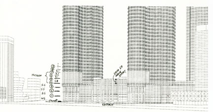
The headquarters towers were planned to be part of an
extensive retail and residential development surrounding a man-made lake.
The two towers were surrounded by smaller cylindrical shaped
forms mirroring the main theme and creating an ensemble.
Although the natural forms were strongly vertical, the brise-soleil,
as you can see, provides a strong horizontal break at the various setbacks. Each tower had a short cylinder attached to the front called a "bustle". A "sky bridge" connected the towers.
The design featured a geometry based on the Muslim “Rub el
Hizb”, or 8 pointed star, with semi circles tucked between the points. A repeating pattern that I was endlessly
thankful for as I started the computer modeling.
The following demonstration seems like a history lesson now,
what with computer gaming programs able to render a scene realistically in real
time. However, the mixing of computer
and hand in the process reminds one that the human mind continues to be the
wild-card in the digital world we live in.
As soon as I got the “go ahead” from the Pelli office in New
Haven, I jumped in the car and drove back to my apartment in Manhattan. A package from Mr. Pickard was waiting for
me. It included site photos, model
photos, and a complete set of drawings (including an elevation sheet that must
have been 8 feet tall). None of the
drawings were in a digital format, so I immediately set to work translating 2D
to 3D, and paper to computer. Unfortunately,
the computer model I created has been lost, but some of the printouts from the
time show the complexity of the job.
The modeling was relatively crude, with a simple line
standing in for 8 inch stainless steel tubes.
To speed up the “hide line” process I eliminated most of the unseen
parts of the building. Note: computer
rendering was being used at this time, but was slow and expensive; hand work
was still the fastest technique in that dark, dusty, primitive age.
Because of the abbreviated schedule, the final art could
only be 24 inches tall, quite small for a building of this size. In fact the size was just enough for the
mullion pattern and brise-soleil to read clearly on the printer that I used for
the final line drawing.
The final line drawing, above, was printed out and sent to
be reproduced on matte photographic paper.
All during the modeling process I was sending updates of the
model, and also sketches exploring the direction of the final rendering.
My first note to Jon (above) gave a verbal
description of my vision, plus a thumbnail sketch on a yellow lined pad.
Jon was the best interlocutor I ever had,
letting me run with an idea, while offering clear, timely comments to keep the
process on track.
He would have made an
excellent illustrator, if he hadn’t been such a successful architect (
he is an award winning principal of his own firm now).
Above is a sketch that explored my proposal to break up the
tower shaft by “melting” it into the sky.
The sketch was produced with a large tip marker so that it could be clearly
sent by fax instead of losing a day sending by Fedex.
We quickly decided to pursue a view from near street level,
and to show the entire shaft clearly instead of breaking it up. Before the computer model was finished I
began to work out the composition in sketches, adjusting existing buildings and
working out the framing.
Since this was to be a full color rendering I started trying
out color schemes. Above is one of the
first passes. It is your basic warm
building lit by sunset and manmade fixtures, set off by a cool background. The vignette sketch below shows the level of
detail expected in the final art, and adds some notes to suggest the principles
that would guide my decisions overall.
Mr. Pelli decided that the building, being stainless steel,
should be closer to the sky color, so a primarily cool palette was chosen, with
warm color relegated to the street lighting and accents.
Another back-and-forth produced more specific adjustments…
…and the final sketch was approved by the time the final
line photographic print was delivered.
Again, amazing expedited feedback from Pelli’s office.
The following images are scans of slides taken at the
time. The quality is limited, but you
can see the process moving along quite well.
The work was done in a small apartment in Manhattan, with a Paasche “V”
airbrush, cheap compressor, and a ruling pen.
The pigments were transparent Pelikan Drawing Ink, and both transparent
and opaque acrylic airbrush media (Badger and Comart).
The line drawing was sprayed with opaque white acrylic to
grey out the lines.
Then, everything but the sky was masked with frisket film,
and layers of ultramarine blue were sprayed and erased back. Frisket is a thin plastic film with a weak
adhesive on the back, which comes in rolls or sheets. When applied to the art they can be cut with
X-acto blades (or some other razor sharp instrument) to reveal an area that you
want to paint.
Since the sky was going to be a dramatic dark foil for the
towers, a large number of layers were sprayed, pulling the frisket regularly to
check progress along the way. Touches of
red, orange and violet recall the sunset, and areas were erased with hand or
electrical eraser to suggest cloud forms.
Here is the rendering minus frisket. The streaks and spots you see in the sky are
flaws in the 20 year old slides, not flaws in the original. By the way, I always sprayed the sky first
because I wanted the sky to be smooth and controlled. I often found that noticeable variations
showed up when spraying an area that had already been masked. The variations weren’t noticeable in the
building sprays because of the texture and detailing that cover most buildings.
Now, the base is masked, and various existing buildings are
modeled with a palette ranging from dull violet to dull red.
As a building area is finished the frisket is replaced, and
another area is opened up. Last to be
opened is the street, which gets a range from dull orange to yellow. Finally, I open all of the existing buildings
and street, and give them all a reddish orange layer to unify them.
Above is the rendering at this point, with all masking
removed. Now, on to the towers
themselves.
The entire image is masked, and the new construction is
opened. A layer of opaque white acrylic
is applied to lighten the lines. More
white opaque is sprayed on the left side of each of the towers than the right,
since the sunset light is coming from that side.
Here, again, is the rendering with all masking removed.
And, here is a shot of the work space; cramped, dark and
dank, with chains attached to the floor (just kidding).
The art is again masked, and the short third tower on the
right is modeled, one facet at a time.
The main towers’ darkest facets are opened and sprayed. And, finally, the short, cylindrical “bustle”
in front of each tower is opened, and the round shape and connection are
rendered. Notice that the cylindrical
shape is opened completely, and the shadow is sprayed so as to leave a
reflective highlight on the far right of the cylinder. Also, all the modeling is faded out as it
approaches the ground, since the wash of street lighting will overwhelm the
sunset light at ground level.
A new sheet of frisket masks the towers (note that it
doesn’t cover the entire picture), and the semicircular facets of the towers
are sprayed one at a time. Since they
are semicircles the shading is gradual.
Also, the cap of the “bustle” is given a warm metal top.
Here you can see the frisket partially removed, to show the
result of the tower modeling.
And, again, a view of the work area. The blood from the daily whipping can be seen
on the right (kidding again).
A new sheet of frisket, and the warm tones of the sunset are
added to the left facing surfaces. Also,
the warm wash from the street lights is added.
Here the frisket is off again, and you can see that the
vertical modeling of the towers is practically complete.
This view of the work area includes the painting, sketches
and inks, as well as an electric eraser and the airbrush at the lower
right. The compressor below the desk was
activated by a foot switch to free my hands (I did not yet have an automatic
compressor with tank).
Now it’s back to the building base. Using brushwork, the detail of the building
entrance is worked out. The street
reflections are varied with an electric eraser, and people, cars and highlights
are painted in. Brushwork also adds
shadow to the brise soleil, and highlights to the mullions, bustle and sky
walkway. At this point I treat the
rendering as a traditional painting; areas are painted, then I step back to
gauge the effect, then back in for more work.
Back and forth getting the right balance.
At this point I am touching up the entire painting. Mainly darkening and highlighting to get
better three dimensionality and punch.
The existing buildings must stand as the background and frame, the
towers must glitter with real and perceived detail, and the base must give life
in spite of the tiny scale. At this
point I am adding spots of pure opaque white, black ink, and primary color.
Finally, the painting is compared with the color
sketch. It is easy to wander away from
the original concept, so the sketch is on the drawing board during the entire
process. In spite of this, I feel that a
touch of sunset warmth can be added.
Above is the rendering as photographed on the board (and
scanned from the resulting slide).
This version, above, is the rendering as photographed
professionally with controlled light and a large box camera. This version was wrapped up and sent off to
Pelli. All finished in less than 10
days!
But it was not the end…
As designed and rendered, Petronas Towers was just short of
the previous tallest building in the world.
Shortly after I finished the rendering I got a call asking me to make a
couple of design changes. The sky bridge
was to be supported by struts rather than the cables originally shown. In addition, the towers were both getting a
new spire, which would make them the tallest building in the world at the
time. I was told that the decision had
been discussed and made at the highest levels of the Malaysian government.
As you can see the new tops were not only taller, but made a
more satisfying finish to the towers.
The design meant that I had to model and render small
patches that would be pasted on to the original, and then photographed to
produce the final-final rendering.
Building on the original computer model, I modeled and
printed out the new pieces. They were
again reproduced on matte photographic paper, and keeping the original
rendering close by, I matched the color and light using the same rendering
technique. When they were attached to
the original you could not tell that they were there.
The rendering was eventually reproduced in all the usual
architectural and construction magazines in the United States, as well as the
New York Times and American regional papers.
But I was blown away not long after, when I visited Pelli’s
offices on an unrelated job, and was shown into a conference room. One of the walls was hidden by what must have
been a hundred magazines from Southeast Asia.
Each of them reproduced the rendering on their covers. I’m not a social person, and fame is not one
of my goals, so as I said; blown away.
The rendering may have been produced at high speed, but the
building construction was complex and slow.
Trouble with unusual bedrock conditions delayed the actual
superstructure construction until 1994.
The towers were finished in 1996, but they were not officially
opened by the Prime Minister until 1999.
Although Petronas lost its title of tallest building in
2004, it is still the most elegant of the “tallest” buildings.
That may not count for much among people that
simply look at the statistics, but it is noticeable to anyone with an eye for
design.
A tall building is still aesthetic riddle, but Pelli and Pickard scored on the Petronas Towers.
I count myself blessed to have been associated
with it and its creators.
- St. Vincent airbrush demo