I had planned to write a few posts on composition, and this
is perhaps a good place to introduce the program.
Composition in painting and illustration is simply the act
of arraigning visual elements to make an image.
The abstract artist can throw paint on a canvas until the effect pleases;
a nice straightforward matter of trial and error.

The realist artist is limited by the subject matter he is
depicting, but can rearrange objects or people to create a more pleasing
design. A generic cityscape can be
rearranged in all sorts of ways and still be a recognizable cityscape.

However, an architectural illustrator is a realist artist
who is constrained by subject, context and client needs. The building cannot move about the
countryside, or into a nicer urban neighborhood. The context cannot be revised to the point of
being unrecognizable, and the client usually wants a detailed and realistic rendition
of his investment. In addition, the
viewpoint is often chosen before the illustrator is brought in.

With all these constraints you might think architectural
illustration is, well, constraining, but there are surprising ways to vary the
composition. The obvious approach,
especially with CAD rendering, is sun angle or time of day. Computer models are typically made and
rendered with no particular thought to composition. The computer’s speed and ease of use makes it
tempting to “just do it”, re-jigger the lighting later. However, an hour messing with the general
arraignment of values can make a good rendering great. This can be done by hand (on paper or
computer tablet), or in the rendering program, (although I have found reiterated
renders in search of a composition to be slower than imagining a conceptual
goal by hand sketching).

Having said that, a straight sun-angle computer rendering is
a good place to start. The design as
seen from the chosen viewpoint might have an unexpected appeal, but even if you
think you have a winner it pays to go further and explore some other
possibilities.

A sketch breaking up the building silhouette is another
angle worth pursuing, as is the counterintuitive trick of making the sky darker
than the building. If you have a
vertical shape such as any urban tower, you might try to make it part of the
surrounding context and add its reflection in the street.
Or, on the other hand, put the building in partial shadow,
and manipulate the sky so as to suggest a horizontal or diagonal shape opposed
to the centered vertical. This was a
regular ploy of illustrators 100 years ago, and, although over used then, can still
be useful.

Finally, you might experiment with unusual (for computer
rendering) light schemes such as that found at dusk or night. This is where the speed of hand sketching beats
computer rendering easily, since the sketch can be roughed out in a few minutes
without any calculation. You only want
the general effect; the details can be worked out later (in fact details at
this stage can be stifling).

If a shadow looks awkward just adjust it to help the
composition; it is surprising how far reality can be stretched when it comes to
shadows and reflections. You are trying
to reproduce a real life time and place, but if it looks right it is
right. And if it looks good, you have a
visual goal to work toward.

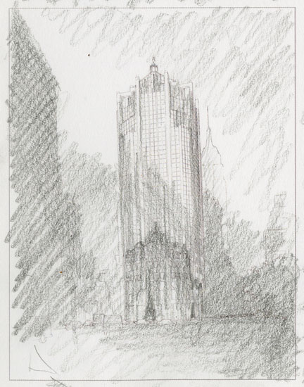
Once you have a direction to go, you can finalize a more
detailed sketch (The color sketch above added space around the board for
elevations and plans drawn in white line).
The final can then be rendered by hand or in a rendering program. In the computer you will have to set up the
lighting so as to create the same effect as the sketch. I’ve worked in and out of the computer for both
composition sketches and final renderings.
Each situation is different and calls for a flexible process that takes
advantage of the tools at hand.
The unique aspect of architectural illustration is that you
have a regular physical object that must be approached like a Jazz musician
improvising on a theme. You
have to stay within the parameters of your art, but by developing a pleasing
composition you will make the selling of your design easier.
Note: Later posts on
composition will focus on the various rules, patterns and techniques used by
traditional artists. Proportional
systems such as the golden section, and patterns like Hogarth’s line of beauty
will be discussed. Traditional
techniques such as thumbnail sketches and value studies will also be
reviewed. I also plan on publishing a
post on the story of the Worth Square Building rendering which was used as the
example in this post.
A caveat for all posts on composition.
You don’t
want to produce total chaos.
You don’t
want to create banal order.
You do want
to entice, hint, and suggest.
You want to
create mystery, even if the subject appears to be obvious.
- Composition Part 2 - The Golden Section & other crutches
- Composition Part 3 - Dark Spot
- Composition Part 4 - Light Spot
- Composition Part 5 - The Cross
- Composition Part 6 - The Pyramid
- Composition Part 7 - Circle
- Composition Part 8 - Diagonal
- Composition Part 9 - "L" Frame
No comments:
Post a Comment