Wednesday, May 27, 2015

Rendering Rules


I was at the Georgia Museum of Art in Athens recently, and saw a painting that jogged my memory: I’d been meaning to write a post on my personal “rules” for architectural rendering. Some rules are obvious, like “Always finish before the deadline” (I say “before” because there are always last-minute adjustments to be made). Another obvious rule is “Don’t overpromise, but always fulfill any promise.”
Anyway, the painting that got me going was Shipwreck by Charles Hoguet (1859). The reason it caught my eye was that it fulfilled one of my rules; that being, “Make the image compelling at all scales.” What I mean is that an illustration should look enticing from across the room as well as when the viewer is within easy viewing distance, and also when its details are viewed up close. 


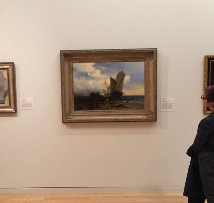
Seen from across the room, the dynamically balanced composition leads the viewer forward to have a closer look at the painting. As you can see, the dark part of the painting covers the bottom third of the canvas plus a curious shape just to the right of center. The light part of the painting includes some interesting shapes on the left.

Once you are close enough that the painting nearly fills your view (eight or 10 feet in this case) the dark areas start to resolve into separate shapes and recognizable objects. The water and sand suggest a seascape, but the sails, which are now clear, look rather awkward. There is much detail in the center foreground, but at this distance it is a jumble of horses, men and unknown objects. Mystery and emotion were added to the original compositional interest. All of this was enough to make me want to spend more time scrutinizing the thing.


Now that the viewer is focusing on various spots on the painting, a story begins to be told. The ship is obviously run aground, and people are removing various stores and hardware, either as a salvage operation or in an attempt to lighten the ship and refloat it at high tide. Four horses are counted within the tumble of shapes. A wagon with three men loading was almost a silhouette before, but is now clear and interesting. Among the horses there are two blobs barely recognizable as men, and three foreground figures in idiosyncratic poses. The scene is so entertaining that one could go on picking out details in the narrative for some time. 


In architectural illustration you don’t usually have a chance to tell a story, but you certainly can construct a compelling composition, and inject some drama. The example below is a bit of “paper architecture” that I did for a site in New York City that was around the corner from where I lived in the East Village.


I tried several pastel thumbnails of this view, varying the values and the palette. I quickly hit on a pencil sketch that contrasted the building’s dark top with the light sky, and the lighter base to the dark mass of the neighborhood. 

I found that this complementary brick-red and olive palette popped out even as a mini thumbnail (much of the original pastel color rubbed off before I could photograph it; moral: fix pastel immediately).


From across the room the final rendering is rather enticing, if a little too stable in composition.


Closer up the building starts to show detail and scale. The context begins to look like the aftermath of a late-day summer shower, which is always magical in Manhattan.


Checking the details shows the turn-of-the-century subway entrance on the left, and the rotating cube sculpture (titled “Alamo”!?) at the center of Astor Place. The foreground would have to show more “street theater” to match Hoguet’s painting, but that was my decision (giving too much emphasis to the street activity can be a mistake when your object is the selling of the actual building). 
At this distance you can also see that the image was rendered in freehand ink, with airbrushed transparent color. There is always a certain magic when a realistic picture merges into ink lines or daubs of paint.

All right, so maybe that was all too obvious… of course you want to make an illustration interesting. But this becomes very serious when you are rendering for a competition entry. Competition juries have to make snap decisions, especially if there are many entries. Getting the jury to choose your design for later consideration is important; it’s like getting your foot in the door. During the second round they will give your design a chance to win the prize. If you don’t make it to the final review, you have no chance to win. A project illustration that compels the viewer to look closer will position a project for success.

Tuesday, May 26, 2015

Perspective - Curvilinear Perspective (& Cheating)


You might think that straight lines are, well, straight…but…

Paris Opera, Plan

There is a bit of a paradox in the world of perspective…

Paris Opera, Escalier D'Honneur, Elevation

When you think as an architect, the world is made up of straight parallel lines and simple geometry. But as a perspectivist, I see the world as straight converging lines with orderly parallels only where I want them. And if that weren’t enough, I know that the world of perspective is threatened by distortion if my field of view is too wide.

Paris Opera, Escalier D'Honneur, Perspective

Ah, distortion!
Paris Opera, Escalier D'Honneur, Photo

As long as you are viewing a limited window (say, 30 degrees total) you can ignore distortion. This was discussed in a previous post. 


If you want to take a very wide view (say, 45 degrees or larger) you can either accept the distortion of linear perspective, or use curvilinear perspective. Curvilinear perspective is theoretically like the human eye, which has a 180-degree field of view (although we typically focus on the 45-degree field directly in front of us). It is similar to seeing a picture made with a fisheye lens; the center section seems normal, but the areas near the edges have “barrel distortion,” in which all rectilinear objects are convex.  This post will ignore the linear distortions and embrace the curvaceous distortions.
If you lived life as a human fish, the built world would look like a mass of swooping curves. For instance, if you looked directly at the long façade of a large warehouse from, say, 100 feet away, you would notice the top and bottom of the wall converging in a curve at the edge of your sight. Fisheye camera lenses accentuate the effect, and you can get the same curved effect with the panorama feature on your iPhone. And of course an artist can draw a curvilinear perspective from scratch.


Above is an example of columns in curvilinear perspective in Die subjektive Perspektive by G. Hauck (1879). Figure 4 shows the curved picture plane in plan, which produces the layout in Figure 1 (at the top of the image). Figure 2 shows the left set of columns using linear perspective, and Figure 3 shows the distortion in the end columns using one-point perspective.


Above is a cityscape in A Treatise on Curvilinear Perspective of Nature by W. Herdman (1853). The swooping curves are the curvilinear extensions of a one-point perspective’s parallel lines. 


Not long after the “discovery” of linear perspective, artists started playing with curvilinear perspective. View in Delft by C. Fabritus, from 1652 (above), is a painting which approximates Herdman’s wide-angle cityscape.

Regatta by Francesco Guardi (1785) seems to show the curvature of the Earth, suggesting a view from on high looking down. The perspective work in this painting is somewhat sloppy, but I can’t help thinking that Guardi, a painter known for his detailed views of Venice, must have heard of curvilinear perspective, and perhaps was up for an experiment.


This church interior by Herdman shows the curvilinear system used on a one-point interior. It has a feel similar to the wide-angle photos at the top of this post.


Artists sometimes construct a view in curved perspective for fun, or as a tour de force: “Look, Ma, no straight lines.” I did it long ago as an experiment for a Christmas card (and to tout my perspectivist bona fides). The view above is looking directly down on the intersection of 40th Street and Fifth Avenue in Manhattan.


Such a drawing is not an exact or a scientific process, and there is a lot of guesstimation, but it does help clarify what linear perspective is compared with the “real” world.  Above is my “worm’s-eye” layout of a proposal in Stamford, Conn. The plan and working lines can be seen on this image (making it quite accurate in horizontal elements), but the vertical dimensions had to be estimated by the distance from the station point at the center of the image.


So, apart from a game or an educational exercise, what is curvilinear perspective good for? It obviously doesn’t eliminate distortion, but rather trades one type for another. It is entertaining but is not a very accurate representation of reality. It is also hard to construct: the view of Canary Wharf, above, is not a strict curvilinear perspective but handles the towers on either side of the plaza as if it were. 


In fact, in all my years working in the field I saw only one drawing which emulated curvilinear and was also highly informative: J.H. Aronson’s bird’s-eye view of Michelangelo's design for Capitoline Hill in Rome (above). A simple plan would show the trapezoidal shape of the plaza, but wouldn’t show the enclosing façades. A normal aerial would show the space, but would lose the forced perspective of the trapezoid or lose one of the façades.  A ground-level perspective would place you in the plaza, but would lose a façade and hide the curious jumble of buildings that Michelangelo had to work with.


Since each of the three palazzos is on a different axis, each one must be compared with its own curvilinear sphere. In the drawing above, the Palazzo Nuovo is in blue, the Palazzo Senatore is in red, and the Palazzo dei Conservatori is in green. As can be seen, none of the palazzos are drawn in strict curvilinear perspective, but each is drawn with straight lines corresponding to its own curved-perspective grid. As with the Canary Wharf drawing, this approach is “good enough.”


While the previous analysis found that the horizontal elements were approximate, one would think that there surely is no reason to fudge the vertical lines. Actually, as shown above, Aronson adjusted the vertical vanishing points also. In the case of each palazzo he pushed the vanishing point a little away from the building façade. This lets us see a little more of the façade with a little less convergence (or distortion, if you will). This is a subtle and clever move which is undetectable without analysis. It is also not new.


Every renderer who has had to illustrate the inside of a small space, like an elevator cab, has used the floating vanishing point, which Aronson used above. It is essentially a distortion in the service of clarity. The example above is an elevator cab that I hand rendered while working as a young, underpaid draftsman (long before computers entered the drafting room).


Un-distorting an elevator-cab rendering is the only example of perspective layout that is easier to do by hand than by computer. The example above was done in a 3-D CAD program by making a model with splayed side walls, then trying out different viewpoints.

Postscript…

Leon Battista Alberti invented linear perspective so as to make a perfect two-dimensional imitation of reality. In his book  De Pictura, he wrote that the perfect painting should be mistaken for an open window (finestra aperta). This statement sounds like poetry, but actually is a very practical rule: if you keep your painting within a relatively narrow (window) frame you can fool the eye into seeing a real three-dimensional view. A wide-angle view is like sticking your head out the window - you have a wider angle of view - but linear perspective can’t mimic reality in that case.
I’ve discussed one-point perspective, two-point perspective, and three-point perspective (see links below). Each of these fits neatly into Alberti’s conception of perspective, and into the perfect illusion of reality at the center of Renaissance thinking. Curvilinear perspective steps outside that ideal, and plays with the idea of the world as a strange (un-human) place. It is a very modern idea, and a good place for me to stop.

Although I seem to be at the end of the line, I am not at the point of vanishing. I expect to post more projects. And some of those projects will include interesting twists in the business of perspective layout.