Thursday, January 16, 2014

Composition Part 17 - Value Studies


In the last post on composition I talked about the use of simple black and white images to study composition. In this short post I’ll note some examples of values studies; explorations utilizing a range of grays. In a way an illustration using a range of grays is simply a colorless illustration. It is certainly both a step on the way to a full color image, and a potentially final black and white image. I am not worried about this aspect, but would rather point out the obvious; a simple value study is a good test of whether a composition is effective or not.

Good composition demands that the artist assemble the work so that any viewer can derive pleasure from the work as a whole, devoid of details. So a test of composition is the elimination of details. The various modern reactions to the bland academic painting of the 19th century (Impressionism, Expressionism, Cubism, etc.) all tend to lose the detail and emphasize composition. Even if you dislike the excesses of modern art you have to appreciate what the original idea was.


James Whistler excelled at this seemingly simple task. All his paintings capture the essence of the object or view, which is the point of composition.
His Self Portrait, although a good enough likeness, is more remarkable for its roughly abstracted blocks of tone and texture. Simplified (in the lower image) it still has a compositional presence.


Whistler’s Nocturne Trafalgar Square Chelsea Snow uses the same approach to illustrate London’s famous urban space. It may not have any detail to keep your interest, but it shows that he had an eye for composition.


Dream by Kati Olah takes Whistler’s idea and makes a beautiful and believable painting. 


This portrait sketch by John Singer Sargent is an example of how an experienced artist works. A completely believable likeness is produced with a minimal range of grays.


This quick study shows what can be created using black and white pencil on colored paper. The forms are geometric and flat, but the soft flesh is captured.


This torso study is even more abstracted, but still evokes the human form.

This is my last planned post on composition, but I will certainly be pointing out compositional inspiration in the future. If you haven’t checked out the previous posts on composition please do; the links are below.


A caveat for all posts on composition.
You don’t want to produce total chaos.
You don’t want to create banal order.
You do want to entice, hint, and suggest.
You want to create mystery, even if the subject appears to be obvious.


Wednesday, January 8, 2014

Composition Part 16 - Light and Dark


One of the easiest ways to test an image for compositional strength is to use Photoshop to desaturate and contrast the painting so as to see only the essential elements and their relationships.  If you have an iPhone you can do the whole process in seconds using the camera and filters. By doing this you are reducing the painting to large areas of black and white, with minimal gradation in between. Renaissance painters called this effect “Chiaroscuro”, which means literally “light-dark” in Italian. 


Early photography often created this effect due to the inconsistency of the chemical process. This photograph of Yvonne de Quievrecourt from 1914 shows (accidently I would guess) a wonderful strength and focus on the upper body and face, while giving only an impression of the dress. If the face had been lost in a light background, it would have been obvious at a glance.


Painters of the late Renaissance preferred the heightened drama of strong lights and darks. The Supper at Emmaus by Rembrandt van Rijn shows this contrast beautifully. It also exemplifies the difficulty of modeling a figure within a very dark range (Christ) or a very light range (the surprised disciple).


This Study of a Nude Man by Thomas Eakins is a perfect example of Chiaroscuro. A pattern of dark and light shapes are arranged upon a middle toned background. The simplified development of the picture ensured that Eakins was focused on the general composition.


Coal Wagon by Géricault is a painting with a considerable tonal range. 


When you filter it to increase contrast and eliminate the color a series of silhouettes emerge. The dark wagon against the light sky, invert the effect of the white horses against the dark landscape. The whole effect is dramatic and highly satisfying.


I have already noted the wonderful composition of The Fog Warning in my post on WinslowHomer


Suffice it to say that the shapes and contrasts revealed in the black and white version make this image memorable. The complimentary colors in the final simply multiply its compositional strength.


Look at the photograph at the top of this post. The face is framed by a dark background while the rest of the figure is obscured. The same approach can be found in The Young Shepherdess by Bouguereau. The young girl's face is practically floating in the center of a white rectangle, while her arms are the lightest shapes intruding on the dark lower rectangle. The result is a bit awkward, somewhat suggestive, and entirely charming.


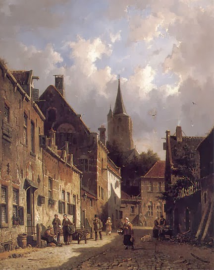
A Dutch Street Scene by Adrianus Eversen is a quaint view of a street, but it has an interesting dynamic quality.


That dynamism comes from the jagged black forms rising from the lower right corner to the upper left. It is still a recognizable street scene, but at the same time is a fascinating abstract.


Good composition can be found every day on the street and in the stores. This photo in the New York Times of Oscar Pistorius during his murder trial (Aug 2013) caught my eye immediately. The photographer seems to have consciously worked toward a cross composition which naturally rivets the viewer's attention. 


This Wall Street Journal photo of fire fighters this past summer also caught my eye.


It matches the painting of the coal wagon above, highlighting each of the fire fighters in reverse silhouettes.
Using dark and light is the easiest way to heighten the drama in a rendering or painting. Using modern electronic gadgets makes the process quick and easy. And if anyone asks what you are doing you can say that you are exploring Chiaroscuro; that’s Kee Are Ooo Scoo Roo. That should get you brownie points with the sultry Italian in class.


A caveat for all posts on composition.
You don’t want to produce total chaos.
You don’t want to create banal order.
You do want to entice, hint, and suggest.
You want to create mystery, even if the subject appears to be obvious.

 - Composition Part 17 - Value Studies

Sunday, January 5, 2014

Composition Part 15 - Bad Composition


I’ve posted examples of good composition over the past year; now I want to highlight examples of bad composition. These examples are by recognized masters, proving that you don’t have to be an aesthetic dolt to make ugly. They are presented with mark-ups and notes to serve as a warning to the unwary. They are also a reminder that anyone can slip up and it is a serious mistake only if you don’t recognize it and learn.


Michelangelo’s Last Judgment is a wonderful thing to experience in detail.


However, it suffers from symmetrical boredom. The “tic-tac-toe” composition is flat and uninteresting. Being a fresco, covering one wall of the Sistine Chapel, The Last Judgement functions as an interior decoration that is dependent on the forms of the chapel. I’d give Michelangelo a pass on this, but it is still a good example of bad composition.


The Annunciation, by Botticelli, is not a favorite of mine but is justly valued as an early example of perspective.


It is, you must admit, clunky. A strong vertical divides the painting, indeed, dominates the image and the figures. Add an awkward-looking Madonna and a tree atop an angel, and… well…


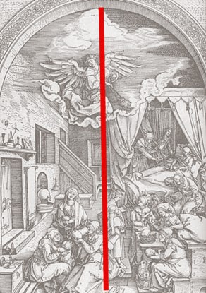
Dürer has an amazing imagination and plenty of detail, as can be seen in Birth of the Virgin Mary.


His compositions however, are occasionally scattered and dull. In this case the various forms are unified only weakly by a centered vertical line. Since the subject is overflowing with images and symbols (all produced in a hurried commercial schedule) I can forgive his skimping on composition, but it remains an example of the bad.


While I’m beating on Durer, consider his etching of Adam and Eve. It is a beautifully observed study of the human form, and a visual parable with considerable detail.


The composition however, is static and dull. There are three verticals, which give some interest, but it is the subject and the detail that keep it all together.


Raphael is one of the masters of the High Renaissance…


…but again, things don’t always work out. His Virgin with the Blue Diadem seems to be a circular composition around the figures but has an unsettling repetition of diagonals above that. As with the following example, it could have used some judicious editing.


In the otherwise entertaining Judgement of Paris, Dürer should have left well enough alone.


He really didn’t need the tree in the foreground, the mountain or even the horizon. And a cupid stuck like a postage stamp in the corner… I don’t think so.


El Greco, unlike Dürer, was not chained to excessive detail; and so you would think that the overall composition would come easily.


His famous View of Toledo would disabuse you of that assumption. It seems a very “modern” painting and so has been praised by the modern critics. It is, nevertheless, a confused jumble with no particular focus.


Of course, bad composition is not confined to the distant past. The Impressionists were quite capable of producing ugly. Take Cézanne's Rocks in the Forest.


Similar to El Greco’s Toledo, it lacks focus. Its charm is in its suggestive abstraction, but in the end there is “no there there.”
Bad composition is everywhere. Make a habit of noticing it and imagining a more pleasing solution. You’ll find it more productive than playing games on your iPhone.


A caveat for all posts on composition.
You don’t want to produce total chaos.
You don’t want to create banal order.
You do want to entice, hint, and suggest.
You want to create mystery, even if the subject appears to be obvious.

 - Composition Part 17 - Value Studies