Showing posts with label Using Dark and Light. Show all posts

Tuesday, August 25, 2020

COLOR DEMONSTRATION


Long ago I created this tiny pastel sketch of a church. I called it “Burning Church” for obvious reasons and filed it away.


Years later I was playing with ideas for “landmarks” along Broadway in New York City, and realized that my “Burning Church” might work on a site at the north end of Manhattan on 170th Street.

In designing the church I ran with a simplified gothic style with a blank base raising the sanctuary above the street level.


I then built an Autocad 3D model and tried out a number of viewpoints. This hidden line view was chosen for the final drawing.


This magic marker sketch gives a preliminary idea of the values I was aiming for.


A base drawing was produced using freehand ink on mylar.


The final drawing was 30” x 40”, so there was plenty of room for detail and texture.


Reproduced above is a color wheel. It shows the full range of colors going around the circumference, with saturation going from the center of the circle (desaturation = grey) to full color saturation at the circle edge. This is fully discussed on the outstanding “Gurney Journey” blog. 


The original “Burning Church” sketch uses a very tight range of yellows and browns marked by the diamond shape of the color wheel. The sketch derives its strength from the limited palette.


The last color sketch above and accompanying color wheel show a complimentary palette ranging from yellow to blue. The combination of color contrast and value contrast makes the tower pop out strongly.


The last color sketch above and color wheel show an orange to grey-green palette. The color contrast is less strong, and the value contrast is created with a tower running from light on dark at the bottom to dark on light at the top. I’ve always loved the red-orange contrast with a grey-green sky; it reminds me of a portrait trick of contrasting warm flesh against a grey-green background.


The two sketches above have low saturation color palettes. Essentially, they are low contrast grey studies with pastel tone here and there.


The strong blue and yellow sketch above is going in the right direction, but seems a little bit too simple.


By adding a graded reddish tint top and bottom I pushed the focus to the center of the tower suggesting a cross composition


The sketch above was done full size with pastel and pencil to study the detailed coloring of the church entry.


 And here is the final art (30” x 40”). Note the darkened foreground and sky which adds to the drama and makes an excellent background for the white line elevations and plans. The final was done with transparent ink airbrushed on a photographic print of the ink line drawing. The title was done with white acrylic applied with (tiny) brushes. The ghosted plans/elevations/sections and quotes were color pencil.


Detail at the bottom of the painting.


Detail at the top.


Wednesday, January 8, 2014

Composition Part 16 - Light and Dark


One of the easiest ways to test an image for compositional strength is to use Photoshop to desaturate and contrast the painting so as to see only the essential elements and their relationships.  If you have an iPhone you can do the whole process in seconds using the camera and filters. By doing this you are reducing the painting to large areas of black and white, with minimal gradation in between. Renaissance painters called this effect “Chiaroscuro”, which means literally “light-dark” in Italian. 


Early photography often created this effect due to the inconsistency of the chemical process. This photograph of Yvonne de Quievrecourt from 1914 shows (accidently I would guess) a wonderful strength and focus on the upper body and face, while giving only an impression of the dress. If the face had been lost in a light background, it would have been obvious at a glance.


Painters of the late Renaissance preferred the heightened drama of strong lights and darks. The Supper at Emmaus by Rembrandt van Rijn shows this contrast beautifully. It also exemplifies the difficulty of modeling a figure within a very dark range (Christ) or a very light range (the surprised disciple).


This Study of a Nude Man by Thomas Eakins is a perfect example of Chiaroscuro. A pattern of dark and light shapes are arranged upon a middle toned background. The simplified development of the picture ensured that Eakins was focused on the general composition.


Coal Wagon by Géricault is a painting with a considerable tonal range. 


When you filter it to increase contrast and eliminate the color a series of silhouettes emerge. The dark wagon against the light sky, invert the effect of the white horses against the dark landscape. The whole effect is dramatic and highly satisfying.


I have already noted the wonderful composition of The Fog Warning in my post on WinslowHomer


Suffice it to say that the shapes and contrasts revealed in the black and white version make this image memorable. The complimentary colors in the final simply multiply its compositional strength.


Look at the photograph at the top of this post. The face is framed by a dark background while the rest of the figure is obscured. The same approach can be found in The Young Shepherdess by Bouguereau. The young girl's face is practically floating in the center of a white rectangle, while her arms are the lightest shapes intruding on the dark lower rectangle. The result is a bit awkward, somewhat suggestive, and entirely charming.


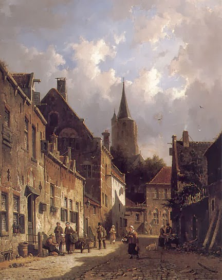
A Dutch Street Scene by Adrianus Eversen is a quaint view of a street, but it has an interesting dynamic quality.


That dynamism comes from the jagged black forms rising from the lower right corner to the upper left. It is still a recognizable street scene, but at the same time is a fascinating abstract.


Good composition can be found every day on the street and in the stores. This photo in the New York Times of Oscar Pistorius during his murder trial (Aug 2013) caught my eye immediately. The photographer seems to have consciously worked toward a cross composition which naturally rivets the viewer's attention. 


This Wall Street Journal photo of fire fighters this past summer also caught my eye.


It matches the painting of the coal wagon above, highlighting each of the fire fighters in reverse silhouettes.
Using dark and light is the easiest way to heighten the drama in a rendering or painting. Using modern electronic gadgets makes the process quick and easy. And if anyone asks what you are doing you can say that you are exploring Chiaroscuro; that’s Kee Are Ooo Scoo Roo. That should get you brownie points with the sultry Italian in class.


A caveat for all posts on composition.
You don’t want to produce total chaos.
You don’t want to create banal order.
You do want to entice, hint, and suggest.
You want to create mystery, even if the subject appears to be obvious.

 - Composition Part 17 - Value Studies

Thursday, January 31, 2013

Composition part 4 - Light Spot


This image (filtered for contrast and color) caught my eye a few days ago.


Eakins’ painting The Gross Clinic came to mind, as did other group portraits.


But….

It was nothing so important artistically,

Or historically for that matter…


It was simply a photo of soldiers carrying a body on a stretcher in China after a landslide (WSJ Jan 12/13).  Funny how a photograph of an activity which happens hundreds of times a day around the world became imprinted on my mind.  It is essentially an unrecognizable light spot on a dark background.  Nothing that important, but to my eye and brain it was something worth spending some time with.


Portraits are the most obvious examples of the light spot grabbing your attention.  I have always liked Titian’s The Young Englishman, in part because it resembles a friend from my younger days, but also because of the scattered light spots.  It happens that Titian’s style of portrait painting became the standard for the next 400 years.  Use a relatively dark neutral background to compliment the light flesh color of the face and hands.


Titian used the same idea with a different shape in his Woman in a Black Robe.  The light colored trapezoid is almost an abstract design in its simplicity, but the reality of the woman herself quickly comes into focus.


Landscapes have also been enriched by a roughly centralized bright spot, as in Gainsborough’s Returning from Market.


…and, the action of “framing” a view has always been a good, unifying strategy.  Francesco Guardi, whose View to a Square is seen here, was a contemporary of Canaletto, and really should be better known.

On to architecture….


Tuck a town into a forested area and you will get a natural “light spot” because man-made construction is generally lighter colored than a forest canopy.  


A night view of nearly anything will end up as some sort of bright spot.  Joseph Urban’s rendering of the Ziegfeld Theatre in New York City (1927) is as straightforward, dramatic and believable an example of the light spot composition as I could find.


Masonry buildings all too blandly fit into this pattern.  To do it justice you have to add some detail, gradation and mystery, as Hugh Ferriss did in his rendering of the Greater Penobscot Building in Detroit.  Ferriss has gotten into two different posts already, and being one of my heroes, will get his own page.


A reflective glass building is harder to fit into the light spot motif, but with a little jiggering of the sky and light it can work well and appear quite believable.  Here is a preliminary sketch for the Dahesh Museum on Columbus Circle in New York City.


Another approach when illustrating a glass building is to treat it as a lantern.  Turn on all the lights, and it glows in the evening, like this rendering of the Museum of Architecture and the City of San Francisco by Christopher Wardana.


My illustration of a proposal for the Main Library in Vancouver (Hardy Holzman Pfieffer Architects), is a mix of masonry and glass, but the entry is a glass cube which is rendered as a glowing box in the misty twilight.


Urban Glow at dusk is the theme of this evocative scene in Boston by Jeff Stikeman.


If there is a practical rule in the light spot composition it might be, “play with the spot”.  A nice white box sitting in a field is pretty boring unless there is more to it.
Enticing the viewer to look more closely is the point, and an off-center, partially masked composition is a good start.