Showing posts with label Color sketches. Show all posts

Monday, July 5, 2021

LIGHT DEMONSTRATION – HERALD SQUARE

Being both an architect and an architectural illustrator, I have always been fascinated by the play of light on different materials. 

The mainly stone churches of Europe create a nice and simple pattern of shade and shadow.


The modern technology of reflective glass is nearly as simple: reflectivity and transparency combine to describe the building form.


The Beaux Art “palette” of stone and punched windows is an old variation on stone and glass.

In my own playing with “landmarks” along Broadway, NYC, I often used a mix of stone and glass. For my proposal on the block south of Greeley Square Park (32nd Street and Broadway) I used large areas of reflective glass set into a frame of stone.


Since the building would be “facing” north toward the adjacent park, direct sun would have little chance to show off a sculpted stone façade. See Full Length Portraits & Tall Buildings.


By using reflective glass facing north, you can make the mirrored play of the northern sky contrast with the southern sky behind the building. The horizontal pattern of the southern sky would also make a nice contrast with the vertical lines of the stone framing. The finished painting above was featured on a 1994 calendar of architectural art.

At the north end of the same elongated space formed by the intersection of 6th Avenue and Broadway is Herald Square, fronting on 35th Street. The square was named for the adjacent headquarters building of the New York Herald newspaper, designed by Stanford White in 1908, and demolished in 1921. 


Years after painting the Greeley Block, I dropped a computer rendering of the same design onto the Herald Square site. Looking at the result made me imagine a more sculptural design along the lines of White’s eclectic 1908 style. It would give me a chance to explore a variety of light conditions via computer renderings. This was done 10 years ago, in 2011. Computer renderings were cheap and ubiquitous, but still did not have the touch of artistic magic that I have always looked for.
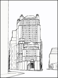


I modeled the idea in AutoCAD and established views from the south, as seen in the wireframes above.


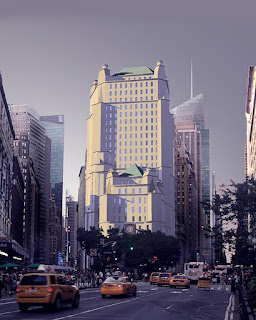
Then, for the fun of it, rendered it in Accurender and pasted it into a photo of the site in Photoshop.

______________________________________________________________________________

So now that we have a design and a site, let me bring on the “Light Taxonomy” from my previous post. I will not use Spot Lighting or Confetti Lighting, as they are more specialized than I want here.

1.     Beaux Art

2.     Frontal

3.     Dusk

4.     Saarinen

5.     Ambient

6.     Ferriss

I now spent numerous photo sessions in Herald Square shooting the site under different light/atmosphere conditions and different times of the day. I eventually had reasonable photos of the site under all 6 light conditions.

Next, I created 6 renderings of the computer model from the same viewpoint, each differing only by the light type and corresponding atmosphere. Each rendering (via Accurender) took into account light angle, time of day, sky, sun and context color, reflected view, etc. 

Using Photoshop I pasted the building rendering into the corresponding photo, setting it behind the trees in the square itself.

Finally, I rendered (on my computer tablet) the final Photoshop’d image to make it more unified in terms of value, color and composition. If I was actually producing a finished rendering, I would take this “sketch” rendering as the general goal for the final image.

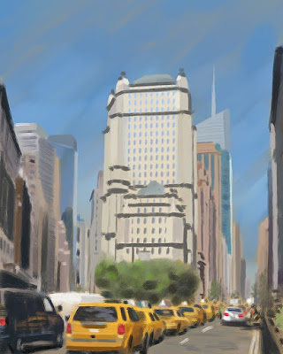
Below you will find each view’s light direction, rendered building, site paste-up and “sketch” rendering.


BEAUX ART


FRONTAL


DUSK


SAARINEN


AMBIENT


FERRISS


At this point, having a number of interesting possibilities, I would have gone on and painted a large, detailed illustration with plans and elevations. I did not. Life got in the way, and I am on to other projects. 
However, I hope the reader gets some ideas and inspiration from the exercise.


Addendum: the idea for a light taxonomy came from John Hedgecoe's The Photographer's Handbook, 2nd Ed. The 8 photos taken from dawn to dusk show an amazing range of color and light.


Tuesday, August 25, 2020

COLOR DEMONSTRATION


Long ago I created this tiny pastel sketch of a church. I called it “Burning Church” for obvious reasons and filed it away.


Years later I was playing with ideas for “landmarks” along Broadway in New York City, and realized that my “Burning Church” might work on a site at the north end of Manhattan on 170th Street.

In designing the church I ran with a simplified gothic style with a blank base raising the sanctuary above the street level.


I then built an Autocad 3D model and tried out a number of viewpoints. This hidden line view was chosen for the final drawing.


This magic marker sketch gives a preliminary idea of the values I was aiming for.


A base drawing was produced using freehand ink on mylar.


The final drawing was 30” x 40”, so there was plenty of room for detail and texture.


Reproduced above is a color wheel. It shows the full range of colors going around the circumference, with saturation going from the center of the circle (desaturation = grey) to full color saturation at the circle edge. This is fully discussed on the outstanding “Gurney Journey” blog. 


The original “Burning Church” sketch uses a very tight range of yellows and browns marked by the diamond shape of the color wheel. The sketch derives its strength from the limited palette.


The last color sketch above and accompanying color wheel show a complimentary palette ranging from yellow to blue. The combination of color contrast and value contrast makes the tower pop out strongly.


The last color sketch above and color wheel show an orange to grey-green palette. The color contrast is less strong, and the value contrast is created with a tower running from light on dark at the bottom to dark on light at the top. I’ve always loved the red-orange contrast with a grey-green sky; it reminds me of a portrait trick of contrasting warm flesh against a grey-green background.


The two sketches above have low saturation color palettes. Essentially, they are low contrast grey studies with pastel tone here and there.


The strong blue and yellow sketch above is going in the right direction, but seems a little bit too simple.


By adding a graded reddish tint top and bottom I pushed the focus to the center of the tower suggesting a cross composition


The sketch above was done full size with pastel and pencil to study the detailed coloring of the church entry.


 And here is the final art (30” x 40”). Note the darkened foreground and sky which adds to the drama and makes an excellent background for the white line elevations and plans. The final was done with transparent ink airbrushed on a photographic print of the ink line drawing. The title was done with white acrylic applied with (tiny) brushes. The ghosted plans/elevations/sections and quotes were color pencil.


Detail at the bottom of the painting.


Detail at the top.