Plans were probably the first type of
construction drawing to be used. There are examples from 18th
dynasty Egypt (on papyrus) and from the city of Nippur Mesopotamia (on clay
tablet) around 1500 BC. Not long after this elevations show up in the archeological
evidence, and it seems an easy step from there to putting the two types of
drawings together in a single drawing. I admit that I have not found any
example of this in artifacts from the ancient world. This doesn’t surprise me much
since such drawing would have been used for on-site (draw in the dirt)
explanations to the workers, not for governmental propaganda or record
keeping).
Suffice it to say (and this is my own,
unsubstantiated opinion) that plan projection drawings must have been one of
the graphic tools of builders early on. In any case, it has been a favorite of
architects and engineers in more recent times.

Projecting a plan into
3 dimensions is quite easy - draw the plan of an object; rotate it to any
angle; and then project the sides down (or up) from the corners.

Add shade and shadow
for a good approximation of reality.

A cylinder (in plan)
is quite easy to draw…

Just draw the circle
top and bottom, and…

Connect with vertical
lines.

Again, shade and shadow…

To draw a sphere in
plan projection, start with the cylinder in plan.

Then add cylinders from
each projected side.

The intersection of
all three cylinders will define the outside edges of the sphere.

Shade and shadow
(blah, blah, blah)… but, you might notice that the sphere is a bit off.

The pink circle shows
how much my constructed sphere has stretched. It isn’t bad, but it does point
out that the vertical projection lines of the original cube are a bit too long.
________________________________________

Back in 1988 there was a very nice
demonstration (above) showing the creation of a plan projection in Architectural Illustration Inside and Out
(by Lorenz & Lizak). The plan (left drawing) is rotated so as to eliminate
confusion in the final drawing (any angle will do, but it is best to avoid
confusing alignments in the projected walls). The middle drawing shows the
walls projected down (at this point any confusion should be obvious). The final
drawing on the right adds detail, and shades some of the planes so as to
clarify the form.
__________________________________________
The following 25 images are examples of
plan projection drawings presented in chronological order. I had no problem
finding them in my books, magazines and files. In fact I could have included
many more.
Architects over the last 100 years seem
to have had a love affair with plan projections. This is actually quite logical
for several reasons. First, architects normally design in plan before anything
else. Second, combining the elevations with the plan in a single drawing is
elegant and informative. Finally, the abstract look of such a drawing is
perfectly in line with the style of the modern art movement.

Here we again have Auguste Choisy the professor
at the École Nationale des Ponts et Chaussées. This plan projection looking up
at a coffered ceiling is from L'art de
bâtir chez les romans. If Choisy had been a professor at the École
des Beaux Arts he would have illustrated this same ceiling with rendered plans,
sections and elevations. Teaching at a school of engineering (bridges and
roads), he instead used measurable projection drawings.

Forty years after the publication of
Choisy’s books, plan projection drawings began to be used by architects for
presentations. The hard, measurable drawings highlighted the machine esthetic of
the modern movement. Above is the Netherlands House by Van Eesteren & Van
Doesburg (1922). It is a nice example of coldly elegant abstraction, in the
service of architecture.
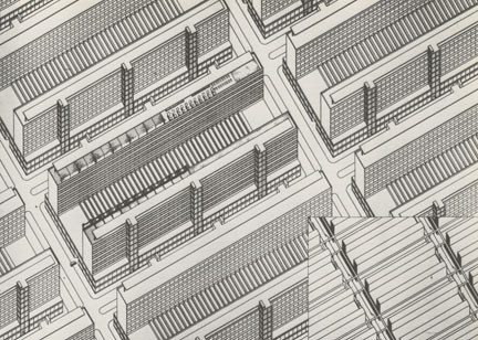
Highrise City by Ludwig Hilberseimer (1926)
shows the degree of machine-like order architects were contemplating in those
days. Admittedly, other drawings of the same project included perspectives from
street level, so there was a recognition that people would actually inhabit
these file drawers.

This stair Interior by F. Jacob (1931)
is visually fascinating, but the design is a bit too complex to understand in a
single drawing. Nevertheless, it has
always been a favorite of mine.

Alberto Sartoris was an Italian
architect who was a member of the Rationalist Movement. He was famous for his
theoretical work and writing, but had few projects actually built. This plan
projection drawing titled “Hermitage” (1933) straddles the line between
architectural drawing and abstract painting.

“Villa Gentinetta”, also by Sartoris (1937),
shows a clean, ink-line drawing style that was copied by cutting-edge
architects 40 years later. Funny how ideas and styles tend to be repeated in
our modern age (not unlike the eclectic rut that the “moderns” revolted
against).

Wilhelm Kreis was a German architect
whose long career began during the reign of Kaiser Wilhelm II, and lasted until
after World War Two. Although he designed in an historical conservative style,
he also produced plan projection drawings. In this example of the Army Command Center
in Berlin (1938), traditional shade and shadow (comparable to Elliel Saarinen)
is used to enhance the reality of the aerial view.

In this study for an apartment by Ettore
Sottsass (1950), the information of the plan has gotten more telegraphic than
the Sartoris interior above. It is quite easily understandable as a space
within a building (a trick that I copied 30 years later), but the functions of
the apartment itself are hard to work out from the large sculptural planes that
form its spaces. Generally, I find that the drawing is awkward and unbalanced.

James Stirling’s plan projection
drawing of Cambridge Library (1964) is a clean and informative image which
harks back to Sartoris, 3rd
image above. His architecture might be called “modern with a twist”, in
that he rejected the cold “machine for living” and reintroduced an eclectic art
of design. His materials were modern, but his sensibility was playful.

Charles Gwathmey had a similar view of
architecture, and had a thriving practice in the United States. The drawing of
a house in Bridgehampton, Connecticut, designed when he was 31, shows the
post-modernist flair for mixing graphic patterns and informative reality.

Above is the Hanselman house by Michael
Graves (1969). Its design is typical of the “New York Five” architectural
group, as is the use of plan projection for the presentation. Graves later
became famous for his more colorful “Postmodern” designs, but switched to
models and colored elevations for presenting those projects. (BTW, In the 80s I
rendered his Team Disney Building in Burbank, California, as part of a master
plan.)

Raymond Erith (who died in 1973) & Quinlan
Terry (who is still practicing) designed in a “radical” classical style,
copying historic styles from ancient Greek to Baroque and Neo-classical. These
English architects designed and built in the traditional way, and usually presented
projects in a traditional way, with rendered plans and elevations. This worm’s
eye plan projection view of the proposed Baha'i Temple in Tehran (1976), is
therefore an anomaly. Still, it is a lovely drawing which explains the design
quite well.

The drawing above, titled “Building 3
Buenos Aires,” is by Diana Agrest & Mario Gandelsonas (1977). It is very
much like Wright’s rendering of the T.P. Hardy House in that the focus
of the illustration is tucked into one side of the composition. When you focus
on the design itself at the bottom of the sheet, you get a fairly pedestrian explanation
of an interesting set of stairs and platforms.

Above is a double plan projection
drawing of Kamioka Civic Hall (1978). Arata Isozaki’s take on hard-line ink
drawing is much like Sartoris (see 5th image above); grids are prominent,
and line weight is not varied. By matching views from opposite sides of the
building on the same sheet Isozaki gives a complete understanding of his complex
design.

While Isozaki seems more inclined to
Sterling’s idiosyncrasies, Richard Meier seems closer to the discipline of
Sartoris’ work. The Arts & Crafts Museum in Frankfurt am Main (1979)
features subtle shifts in the grid, but keeps a consistent unifying module. Meier’s
plan projection drawing presents an interesting contrast between the old Villa
Metzler (standing alone) and the surrounding flurry of modernity in Meier’s
design. The modern addition seems to merge well with the hard-line ink drawing.
Meanwhile, the neoclassical Villa Metzler loses much of its sculptural molding
and ornament.

Emulating previous drawing approaches
is for everyone. This cut-away plan projection of the trading floor at the
(then) Republic National Bank Headquarters in New York City (1983) harks back to
Etore Sottsass’ apartment study from 1950.

This plan projection view of Restaurant
Row in New York City (where I was living in the 80s) was done with two
projecting directions to show both sides of the street at once.

This proposed brownstone renovation, was
a presentation board for a freelance job I did with my old friend Ty Kaul. It
was illustrated using a plan projection worms-eye view to show off the colorful
wall and ceiling work.

This sketch was done for a student
project involving the American Stock Exchange. It is a good example of plan
projection drawing as a design tool. The student who designed and drew it is a
talented architect who I worked with later in my career.

Plan projections of simple cubes can be
confusing: am I looking down at the exterior or up at the interior. This
drawing by Edward Jones of the Schinkel Archives (1981) is obviously the
latter, but I admit that it “flips” on me sometimes.

In 1983 I was at McDonough Rainey
Architects, and worked on the new Time Magazine Executive Floor in the Time-Life
Building. The 1983 remodeling included
the concept of recreating the iconic skyscraper’s curtainwall system in the
reception area. To illustrate the idea to the client we decided on a plan
projection with the interior “curtainwall” set into a ghost of the exterior
curtainwall. The drawing combines an understandable plan, a realistic rendition
of the reception area’s forms and materials, and a powerful illustration of the
concept. The art was about 20” x 20”, and was produced using airbrush and color
pencils on illustration board.

This New York Picture and Street Map by Bollmann Bildkarten Verlag, from
about 1984, emulates a technique used to illustrate European cities dating from
the 15th century. The buildings are scalable (the vertical is
exaggerated), but the streets and avenues are widened to show off the
individual buildings. The art was done by Hermann Bollmann, who had previously
created views of many European cities. This map was, and still is an
inspirational work of art for me.

The sketches above are not strictly
plan projections since they separate the plan from the enlarged façade, but
they are close, and I like them a lot. They are from Rob Krier’s Elements of Architecture (1986), and are
another example of the power of this type of drawing in understanding a design
idea.

Above is my plan projection drawing of
a mixed use development proposal in the Tribeca section of lower Manhattan
(1988). The drawing is ink on mylar following a simple pencil block out. An
aerial perspective would have taken a day or two to complete, while this plan
projection took an hour. I know… with CAD modeling any sort of view could be
done in a few hours. Still, a plan projection has a certain elegance that
should be kept in mind when choosing how to illustrate something.

Stanley Tigerman’s Fukuoka Apartments (1989) is a curious example
of this drawing type. It certainly delineates the complex layering of façade
elements and shifting blocks (it reminds me of traditional Japanese “fusuma”
screens stacked on top of one another). On the other hand it has always felt a
bit confusing. Perhaps coloring the different materials would have helped
clarify the drawing. The model of the project and the photos of the final
building explain the design better (well, duh!). I can’t help wondering what an
elevation rendered in shade and shadow would look like.

I will end this long inventory with a plan
projection drawing that is morphing into a more abstract sort of drawing. The project is the Santa Monica Restaurant by the
design firm called Morphosis (1989). It is a typical example of the
Deconstructivist architecture of that time. There have been a lot of words
spilled about the Deconstructivist Movement, but the actual architecture is
always striking (and sometimes even beautiful), in spite of the verbiage.
This drawing, and most of the other
presentation drawings for this project, tend to be “amphibians”; they are both
a representation of 3D reality and a fascinating 2D collage of shapes. The singularity
of the drawing doesn’t always lead to a wonderful design (in this case it did).
The modern movement is no different from the Beaux Art era in this regard; the
presentation drawing is both a means to an end (a building), and at the same
time is a work of art in its own right.
I will be addressing the curious
obscurantism of projection drawing in the next post.


