I expect that someone following this
blog has wondered why I’m wasting my time exploring graphical projections. They
are not central to professional rendering. They are certainly not in the
mainstream of architectural illustration. Graphical projection is not what
springs to mind when you think about selling a design: it isn’t very dramatic
or emotional; in fact it is a rather cold, abstract technique.
But, I don’t think you can understand
the modern movement of architecture without understanding graphical projections;
and understanding the modern movement has been on my mind for a long time; and
is what I’m after right now.
Back in the hay-day of Beaux Arts building,
architects used orthographic drawings (plans, sections and elevations) rendered
in shade and shadow. They avoided graphical projection drawing. If a three
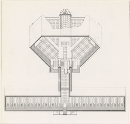
dimensional view was necessary, a perspective was created. Even a simple diagram such as this
vault study from Joseph Gwilt's Civil
Architecture (1825) was drawn in perspective!

I have previously reviewed the
“questioning” era of perspective drawing that occurred about a hundred years
ago. The perfect reflection of reality in art and
architecture upheld by Renaissance thinking became mixed with a modern need to
blur and re-imagine the drawn reality of linear perspective. My last post shows examples of the extreme edge of that trend. But, why did we opt for
confusion? Has society gone mad? Are the “taste makers” crazy? Is it confusion,
or is it simply a different view of reality? I would guess that it is not
madness (or some subtle mass hysteria) or uncontrolled confusion; it is too
long running for any of those things to be the cause. The reality is that
people do whatever they need to do to survive and gain power and pleasure.
So why did it happen, and why did it
happen when it did (the decades following 1900)? “When” is the key. It happened
as the industrial revolution became wide spread in Europe and America.
So what is the connection between the
industrial revolution and the rejection of classical beauty?
Note: Society was changing in many
ways at this time (long running stability and peace in western countries, a
high point of humanism, a jump in population density, the rise of mass media,
etc.). I’m taking the industrial revolution as the primary mover, even though
other factors must be involved in the process.
 |
| The Carpet Bazaar in Cairo by Charles Robertson 1887 |
Technological
Change = Cultural Change
The industrial revolution changed the
way luxury goods were produced. Previously, a highly trained craftsman took
several weeks or months to produce a highly ornamented object (like a fork, a
portrait or a clock). With factory mass production and machine precision, the
same object could be produced with equal quality at a fraction of the cost.
This revolution brought cheap, high quality goods within reach of the average
family. You might think that this would have been seen by all as an unalloyed
good, but you would be wrong.
 |
| Rug Making Machine |
The flood of cheap goods did not
eliminate wealth inequality; there were still very rich people – the elite.
This was not new; what was new was that the elite still needed to “show” that
they were richer, or at least “different” from the mass of people. But how do
you do that when everyone can afford traditional luxuries?
 |
| Young Lady with Her Maid by Aimee Brune |
Sumptuary
Law
This was a “social” problem. The elite
have always needed ways to signal their superiority to the average citizen.
This usually took the form of expensive clothes and jewelry which were beyond
the budget of the poor, and were often forbidden by law to the middle classes. The
“royal purple” was reserved for the emperors of Rome by law, and sumptuary laws
were meant to keep the nouveau-riche of medieval Europe from showing up the
nobility.
But if expense and law could not hold
the “class” line in the newly democratic order, how could the elite distinguish
themselves from the rabble?
 |
| Elizabethan Fashions |
The
Endless New
The answer that developed in the late
19th and early 20th century was to create new fads, new
styles, and new “languages” of criticism. This sounds like a conspiracy theory,
but really, who doesn’t like a new fad? And, what young person doesn’t love to
create slang to get around the stogy rules of their parents? All it took was a
natural loosening of traditional norms. The elite trend-setters just had to
stop supporting the old order, and the fashionable new would do the rest.
 |
| Hemline Lengths in the 20th Century |
The establishment of good universal
education in this same period, allowed some in the lower classes to move up and
emulate their “betters” with fashionable mansions and fine clothes. But this
only advanced a few. The greater threat to elite “marking” was the free market
system. Any schmoe with brains, guts and drive (and a bit of luck) could make
it into the upper middle class, complete with BMW and suburban McMansion. Not a
big deal; the nouveau riche have been around for a long time – eventually
becoming “old money”. The problem is that even the poor in the U.S. have cars,
flat-screen TVs, and iPhones. Not only can everyone pretend to be someone, but
anyone can record it all in “selfie” style!

So, the super rich created through
their patronage, a whole industry of “new”. An army of artists, critics,
curators, flaks and hangers-on who’s only business was producing new art,
fashions, and ideas on a yearly, monthly, even daily basis. If necessary they
would keep coming up with new things at a pace that an overworked middle class
Joe would find hard to keep up with. Above all, they were tasked with promoting
anything that contradicted what the plebs held dear; just to make it less
likely for Joe Schmoe to mimic his “betters”.
 |
| The Scorners of Vanity Fair by Henry C. Selous 1844 |
Interestingly, with the spread of cheap
technology and the internet, huge numbers of people are getting in on the
production and consumption of “new”. Blog writing, podcasting, Facebook
celebrity and Twitter stardom are available to everyone. It is still the upper
strata of celebrity, power and money that steer the cultural flow of all this,
but the control is not absolute.
 |
| Shooting the Rapids by Arthur Heming 1938 |
In the end we are left with a culture
careening off into the nihilistic future. It seems to be all fluff and spray
and momentary “memes”, but, like a drug or an ear-worm, you can’t get it out of
your head. I’m afraid that the unseriousness of it all will lead to collapse
when the surrounding physical reality comes back (I’m talking violence, war, disease,
starvation, chaos, etc.). After all, someone has to keep the lights on and the
water running.
 |
| The Four Horsemen of the Apocalypse by Benjamin West 1796 |
…but even that apocalyptic image looks
like a cool superhero flick.

OK, OK…
And this led to the popularity of
graphical projection drawing?
Well, yes!
Architects began illustrating their
“machines for living” using “anti-traditional” techniques. The result could
often be striking and beautiful, but the human element was lost in the love of
the machine.
 |
| Analytic Drawing by Peter Eisenman |
“Machine for Living”; what a curiously cold phrase! If it
had been coined by a scientist I might be grimly unsurprised, but, being
suggested by a thoroughly artistic artist (Corbusier), it seems appalling.
Philip Larkin said that all art “is
inextricably bound up with giving pleasure,” and although human pleasure is a
wide category (including novelty), it doesn’t usually include pain and
confusion.
 |
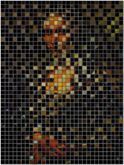
| Three Studies for a Self Portrait by Francis Bacon |
But are we using art to replace the
lost sense of mystery in life? Is art now merely a riddle, used to entertain
people who live in too safe (and boring) a society? An emotional/visual roller
coaster of the mind; exciting as the abyss, but safely theoretical.
 |
| Symptoms of Love by Daniel Libeskind 1981 |
And...
In case you were thinking the same thing...
Isn’t it easy to fake complexity and mystery? A stain on a wall can look like the Virgin Mary. A Rorschach test image can look like a butterfly.
In case you were thinking the same thing...
Isn’t it easy to fake complexity and mystery? A stain on a wall can look like the Virgin Mary. A Rorschach test image can look like a butterfly.

Has the combination of “art as riddle”,
obfuscating critics, undemanding collectors, mercenary investors, and an
“anything new” cultural milieu, made the modern movement(s) dry and fruitless
(not to mention ugly).

Don’t ask
me; I haven’t a clue.
We may (or
may not) know in another decade or so.