Just to be upfront about this post, I DO NOT want to teach 2
point perspective. There are plenty of books and websites devoted to laying out
perspectives by hand and computer. If you are looking for a basic tutorial,
stop and look elsewhere.
If, however, you know the basics, this post may be of use to
you because it will address some of the problems normally found in perspective
layouts.

In high school I took a class in architectural drawing. It
involved designing a relatively simple (indeed bland and boring) house, and
then producing a fairly complete set of working drawings. In addition, the
teacher allowed extra credit for the production of a rendered perspective of
the house.
I had never created a perspective layout, but after checking
out an example, I found it an obvious trick. The whole process seemed easy and
self-evident (I know that this sounds like boasting, but it is a true story). I
imagine that I have undervalued the skill because of that early facility that I
stumbled upon.

In addition to this, I have found (along with every other
architect or artist) that computers make perspective layout obsolete.
What I’m trying to say is that teaching perspective seems a
boring waste of time to me.
So… I’m going to touch on the basics of 2 point, and then
get on to making a few points about distortion.

If you read my posts on one point perspective you know that
there isn’t much difference between 1 and 2 point perspective. The idea is the
same, and one can be developed from the other (and vice versa), especially if
you are working on a rectilinear floor plan.
So… here is a quick
and dirty review of perspective layout.

Take a site plan of your building (it is best to use a roof
plan or something showing the general setbacks and shape of the building) and
pick a point to view it from. Draw a line from the approximate center of the
building to the “station point” (where
the viewer is standing). Strike a line called the “picture plane” perpendicular
to the line through the station point. This line can be placed practically
anywhere, but for simplicity is usually touching the closest corner of the
structure (as shown).

The “picture plane” is the same thing as the dotted paper on
a hinged frame, illustrated by Durer above, except that it deals with plan
only. The vertical dimension comes later.
Next, strike lines parallel to the elevations and running
through the station point. Mark where these lines intersect the picture
plane. From these intersections drop lines as shown. Mark a “horizon line”
parallel to the picture plane (again, this can be placed anywhere above, below
or on the picture plane, but for clarity is usually placed below the station
point). Where the drop lines intersect the horizon line mark your “vanishing
points.”

Now draw another line parallel to and slightly below the
“horizon line” (“h” above). Call this the “ground line,” or “g.l.” The relation
of the “g.l.” to “h” will control the height of the viewpoint: if below the “h”
line, the viewer will be above ground (and with greater distance you will have
an aerial view); if above the “h” line the viewer will be below the base of the
building (normally used if the building is on raised ground with the viewer
looking up at it). Next drop a line from the point where the picture plane
touches the building. This is the “height line,” or the line on which the
vertical dimension is measured.
Now draw lines connecting the station point or “s.p.,” with
each of the major plan corners. In this case I’ve connected the 4 corners of
the building as well as the ridge line of the roof. Note where these lines
intersect the picture plane, or “p.p.” (red dots).

Next drop lines from the p.p. intersects to the area
around the “h” and g.l. These lines are the corners of the building as seen
on the perspective drawing itself. But what about the vertical dimension? For
that you must draw or paste the elevation(s) (drawn to the same scale as the
plan used), with the ground at the same position as the g.l. Strike lines
across until they meet the height line (“h.l.”) (red dots). Drawing lines
that connect these marked heights on the h.l. to each vanishing point
(“v.p.”) will create a frame for the building in perspective. The box portion
of the house is described by the lower two vanishing lines, while the ridge
line from the plan and the top vanishing line mark the position of the ridge
in perspective.
The result (because we chose a high viewpoint) is a low
aerial view.
Here ends the quick
and dirty review of perspective layout.
And here begins a collection of comments on two point
perspective.

As with the one point process, once you have a rectilinear
grid set up, you can describe any shape. Inscribe an oval in the top and bottom
of a cube…

… and you have a cylinder.

Add shade and shadow, and you are on your way to modeling
reality.

As I noted in the quick and dirty review of perspective
layout above: if your ground line is above the horizon line, you are
underground; if your ground line is below the horizon, you are in the air
(above ground), and if your “ground line” is in the same position as the
horizon, your eyeball is rolling around on the ground (look out for ants!).

Distortion is the bane of the inexperienced perspectivist,
but it is easily avoided. The usual mistake is to place your viewpoint, or station
point, too close to the building being drawn. You might think that a skyscraper
would look better within the limits of the surrounding buildings, but
distortion at the top would be very noticeable.
The additional problem of placing the object at the edge of
vision will be addressed.

In this layout of a building in London, done very early in
my career, the topmost cornice is simply too angular to be believed. Moving
the station point 100 feet back would have fixed that without anyone noticing
the added distance from the building generally. (Note also the building plan
floating over the upper part of the building and on into the sky.)
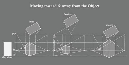
The diagram above shows a building being moved farther away
from and closer to the viewer. When you move farther away the building seems to
flatten, while the close view seems to have an awkward distortion.
Also note on this diagram the relation of the building plan
to the “picture plane” or “p.p.” As I
said before, you can place the “picture plane” anywhere on the layout, but you
will have to adjust the “height line” to make it work.

Viewpoint placement will also affect the perceived depth of
the final rendering. The photos above are of the same house; the left viewed
from just across the road (shot with a normal lens), and the right seen from
the middle of the adjacent field (shot with a telephoto lens). The “Telephoto”
view is not normal because it would only be a small part of a larger view under
“normal” conditions.

In the diagram above, the left is a “normal” view (as you
experience an object set in front of you), and the right is a “telephoto” view
(seen through binoculars or a telescope). To insure a “normal” view you should
follow the 30 degree rule: place your “station point” at the point of a 30
degree triangle formed by the two outer corners of the building, and the
“station point”. Using a 30/60 triangle (colored in tan above) to locate the viewpoint
makes the rule an easy one to follow if working by hand.

Besides getting distortion at the top of tall buildings, you
can have distortion at either side of a drawing (at the edge of vision). Each of the 3 layouts above show the same
barn, but each (reading from left to right) places the barn to the right, the
center, and the left of the direction the viewer is looking. You can see that
the side of the barn is stretched out in the view on the left, while the end of
the barn becomes dominant in the view on the right. On its own the barn doesn’t
look too bad, but if included with a group of buildings, or a single sprawling
building, it will look awkward.

The layout of the New York Stock Exchange Main Trading Floor
(above) was completed when I was still learning to do layouts. It not only has
distortion occurring in the ceiling, but it is an unfortunate mix of 1 and 2
point perspective. At the beginning it was important to see the end and right
side of the room. Later it was decided that the left side of the room should be
shown also. The wall on the left is reasonable, but the truss structure becomes
rather overbearing in the upper left corner since it as at the edge of a
person’s normal vision.

Not every building is rectilinear. Some streets and
buildings are acute or obtuse angles. What to do? If the entire building is
designed on some angle other than the usual 90 degrees, you can simply use that
new angle as though it were the same as a normal right angle. In the example
above all walls are parallel to one of the front elevations. If each wing was
layed out as a separate right angle grid, then you would need 4 vanishing
points to complete the drawing.

In the drawing above there were a number of vanishing points
used, corresponding to the various surfaces on the building. The blue wall
followed the street angling off to the left. The orange wall was perpendicular
to the front façade, and angled in from the blue wall. The yellow billboard was
angled out from the street wall to give people a better view of the sign.

Many buildings are built on flat, or almost flat sites. In
those cases the vanishing points for the building and the streets are on the
horizon.

If, on the other hand, the building you are drawing is on a
steep street you will find the vanishing point for the adjacent street above or
below the vanishing point of the building.
Distortion is also found in computer generated rendering,
and can be eliminated using the same tricks. Interestingly, distortion was, and
still is occasionally, emphasized to give an image a futuristic look.
Next post… historic
examples of perspective layout (and comments on same).
Other posts on Perspective:
Perspective - Two Point Perspective -
Distortions & ComplicationsPerspective - Three Point Perspective- Hand & CAD