John Singer Sargent (1886 - 1925) is best known for his
portraits and his subtle compositions.
Madame X (1884) is his most famous
portrait, and has enough drama and history behind it to have been the subject
of a book,
Strapless by Deborah Davis.
I’m not going to outline Sargent’s curious
expatriate life here, so if you are interested and want a good read, get
Strapless.
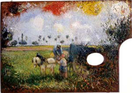
His compositional skill is best illustrated by the painting Carnation, Lily, Lily, Rose (1886),
which straddles the line between pure reality and wild abstraction. Two children are holding Japanese lanterns,
but there is no horizon or ground plane, no sense of distance, and the general
effect is of scattered confetti. And
yet, it has a real, almost commonplace feel about it; like a childhood memory.
A third weapon (reflecting the surprising Spanish
Inquisition) in Sargent’s arsenal is his brilliant brushwork. He is capable of teasing reality out of a dab
of paint, creating the wonderful tension between reality and paint on canvas. The detail of The Daughters of Edward Darley Boit, below, shows the range of
effects that Sargent’s brush covers; from the abstracted rug and dress, to the
perfectly modeled face.
Alright…. That is all
well and good, but what does that have to do with architectural rendering?
Well, Sargent also did brilliant paintings of buildings. He was not an architect, and seems to have
had no interest in the practical business of designing and constructing the
built environment. But, he was an
observer and recorder of the world, whether animal, vegetable or mineral. Sargent’s viewpoint can be very useful in reminding
the architect that “normal” people see things differently than architects
do. Theory is all very well, but the
surprising world of light, the tactile feel of materials, and the delight in
color is at the center of the human experience of buildings.
I will, as usual, make short comments on the following
images, relating the reason they caught my eye in the first place. By the way, paintings 1 to 6 are in oil, while the
rest are watercolor.
Above are two views of the same loggia at Vila Torre Gali,
but painted at different times of the day.
One having a warm and hazy feel, and the other having a cooler and more
focused light. It is good to be reminded
that an omnipresent glow can be as dramatic and real as direct sun in the late
afternoon.
Worn stone and water stains aren’t what most clients want to
see, but the almost flippant way that Sargent captures this weathered building
is breathtaking.
The same confident strokes define this ornate interior. Note the “telegraphic” rendition of people in
the lower right corner. This composition
is as close to a typical architectural rendering as you will get from Sargent;
he was a master at choosing the off center, sometimes eccentric point of view.
The foreground paving in this interior view of a church
reminds me that stone and tile are natural 3 dimensional materials which show
wear, and whose joints can be variously lighter or darker than the paving
itself.
Raking sunlight on a plastered white wall should reveal all the
warm and cool variations of the color white (
That’s White, Right?).
In addition, this painting utilizes the brushed
texture of oils to suggest the rough surface of the plaster.
Although architectural renderings tend not to
represent textures in this way, the fact remains that textures can be an
important part of a building, and their depiction can make or break an
illustration.
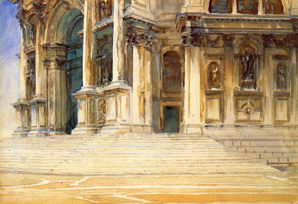
This painting of San Stae in Venice is a good place to start
viewing Sargent’s watercolors. You can
see the pencil lines at the bottom and upper right, showing how he sets the
rough boundaries before playing with the paints. It also shows his (and watercolor’s normal)
use of transparent layers, with blues and violets melting into tans and browns.
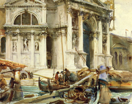
The three painting above are of the Library and Doge’s
Palace which form two sides of the Piazzetta in Venice. There are many aspects worth noting here,
such as the fine underlying drawing, and the ability to range from detail to
suggestion. I am most interested here in
pointing out his tight palette of Burnt Sienna and blue. Sargent
was as draconian in limiting the number of colors, as he was libertine in
employing them.
These views of Santa Maria della Salute (or “the Salute”) in
Venice, range from studied details to impressionistic background. They also range from highly colored to subtle,
and monochromatic to a warm/cool balance.
If you are dealing with a stone building such as The Salute, these paintings
are worth studying, in that they express the material, sculptural form and
windows in a simple but completely believable way.
These
monochrome studies (just a touch of blue) show how
much realism can be created from a one or two color palette.
Also, look closely to see the barely
noticeable line layout – which, although not exact, is more than enough to
support the looser brushwork.
In these three images water and a cool palette are
combined. Note how often Sargent lets
the blue and brown mix in a wet wash which itself suggests the theme of water.
The same theme of water is found in these 3 images, but note
the addition of violet in the first view (by the steps and shadows), and green
in the second view (in the foreground water).
These touches create a more subtly realistic effect than Sargent’s
simpler palette.
I don’t know why I included the above paintings… or rather I
do, but it has nothing to do with architectural rendering. (The sheer joy of the brushwork and color made
me do it) I can’t imagine trying to get
away with a dissolving series of brown and blue dabs, or making them represent
a recognizable temple structure, as he has done in the second image.
This watercolor of a Venetian doorway caught my eye years ago. The dark wet in wet passage of the doorway
seems a throw away until you realize what a perfect foil it is for the bright
water and detailed stonework. The
composition is a classic cross set off center with various secondary moves to
keep it from becoming static. It is
topped by the bravura spiral column and window lattice. I was, and still am, choking with envy.
This painting of Bernini’s Four Rivers Fountain and the
church of Sant’Agnese in Agone, both within the Piazza Navona in Rome, is
included to show that even Sargent could be overwhelmed by Baroque
architecture. You can see how he worked
unsuccessfully to separate the fountain and the church, but the final effect is
more confusion than satisfaction.
Bridges, bridges, bridges… Venice has ‘em, and Sargent
painted ‘em. The series above gives an
interesting tour of bridges as subject, background, afterthought, framing
device and lighting study. The last
image reminds me that I should do a post on curious effects found under bridges,
and wherever water and shadows meet. I
might attract “trolls” but it’ll be worth it.
These two paintings are another example of the possibilities
light gives to illustrating buildings.
Both are of the Scuola di San Rocco, but the first is done in a moderate
morning light, while the second is taken in late afternoon, with a warmer and
lower sun angle. Which version do you
prefer? Which light would be best for
your next job?


Four fountains.
You
might notice that in spite of his skill with watercolor, Sargent was not above
using opaque white (or anything that gave him the effect he wanted) on several
of these fountains.
The first image is
another painterly hat trick which seems throw away, but is perfect.
The second image nails the effect of wet
bronze.
The third fountain is a
beautiful reminder that the underside of something in direct sunlight is
brightly lit by reflections from the ground.
The last two images are a final set of “same place, different light”
comparisons; one working the warm afternoon light, and the other suggesting a
cooler mid day sun.
Note in the forth image, how Sargent shifts the light on dark of the near statue, to dark on light.

This (almost) final sculpture is a nice reminder of
Sargent’s talents in tackling reflected light.
It shows two sculptural figures beside a path. The surfaces facing the ground glowing orange
and brown, while the surfaces facing the sky are blue. Sargent exaggerates perhaps, but the result
is magic, and more importantly, correct.
This (actual) final sculpture is of an escutcheon of Charles
V, from a building in Spain. OK, so
Sargent can speed dial with a brush, and nail an effect with the flick of the
wrist. But, as shown here, he is also a
patient observer of buildings. Sit down
and draw a straight elevation of such ornamentation. I have, and it is not easy or quick. So… hats off to John Singer.