I’ve posted examples of good composition over the past year;
now I want to highlight examples of bad composition. These examples are by
recognized masters, proving that you don’t have to be an aesthetic dolt to make
ugly. They are presented with mark-ups and notes to serve as a warning to the
unwary. They are also a reminder that anyone can slip up and it is a serious
mistake only if you don’t recognize it and learn.

Michelangelo’s Last Judgment
is a wonderful thing to experience in detail.

However, it suffers from symmetrical boredom. The
“tic-tac-toe” composition is flat and uninteresting. Being a fresco, covering
one wall of the Sistine Chapel, The Last
Judgement functions as an interior decoration that is dependent on the
forms of the chapel. I’d give Michelangelo a pass on this, but it is still a
good example of bad composition.

The Annunciation,
by Botticelli, is not a favorite of mine but is justly valued as an early
example of perspective.

It is, you must admit, clunky. A strong vertical divides the
painting, indeed, dominates the image and the figures. Add an awkward-looking
Madonna and a tree atop an angel, and… well…

Dürer has an amazing imagination and plenty of detail, as
can be seen in Birth of the Virgin Mary.
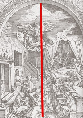
His compositions however, are occasionally scattered and
dull. In this case the various forms are unified only weakly by a centered
vertical line. Since the subject is overflowing with images and symbols (all
produced in a hurried commercial schedule) I can forgive his skimping on
composition, but it remains an example of the bad.

While I’m beating on Durer, consider his etching of Adam and
Eve. It is a beautifully observed study of the human form, and a visual parable
with considerable detail.

The composition however, is static and dull. There are three
verticals, which give some interest, but it is the subject and the detail that
keep it all together.

Raphael is one of the masters of the High Renaissance…

…but again, things don’t always work out. His Virgin with the Blue Diadem seems to be
a circular composition around the figures but has an unsettling repetition of
diagonals above that. As with the following example, it could have used some
judicious editing.

In the otherwise entertaining Judgement of Paris, Dürer should have left well enough alone.

He really didn’t need the tree in the foreground, the
mountain or even the horizon. And a cupid stuck like a postage stamp in the
corner… I don’t think so.

El Greco, unlike Dürer, was not chained to excessive detail;
and so you would think that the overall composition would come easily.

His famous View of
Toledo would disabuse you of that assumption. It seems a very “modern” painting
and so has been praised by the modern critics. It is, nevertheless, a confused
jumble with no particular focus.

Of course, bad composition is not confined to the distant
past. The Impressionists were quite capable of producing ugly. Take Cézanne's Rocks in the Forest.

Similar to El Greco’s Toledo,
it lacks focus. Its charm is in its suggestive abstraction, but in the end
there is “no there there.”
Bad composition is everywhere. Make a habit of noticing it
and imagining a more pleasing solution. You’ll find it more productive than
playing games on your iPhone.
- Composition Part 17 - Value Studies
A caveat for all posts on composition.
You don’t
want to produce total chaos.
You don’t
want to create banal order.
You do want
to entice, hint, and suggest.
You want to
create mystery, even if the subject appears to be obvious.
- Composition Part 1 - Architectural Illustration
- Composition Part 2 - The Golden Section & other crutches
- Composition Part 3 - Dark Spot
- Composition Part 4 - Light Spot
- Composition Part 5 - The Cross
- Composition Part 6 - The Pyramid
- Composition Part 7 - Circle
- Composition Part 8 - Diagonal
- Composition Part 9 - "L" Frame
- Composition Part 2 - The Golden Section & other crutches
- Composition Part 3 - Dark Spot
- Composition Part 4 - Light Spot
- Composition Part 5 - The Cross
- Composition Part 6 - The Pyramid
- Composition Part 7 - Circle
- Composition Part 8 - Diagonal
- Composition Part 9 - "L" Frame
No comments:
Post a Comment