One of the easiest ways to test an image for compositional
strength is to use Photoshop to desaturate and contrast the painting so as to
see only the essential elements and their relationships. If you have an iPhone you can do the whole
process in seconds using the camera and filters. By doing this you are reducing
the painting to large areas of black and white, with minimal gradation in
between. Renaissance painters called this effect “Chiaroscuro”, which means
literally “light-dark” in Italian.
Early photography often created this effect due to the
inconsistency of the chemical process. This photograph of Yvonne de
Quievrecourt from 1914 shows (accidently I would guess) a wonderful strength
and focus on the upper body and face, while giving only an impression of the
dress. If the face had been lost in a light background, it would have been obvious at a glance.
Painters of the late Renaissance preferred the heightened
drama of strong lights and darks. The
Supper at Emmaus by Rembrandt van Rijn shows this contrast beautifully. It
also exemplifies the difficulty of modeling a figure within a very dark range (Christ)
or a very light range (the surprised disciple).
This Study of a Nude
Man by Thomas Eakins is a perfect example of Chiaroscuro. A pattern of dark
and light shapes are arranged upon a middle toned background. The simplified
development of the picture ensured that Eakins was focused on the general
composition.
Coal Wagon by Géricault
is a painting with a considerable tonal range.
When you filter it to increase contrast and eliminate the
color a series of silhouettes emerge. The dark wagon against the light sky,
invert the effect of the white horses against the dark landscape. The whole
effect is dramatic and highly satisfying.
I have already noted the wonderful composition of The Fog Warning in my post on WinslowHomer.
Suffice it to say that the shapes and contrasts revealed in
the black and white version make this image memorable. The complimentary colors
in the final simply multiply its compositional strength.
Look at the photograph at the top of this post. The face is
framed by a dark background while the rest of the figure is obscured. The same
approach can be found in The Young
Shepherdess by Bouguereau. The young girl's face is practically floating in the center of a white rectangle, while her arms are the lightest shapes intruding on the dark lower rectangle. The result is a bit awkward, somewhat suggestive, and entirely charming.
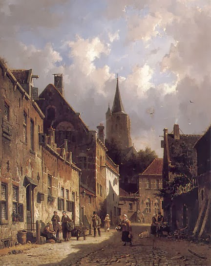
A Dutch Street Scene
by Adrianus Eversen is a quaint view of a street, but it has an interesting
dynamic quality.
That dynamism comes from the jagged black forms rising from
the lower right corner to the upper left. It is still a recognizable street
scene, but at the same time is a fascinating abstract.
Good composition can be found every day on the street and in
the stores. This photo in the New York Times of Oscar Pistorius during his murder
trial (Aug 2013) caught my eye immediately. The photographer seems to have consciously worked toward a
cross composition which naturally rivets the viewer's attention.
This Wall Street Journal photo of fire fighters this past
summer also caught my eye.
It matches the painting of the coal wagon above,
highlighting each of the fire fighters in reverse silhouettes.
Using dark and light is the easiest way to heighten the
drama in a rendering or painting. Using modern electronic gadgets makes the
process quick and easy. And if anyone asks what you are doing you can say that
you are exploring Chiaroscuro; that’s Kee Are Ooo Scoo Roo. That should get you brownie points with the sultry Italian in class.
- Composition Part 17 - Value Studies
A caveat for all posts on composition.
You don’t
want to produce total chaos.
You don’t
want to create banal order.
You do want
to entice, hint, and suggest.
You want to
create mystery, even if the subject appears to be obvious.
- Composition Part 1 - Architectural Illustration
- Composition Part 2 - The Golden Section & other crutches
- Composition Part 3 - Dark Spot
- Composition Part 4 - Light Spot
- Composition Part 5 - The Cross
- Composition Part 6 - The Pyramid
- Composition Part 7 - Circle
- Composition Part 8 - Diagonal
- Composition Part 9 - "L" Frame
- Composition Part 2 - The Golden Section & other crutches
- Composition Part 3 - Dark Spot
- Composition Part 4 - Light Spot
- Composition Part 5 - The Cross
- Composition Part 6 - The Pyramid
- Composition Part 7 - Circle
- Composition Part 8 - Diagonal
- Composition Part 9 - "L" Frame


No comments:
Post a Comment