I’ve been lucky in that I started illustrating buildings
when it was done entirely by hand. I say that I was lucky because knowing the
ins and outs of perspective helps any artist manipulate a nitpickingly correct
computer perspective. Artists who only know computer modeling make simple
mistakes, and often end up with mediocre illustrations.
I graduated from architecture school in 1974; a time when
computers filled large rooms, and 3D computer simulation was crude, and limited
to large, well funded institutions. The
following examples show my (and the profession's) progress from purely hand made
perspectives to computer layouts. They also will illustrate some of the
problems encountered and tricks learned.

I had drawn perspectives for friends in architecture school
for years, and when I arrived in New York City in 1977, I got a job as a
draftsman largely because of my ability to draw perspectives (as well as my
being willing to work cheaply and start immediately).


At first the perspectives I did were “in-house” sketches
used to visualize my own designs and those of fellow architects. Above are process
views of a small perspective showing a trading pit at the Commodity Exchange in
New York.

Eventually these perspective layouts included interiors and
exteriors, and projects of every size. In this image of a small office building
you can see the building plan with the picture plane floating in the space
above the building. The vanishing points and station point are all off the
paper to left, right and bottom, respectively. This building was relatively
short, so there was no problem with distortion at the top of the front corner.

This layout of a residential building was done on trace
paper, with the building plan laid underneath. It is hard to see in this photo,
but the picture plane (a line of dots actually) is in the sky above the
building. Being on a corner lot (with legal setbacks) the building appears to
lean to the right, a defect that was impossible to remedy via viewpoint, short
of playing with a three point perspective.

Here’s an aerial layout for a mixed use development in
Stamford Connecticut. This drawing was not created using a traditional linear
perspective technique. Instead, the site/building plans were made into a
perspective (easy in a computer, but hard by hand), and the forms were extruded
using an estimated vertical scale. Vertical lines are all parallel, while the
horizontals are on a distant vanishing point (your typical two point
perspective). The existing church buildings were constructed using a floor plan
and site photos.

This layout for a proposed office building in Queens, New
York has a very regular geometry, but needs three vanishing points because of
the angled façade. The plan can be seen at the top of the image, but the
picture plane is a bit beyond the top of the paper. Luckily the building
fronted on a wide boulevard, allowing the station point to be at a natural and
non-distorting distance.

This proposal for a development in Manhattan used a
photograph of the site from across the East River as a base. The footprints of
the new buildings were estimated based on the landmarks seen in the site
photograph. The plans were then located relative to the station point, so as to
match the estimate. Once the buildings were blocked in I estimated a vertical
floor height, and extruded the forms. Obviously the design was very
preliminary, and could reasonably rely on estimation for a rough perspective.

Here is a layout for a proposed signage ensemble at the
north end of Times Square. The working lines have been cleaned up, and the
result was later transferred to an illustration board via carbon paper. The
background buildings are traced from photos, and the new building has at least
5 vanishing points because of the angled signs on the Broadway façade. This was
one of the first renderings which I felt that I had produced real art. A closeup of the final rendering can be found in this post.

This residential tower entry is fairly simple, but it has
floor tiles in a triangular pattern which calls for extra vanishing points. The
plan was placed underneath the mylar sheet, and the picture plane can be seen
as a series of dots over the glass canopy. By this time I was very comfortable
with the perspective process, and would mark the picture plane with minimally
different shapes for different building elements.

Office interiors are often very simple, but they have
furniture and ornamentation which can be complicated. The construction lines
for the stairway (at the right) are the most complex part of this view. Note
the use of a diagonal vanishing point to simplify the layout of the ceiling
lights.

In this example the plan, station point, and picture plane
are visible. You can see the plan to the lower left, and the picture plane is
the top of the sheet of mylar. Since the basic volumes are simple, the plan has
been traced at a small scale (1/8” = 1’-0”), and the final view has been made
large by pushing the picture plane back to farthest end of the hallway the
viewer is standing in. Note the vertical line just to the left of the man on
the right; it is the joint of an added strip of mylar allowing the right side
of the hallway to be seen. Note also that the walls on the far right have been
cheated so as to eliminate the distortion that might come from a strict adherence
to linear perspective.

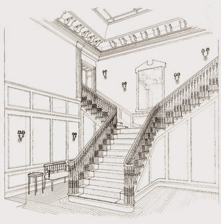
Here is another example of an interior perspective produced
from a small plan. The station point is at the very bottom of the sheet, and
the picture plane is at the top edge of the sheet, with the plan floating over
the lower stairs. The geometry of the stairway and space was carefully worked
out with the vertical scale being taken from the farthest corner of the space.
Once the basics were set, the details, and ornamentation were worked in by eye.
The final trace is clean and neat, but not particularly
impressive. It isn’t my usual approach, which is dramatic and moody. However,
as a perspective created without any computer, it still is impressive.

And, the coldly precise line work is mesmerizing in its own
way.

This is an unfinished layout for a restaurant called The
Casual Quilted Giraffe, a celebrity haunt of the eighties. As with the examples above, it was a simple
space with spots of delightful detail (designed by Woody Rainey). Every part of
the linear perspective form can be seen on the small (and aging) piece of trace
paper. Once the basics of the ornamental torchieres were set, I worked them up
into a neo Art Deco bit of fantasy. This drawing was purely for design
purposes, and was never made into a finished rendering.

The plan and picture plane are drawn in pencil on the
perspective above, while the actual perspective is traced in red. This is an
example of a layout that was rejected. The station point is too close to the
building, and the client wanted to see a bit more of the facades on the left.

This residential proposal in Scarsdale, New York was
intended to suggest an architectural feeling. The footprint and height of the
building was set, and a roughly sketched concept was followed, but the details
were added while drawing. You can see some of the layout lines at the top of the
roofs, and the vertical points are visible on the front corner of the main
block. The final was drawn in freehand ink over this sheet.

This residential block on upper Broadway in New York City,
switches the positions of the plan and picture plane. The roof plan has been
drawn above the frame of the perspective (in light blue). The picture plane is
drawn at about the 14th floor of the final layout (again in light
blue). The result is a perspective which is smaller than the floor plan,
allowing an accurate spacing of the windows. The vertical dimension line is at
the right corner of the building; scaled at half that of the plan above.This is another rendering which began with exacting detail, but was finished with drama and color. The final rendering can be found in this post.

I was never satisfied with the view above of Canary Wharf.
For one, the vanishing point to the left should have been much farther out. On
the other hand, it was a quick sketch layout meant to test a viewpoint. The
layout was not from a plan, but instead worked up elements separately from
design sketches.

Above is a nice clean example of a large building
perspective layout. The plan is drawn in red, the picture plane and working
lines are drawn in blue, and the final perspective is in black. The plan
includes the context, site and building details, indeed all aspects of a large
scale exterior perspective. The finished rendering (again, dramatic atmosphere) can be found at the end of this post.

The layout lines which are light blue, can barely be seen on
this view of a child’s chair. However, it is interesting for its viewpoint,
which is that of a playing toddler. In effect it has been drawn as if it was a
large building.


The two images above are together an example of an early use
of computer model based hand rendering. The top is a very simple block model
with rough window and ornament placement drawn on the faces (using AutoCAD).
Below is the final ink line drawing. The complete tutorial for this rendering
can be found HERE.

The computer modeling is getting more complex in this aerial
view of a development proposal in Azerbaijan. It is too stiff to make a good
rendering, and so it was used as an underlay for a pencil drawing. The tall and
short vertical lines seen in the lower left were used to scale trees and people
respectively.

This computer model has pushed the layout about as far as it
can go. Beyond this point the computer was doing the rendering, and painting by
hand became a luxury commodity. In this case I painted directly on a print with
acrylics. The computer model handled the architectural ornament, and the
people, trees and other “free-forms” were done by hand. Typically, after all
elements of the rendering were complete, I would make one more pass to obscure
and vary the image so as to create a more coherent and “human” piece of art.
Creating the illusion of 3 dimensions on a 2 dimensional
piece of paper is one of the ways to wow a viewer. It can be faked or dispensed
with in many cases, but for architectural rendering a serious attempt at
reality is a prerequisite. Having said that, the super realism of computer
renderings have limits. The human mind prefers some mystery in what they
experience. This can come from suggestion and keeping things unfinished, or
from pure fantasy. There are many ways to elicit mystery out of a flat image,
but you have to learn how to use the tools at hand. Linear perspective is still
one of those tools.
Note: The drawings in this post are all now in the
Northwestern Architectural Archives at the University of Minnesota.
Perspective - Three Point Perspective- Hand & CAD
Other posts on Perspective:
Perspective - Two Point Perspective -
Distortions & ComplicationsPerspective - Three Point Perspective- Hand & CAD
Wow! This is truly amazing. Thank you for your sharing (: It is really interesting to read through this post! :D :D
ReplyDelete