This post is a continuation of my look at Cooper Robertson’s
design for Disney’s Buena Vista Studios in Hollywood, California (1990). The
previous post covered 8 mundanely informative views. This post will cover two
of the more interesting views.
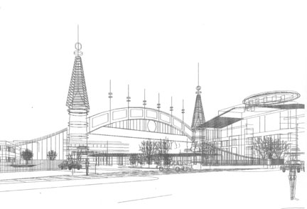
The first
view is a ground level view of the food bar proposed for the base of the water
tower. All drawings are an 8” square format.

The first
wireframe sketch started with the rough CAD model that I used for the aerial
shots (see previous post). The shading provides a vague idea of the space and
structure.

In this
second round sketch I’ve created a much more understandable image. I copied the
CAD model and used the copy to eliminate all parts of the model that couldn’t
be seen from this viewpoint. I then used pastel and pencil to evoke a sunlit
spot.

In the third
pass the viewpoint was adjusted slightly, and the design was developed and
detailed.

After some
minor adjustments this ink line drawing was produced on mylar…

… and color was added with transparent ink applied with an
airbrush.
The second example
is a view of the main entry gate; which was essentially a three dimensional
logo/sign for the Disney property. The design was fairly set, so I expected a
straightforward drawing process, with the viewpoint as the only unknown.

A close view
seen on a diagonal was preferred, but the near tower was cut off. Note the lack of line hiding or shading.
These were quick shots to establish viewpoint.
Here we are
further back, but still at an angle to the gate.

This view is
almost directly in front of the gate.

Finally,
this view, which is slightly off center, was chosen.

Minor design
changes and detailing was added.

Additional
minor details were added, and the confusing hidden lines were eliminated on the
print with white out.

Shade and
shadow was added on a Xerox print with pastel and pencil. At this point I
thought we had an interesting basis for a finished rendering.

Unfortunately,
the design was considered insufficiently “Disney”. A new design was worked up,
and I revised the CAD model. This time a medium close-up view was tried on a
diagonal, so as to include the “Team Disney” building (Michael Graves and the
Seven Dwarves).

A bit of
pastel and pencil helped separate the gate from the background forms.

It was
decided to move the viewpoint back. This would allow a full view of the “Team
Disney” building as well as a better understanding of the undulating fence.

In working
up this pastel and pencil study, I realized that the major challenge would be
separating the gate from the façade of the building behind. Both were rather
complex and “busy” forms, so I was going to have to punch up the gate and grey
out the building.

I decided to
use stippling on the building and solid lines on the gate. It was a rather
tricky business on such a small drawing (about 8” square), but I thought (and
still think) it worked.

The client
never asked for a color rendition of this view, but I later did one for fun. I
softened and lightened the stipple on the far building with sprayed opaque
white paint. Then I airbrushed transparent ink color. The result is pretty
successful, although there is an awful lot of depth and detail in a very small
finished painting. The only discordant bit in the drawing is the perspective of
the “Team Disney” building, which can’t be helped since it is not perpendicular
to the street and the rest of the buildings.
No comments:
Post a Comment