Tuesday, August 30, 2016

Hand & CAD - The Wireframe Years - 4

1990… CAD was in its infancy. Three dimensional modeling of buildings was difficult, but impressive in its results. Wireframe perspective views were regenerated and printed fairly quickly. Hidden line regeneration and printing however, was very slow. It was especially slow on complex buildings.

 In June, desperate for work, I got a call from Rafael Viñoly Associates. They wanted me to work overtime in their offices for two months on the development phase renderings for the Tokyo International Forum (Forum competition blog post). As it happened, the work was more like a continual design development sketch job. I worked with a handful of young architects who were familiar with CAD. I did modeling, generally coordinated the CAD work, and also sketched views to review with Mr. Viñoly. 

The Tokyo International Forum was a very complex building. The hide line process was very slow. It was so slow that we had to model and select views during the day, and run hidden line printing overnight, and even then the process took too long. The final line drawings shown here are the result of multiple renderings which were cut together by hand and photographed to make the final layout.

The images below show the progression of the design and view for each rendering. Each view is taken in turn, with the images shown chronologically; usually starting with a freehand sketch, followed by wireframe views, a value study and a final line drawing. Because of schedule problems the final presentation in all cases was left as a detailed line drawing. I will comment on other aspects as they come up.
_____________________________________________________________


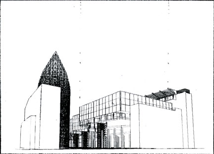
Since the Tokyo International Forum was to be built in the center of a dense urban area, the north side of the building was the only side where you could see the entire building at once. This early view led to the decision to increase the height of the Glass Hall (red revision).


Because of the density of the CAD lines, this quick line sketch was needed to produce…


… this pastel study for a night view.

The final line drawing was not dramatic, but presented lots of detail.
____________________________________________________________


The view from the west was limited by the surrounding buildings…   Because the surrounding buildings were adjacent to the west façade of the Forum, I was limited to…

a close-up entry shot…
or a view down the street.


Since the modeling of this view was so simple, I focused on shade and shadow.


Values were explored in some detail…


But in the end we stayed with a line drawing.
___________________________________________________________


The Forum has a street level plaza separating the Glass Hall from the square blocks housing the auditorium and various theater spaces. I explored the plaza from both the north…


And the south…


With pastel and CAD.


The view from the south was eventually chosen.


It was explored in fascinating shade and shadow…


But again, the line drawing approach was the final.
_____________________________________________________________


The Glass Hall was the jewel in the entire design for the Forum. It was also impossible to visualize without CAD modeling. My preliminary sketch was a poor approximation of this view from the Conference Bar.


The best views that we found didn’t seem worth the trouble…
So this view was dropped, although I made a quick pastel study (above) for the fun of it.
_____________________________________________________________


The next view of the Glass Hall was from a ramp suspended from the glass wall. My sketch was not particularly promising, but…


The various views were quite dynamic.


The wireframe was getting very dense with lines even after hiding lines. To make the view understandable I drew a simplified line sketch over the preferred view (original was 8.5” x 11”).


I then created a value study over the line drawing using pastels.


I studied the complex shade and shadow on a larger print.
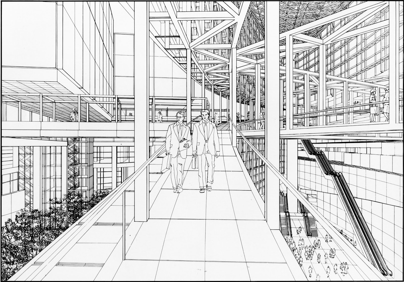

The large line drawing used for the presentation.
______________________________________________________________


Most people experiencing the Glass Hall would enter at ground level, so that view was essential. My first sketch suggested a conventional view, looking horizontally from the far end of the hall so as to see as much of the whole space without creating a distortion in perspective.


After exploring the hall thoroughly in this way it was decided that it might be best to explore the space unconventionally. By looking up instead of across we would see more of the sky bridges and glass roof.


  The resulting views were really exciting, and we quickly chose a view.


 I simplified it into a line sketch…
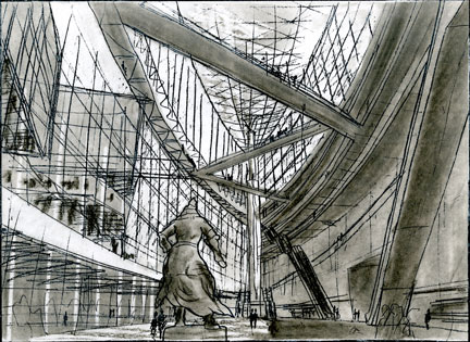

And worked out a value study.
 

I have to admit that the final line drawing is probably more powerful than a complete color rendering would have been. Unfortunately, I don't have a high resolution image of this view.
_____________________________________________________________


The Glass Hall can be experienced from the Exhibition Hall, so a view from there was proposed.


The relationship between the flat conventional space of the exhibition area and the Glass Hall was hard to evaluate…


So I defined the edge of the exhibition ceiling by hand.


 A simplified line drawing was worked over the CAD view…


 And pastel was used to explore the view.


A more detailed study of the shade and shadow followed.


The finished line drawing.
_____________________________________________________________


Another view of the Exhibition Hall from deeper in the space was needed. However, we wanted to catch a glimpse of the curving Glass Hall.


The model here was simpler, and we could use the hide line command to explore the relation to the Glass Hall.


A simplified line sketch added scale and context…


And value was quickly developed.


The final; not so dramatic.
____________________________________________________________


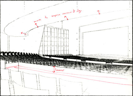
The theaters and auditorium were also being designed while the model was being made. The sketch above is of the “A” auditorium, seating about 5000. I started with a viewpoint looking from the lower seating area.


The seats had to be made in both a simple form and a complex one so as to show the detailed form in the foreground seats, while not slowing down the hide line process with too much detail in the background seats.


We eventually decided to make this rendering a view from the balcony to emphasize the huge space.


A simplified line sketch…


Led to a value study.


The final line rendering
_____________________________________________________________


An additional view of the “A” auditorium was taken from the stage.


A nearly symmetrical view was chosen.


A simple line sketch eliminated the black blobs created by the distant seats.


A dramatic value study looked promising…


But we only had time for the line drawing.
_____________________________________________________________


There were a few other drawings in the presentation, but they are less interesting in terms of the CAD aspects that I want to show here. perhaps later when entourage is the topic.

I realize that all of the above is mere history, and probably holds no interest for young illustrators. But I find it a fascinating view into the transition from hand drawn architecture and the current world of CAD.


Note: I have been busy rearranging my life during the last few months, and thus the dearth of posts. I hope to do better in the future.


Sunday, March 6, 2016

Hand & CAD - The Wireframe Years - 3


I constructed perspectives by hand until I got my first CAD capable computer early in 1990. I started playing during my free time with wireframes and learning the AutoCad system. I very quickly tried to model an Idea I had for the north end of Times Square.

The first hand sketches I did for the project are lost, but the following images show the rest of the process, from the point I started to model in the computer.

As I viewed the model from different angles, I made revisions by hand.

Using a rough wireframe model, it was easy to try on different elements, such as this radiating “crown” cornice.

As the model progressed, I added a little pencil shading to help pick out the massing.

A too small element could be easily resized…

… and checked out from all angles.

As the design finally began to coalesce, I started adding shade and shadow to views.

Adding new ideas…

…and details as I went.

This building was for Times Square, so the jazzier the sign opportunities the better.

Once I’d developed the model as if it were an object seen from afar, I started to look at it from the sidewalks nearby.

Sometimes the wireframe became a swirling mass; beautiful, but less than useful for design purposes.

Since Times Square is surrounded by a dense urban fabric…

…views from other similar buildings…

…and true skyscrapers were needed.

One of the great advantages of computer modeling was that you could easily develop plans and elevations from the model. Above is the conceptual plan sketch (rendered as a computer drawing), with the resulting plan schematic below.

By working out the core, and then placing it into each of the different plan types, you can create a traditional set of tower plans.

Elevations are even easier to produce. Simply take a view from any side, and eliminate the hidden lines.
_____________________

And now for the FUN part.

To create a quick, but powerful presentation, I blocked in the surrounding buildings of Times Square. I then chose a viewpoint that showed the project’s position and “feel” in the urban space.

This is the wireframe view from the north…

…and this is a quick pastel/pencil sketch of that view.

Here we look up from the east side…

…and… drama!

The west side…

…shining in the sun.

More from the east side…

…and the revolving signs.

A wonderful cropped view from the south…

…blew me away when I was finished.

So I made it into a full blown painting (airbrush and brushed acrylic, 18” x 18”).

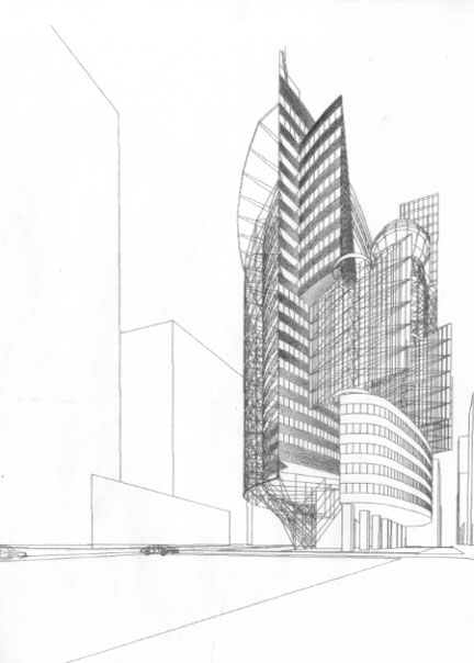
I finish this post with the primary view; street level from across the “square” (from south). This is what you would see walking up Broadway at 42nd street; the whole ensemble from sidewalk to cornice.

Here is my habitual attempt to place the perspective view into the board’s (and building’s) geometry.

And, here’s the pastel and pencil sketch with a suggestion of plans and elevations on the left.

Technical note: On the rendered sketches: I printed (Xerox) the wireframe on a good letter sized bond paper. I then covered the sheet with grey pastel, rubbing it with my finger to create a smooth grey base tone. Next I added darker pastel to pick out the forms, and erased the grey base where I wanted to reveal the white paper, creating a lighter area or a highlight (this also allowed the line drawing to show though the pastel). I finalized the building details with a black Prismacolor pencil. The final drawing was sprayed with fixative to stabilize the pastel.

Saturday, February 27, 2016

Hand & CAD - The Wireframe Years - 2


1989...

Being rather isolated at my small work station in a one bedroom apartment (shared with my pregnant wife and a toddler), I had not heard of the big architectural competition of that year. So it was a surprise when I got the call from Rafael Vignoly Associates (well, not a complete surprise since I had done work for them before).

The competition was the Tokyo International Forum, a large convention center in the center of Tokyo. The design was largely done and the submission date was coming up fast, when I was called. Luckily, they were early adopters of 3D CAD work and had produced a model.
At the very first meeting they showed me a number of views produced from that model; 4 of which looked promising.

The first view was an aerial which gave a very effective idea of the massing. I took the wireframe print and worked it over with black pastel to produce a night view. This is a Xerox of the lost original (8” x 10”), but you can see the dramatic concept: a glowing Japanese lantern set in an elegant assemblage of solid blocks. Unfortunately, being an urban site it was partially masked by the existing foreground buildings. In addition, this view showed a major commuter rail line which emphasized the odd juxtaposition of uses. At any rate, this view was set aside. 

Although this view was not used, the monochromatic rendering with a touch of red accent became the theme of the competition renderings.


The next view was from the same side of the project, but was taken from street level. The major elements of the design are visible, and the plaza running through the site is well represented. Both this and the aerial view were redrawn for the pastel sketch because the dense lines of the printed wireframe would have created areas of featureless black ink; that is, I had to eliminate detail to make the drawing intelligible. 


I went with a night view in the sketch to keep the monochrome theme and to heighten the drama of the glowing curved glass hall on the left. The sketch was produced using pastel on a letter sized bond paper copy.


The final “line” art used the wireframe as the base, but added people, trees, signage and banners to carry the accent color. The result was reproduced on glossy photographic paper (with an extra print in case disaster struck). All rendering was done by masking and airbrushing areas, starting with the largest (the sky), and continuing on to smaller and lighter areas. Most of the spraying was done with black India ink (which gave a warm tone). The red accents and the warm plaza paving were done with colored transparent inks. Reflections and streaking in the street were produced by removing the pigment with various types of erasers.


Since the “Glass Hall” was the focus of the design, both interior views had to include it. The red banners first seen in the aerial view were eventually included in all views so as to clarify the location of each rendering. This pastel sketch was only 8 inches square. The incomplete wireframe image was used with people and trees added by hand. It was a very quick and rough sketch, but it established the major toned areas of the final art.


The final wireframe included more detail than the sketch, although considerable hand drawing was needed before the airbrush work. The basic forms were printed in hidden line mode, but finer detail was added by hand. The banners were pasted over the original, and the trees and people were drawn directly on the print in ink. Again, the sky was masked and sprayed first, while smaller and lighter areas came later. As with the exterior view the final airbrush work was done on a photographic print.


The second interior view shows the exhibition hall (center and right in the view). The “Glass Hall” can be seen on the left. The concept of flowing spaces was nicely illustrated by this view. Again, the 8” x 8” pastel sketch is crude, but enough to establish the general tone areas. 


The final line art, like the first interior view, involved a lot of hand drawing and patching on a detailed wireframe. The result was photographically reproduced on glossy print paper, and then masked and sprayed, working from dark to light. I should note that spraying ink on glossy photographic paper created a very smooth machine-like finish, as long as the surface being sprayed was completely clean. This is why I sprayed the sky first: it needed to be perfectly smooth black, and spraying after applying frisket film or tape tended to leave noticeable imperfections.

Conclusion….

The use of CAD 3D wireframes for this competition allowed the drawings to be produced on very short notice (I think it must have been about a week start to finish). The airbrush work had to be simple and strongly graphic, but developed enough to reveal the three dimensional space. The limitations of the technology helped to direct the direction of the architecture and illustration styles of that time.
It was an interesting, indeed exciting time to be an architect.