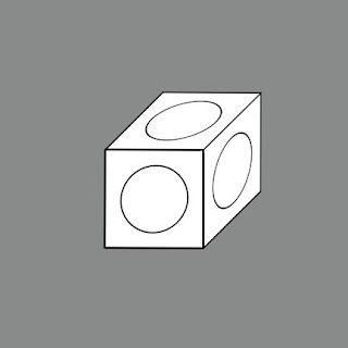
To make an elevation projection you must
first view the world from the side.
No, this is not a trick! I mean it!
Actually, this is the normal viewpoint
of humans. Walk down a street in your neighborhood and you will be confronted
by the sides of houses. The plans may be known or completely unknown, but the
elevations are easy to see. An architect or builder will probably think in 3
dimensions while walking the neighborhood, but a “normal” person will see the
sides of the houses, and react to them first.
Anyway… Start with a square wall with a
circle drawn inside.
Extrude it away from you and…
Voila! A cube!
The main problem in drawing elevation
projections is distortion in a familiar plan.
If a cylinder (standing on end like a
coffee cup) is created using the original cube you will find that…
The circular plan of the cylinder seems
to be stretched into an oval. This can be easily adjusted by eye, but it is
still a problem that limits the use of this drawing type in architecture, and
makes the measurability in plan troublesome.
_____________________________________________
In spite of this, elevation projections
have been used throughout history.
Medieval map makers liked to place
recognizable structures on their otherwise confusing maps. With any luck you
could follow a road and know when you had reached your famous destination (or
not… best to ask directions of the natives at every chance).
Leonardo da Vinci could obviously think
in 3 dimensions, and knew what sort of drawing to use to explain a complex idea.
His multi-stair tower is confusing in plan, but is clear in the projection (in
fact he seems to have revised the basic idea between drawing the plan and the
elevation projection).
Auguste Choisy has already been noted
for his wonderful plan projection drawings. This elevation projection drawing
of the Basilica of Constantine in Rome is from his book L'art de bâtir chez les romans. Although the scale of each
axis (including the receding diagonal one) is the same, the distortion is
minimal.
Rob Krier’s
sketches in Elements of Architecture show elevations plus enough
diagonal depth to have a clear understanding of the 3-dimensional idea. I am
surprised that more architects don’t sketch ideas in this information rich way.
But perhaps Krier’s neo-traditional architecture makes this a logical approach,
while the flattened facades of modern architecture discourage such use.
I’m surprised
that I haven’t found more examples of this technique. Perhaps my library is
less extensive than I thought; or perhaps the design professions prefer other
ways of exploring a three dimensional idea.


This is all quite incredible...please keep it up.
ReplyDeleteI enjoyed reading your blog thanks
ReplyDelete