Being an
architect, and having spent an inordinate amount of time being a professional
purveyor of 3 dimensional illusions, the following post might seem odd…
I just
stumbled across the drawing above in my files. It is from a July 2012 Wall
Street Journal review of a Gustav Klimt exhibit at the Getty Center. It
fascinated me then, and does now; but why? It is simple to the point of being
crude. The face is nearly invisible, and the black clothing dominates without
informing. It isn’t particularly beautiful, or balanced, or even entertaining.
But it still speaks to me.
The answer,
on reflection, is the creative tension between the flat surface and the three
dimensional illusion. Yes, there isn’t much 3 dimension to go with here, but between
the shape of the black dress and hat, and the suggested face, it is a complete
likeness.
Klimt was
quite capable of creating a three dimensional illusion on paper or canvas, but
he was fascinated by the flat, graphic qualities of church icons. The contrast
between stylized illusion and flat sheets of gold foil was a new and exciting
idea in the established (dare I say dull) world of Beaux Arts painting, with
its emphasis on the illusion of three dimensions.
The result (Portrait of Fritza Riedler, 1906) is striking.
It is a realistic portrait, but the overall effect is abstract; like a
designer’s material board with a color photograph of a woman pasted in.
Now, this of
course was not the first time that serious artists had used flat expanses of
color. Rembrandt left many paintings unfinished. His Portrait of the Artist’s
Son Titus leaves the background as a dark scrumb, and rendered the body with a
few brush strokes over an undifferentiated brown base. This however, was not a
revolt against three dimensionality, but a short cut in an artistic experiment.
Pierre de
Valenciennes was a landscape painter of some skill in the late 16th
century. His Villa Farnese - Two Poplar
Trees features a flat blue sky along with flat shapes for the walls of the
villa. But it is an exception to his usual painting style, so I wouldn’t call
him a precursor in any way.
With the
high point of the Beaux-Art influence came the birth of artistic protests. Berthe Morisot With a Bouquet of Violets
by Edouard Manet (1872) is a surprising match for Klimt’s drawing above. The
black of the hat and dress are barely modeled, the background is largely blank,
but the face is realistic. And, the effect is created on purpose.
Self Portrait by James Whistler, at about the same
time, is also flat by design. In this case the painting calls to mind
Rembrandt’s hurried brushwork. The idea was to elicit the sense of reality
while being blatantly two dimensional.
On the other
hand, The Cowboy by Frederick
Remington (1902), is a purposeful use of flat color to set off the well modeled
horse and cowboy. And there are plenty of other paintings by Remington which
use the same trick.
Sargent,
about whom I have already posted, used a similar technique in Reconnoitering (1911).
It was
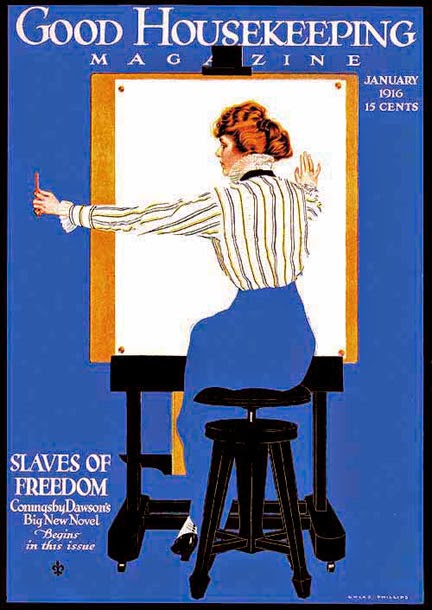
natural that illustrators latched onto the idea of flat color. Reproduction of
color art was in its infancy a hundred years ago, and blocks of solid color
were easier to reproduce. This magazine cover is by Cole Phillips.
And, the
game of optical illusion could catch eyes and sell magazines. This cover is by
Valentine Sandberg.
As with all
stylistic developments (or fashions), Architects copied the look in their
renderings. Frank Lloyd Wright seemingly could not resist a new look; and this
shows in this rendering of Ravine Bluffs Bridge (1915).
Cyril A.Farey was the most famous English architectural illustrator in the early 1900s.
His rendering of the House at Silver End (Thomas S. Tait, architect) combines
the naturally flat tones of a moonlit view with the realistic detail he was otherwise
known for.
I have
occasionally played this game myself. A night view such as that above can
include flat gray skies and dark silhouettes. I never loved oil pastel for
finished renderings, but it works if you want to play around with a vague idea.
A computer
rendering, with its detailed shade, shadow and reflection is often improved
with a little simplicity. The extreme intricacy of this design by Hardy Holzman
Pfieffer was eventually simplified even more by eliminating color entirely.
I have done
quite a few montage boards in my career. Flat expanses of color are perfect
surfaces for adding plans and elevations, even if there is some gradation. In
this board the sky and street provide the background, but a vignette rendering
can have plans or elevations surrounding the building on all sides.
Just as an
unadorned wall is a good foil for ornament, a flat surface can emphasize and
highlight a 3D illusion. In the “old days” I had to rough out the possible shapes
on a pastel sketch, and usually had little time to make a decision. Today, with
computer files you can try out dozens of shapes and colors in no time. Don’t be
afraid to play with it; the results are worth it.
Postscript
(in regard to simple and complex): I attended a performance of the Ensemble
Organum and Christos Chalkias last weekend in the Fuentiduena Chapel, at the Cloisters in New York City.
It was a celebration of Saint Nicholas in Byzantine chants. What struck me was
the contrast between the simple background drone and the extremely complex
chanting of the text. The one without the other would have been boring, but
together they kept my attention. Indeed, there were times when the effect was
mesmerizingly beautiful.


Organic Blankets sale
ReplyDeleteIf you set out to make me think today; mission accomplished! I really like your writing style and how you express your ideas. Thank you.