Sunday, December 29, 2013

Composition part 14 - Silhouette


While at Garden of the Gods in Colorado Springs, I took a snapshot of one of the rock formations. The resulting silhouette was almost as informative as a sunlight photograph and was quite dramatic. An object with a distinctive shape can gain strength when rendered with a silhouette-like technique.


Self Portrait, by Jacek Malczewski, is an unusual and daring use of a near silhouette. The likeness is more difficult to read, but the effect is quite striking.


Riders on the Beach, by Max Liebermann, features a very familiar form which doesn’t need much elaboration to be effective or recognizable.


Flowers in a glass vase, on the other hand, create a more complex silhouette. Izsak Perlmutter took advantage of that complexity, and walked a fine line between reality (in the red flowers) and the competing complexity of the stems, glass and lace curtains. Cyclamen is a masterwork in the still life tradition.


The Charles Bridge, in Prague, has a distinctive look and is adjacent to several buildings that are recognizable in silhouette. I have seen many paintings of the same view, but this one, by Alexandr Onishenko, is perhaps the most dramatic.  


Skylines are often distinctive. Most large cities have groupings of buildings that have become iconic.  This painting of Chicago by Ronald Schatz is one of my favorites.


Amsterdam Bridge Amsterdam NY by Eric Whiting takes the silhouette to an extreme, but without sacrificing the information needed to understand the subject. The combination of abstraction and realism is quite striking.


There are times when you can use a mix of differently toned silhouettes. This house elevation is a nice combination of dark roof silhouette and lighter brick wall silhouette. Even if you were to remove the detailing of windows and doors, you would get a fairly complete sense of the building.


This rendering or the Tom Ling Son Road Mixed Dev by M. Tamada shows a balance of silhouette and detail. Like the portrait by Mr. Malczewski above, it is an effect that can be read both ways. In this case the details show an asymmetric trend, while the silhouette reinforces the formality of the composition.

Silhouettes may seem obvious, but when you are in the scrum of rendering a building it is easy to forget that a silhouette can unify a composition. Toss your unfinished rendering into Photoshop and simplify it with a filter; you might be surprised by the result.


A caveat for all posts on composition.
You don’t want to produce total chaos.
You don’t want to create banal order.
You do want to entice, hint, and suggest.
You want to create mystery, even if the subject appears to be obvious.

 - Composition Part 17 - Value Studies

Friday, November 29, 2013

Composition part 13 - Quick Tips


Although hard-and-fast rules are not the sure path to good composition, there are basic rules that should be remembered. The following are rules that will keep an illustration from becoming static and flat. Practice them until they become second nature­---then proceed to break them.


One-point perspectives should never be allowed to become too symmetrical. Kick the vanishing point to one side so that you see more of one side wall and the horizontal lines are not parallel.


Do the same thing with two-point perspectives, making them somewhat asymmetrical.


Avoid one-point perspectives when making exterior renderings. Rotate a rectilinear building so that it is not being seen on a 45-degree angle.


Adjust the position of a building so that it neither is too centered in general nor has a corner (or distinctive feature) that is too centered.


Don’t crowd the subject building in a too-small frame or let it float untethered in a large frame.

Keep an eye out for perspective distortion at the edges of a proposed view. Remember that distortion is easy to hide in a rural view but will take considerable adjusting to eliminate in an urban project.

And if I haven’t been clear enough about this…
  Rules are suggestions from past experience.
  Rules are only the start of the process of learning.
  Rules can be broken.
  If it looks right, it is right.

And just to inspire a little rule breaking, here is Frank Lloyd Wright and Marion Mahony breaking the rules, brilliantly. Above, the Lexington Terrace Apartments filling the picture frame…

…and the T.P. Hardy House, tucking the house into the top of a long page. The dark horizontal is the crease in the scanned page, but is about where the lake shore is drawn.


A caveat for all posts on composition.
You don’t want to produce total chaos.
You don’t want to create banal order.
You do want to entice, hint, and suggest.
You want to create mystery, even if the subject appears to be obvious.

 - Composition Part 17 - Value Studies

Tuesday, November 19, 2013

Inspiration - Bierstadt & Atmosphere


Albert Bierstadt (1830 – 1902) was an artist associated with the Hudson Valley School. He was a talented student of landscape painting who studied light and nature with a clear albeit romantic eye. He can be melodramatic (I myself have been accused of same), but there is much to admire about and learn from him.


Bierstadt, like Constable, Leonardo da Vinci and others, studied the sky and clouds. His purest sky paintings involve views over a calm sea, as in his Sea and Sky, above.


… or this Beach Scene.


Add a ship to such an atmospheric study, and you have scale and a story that will sell… yes, he had to make a living… duh. I find this painting, Wreck of the Ancon, moving on many levels.


Landscape, combines a sky study with mysterious mountains and a foreground frame to create the quintessential Bierstadt painting.


Bierstadt helpfully reminds me that the sky is simply a rendering of light, which can take almost any color. Sunrise over Forest and Grove spreads the warm light over the landscape creating a unified effect that is surprisingly enjoyable.


Of course, when I think of Bierstadt I think of drama, and Deer at Sunset serves it up in great glowing gobs. I wouldn’t recommend this approach for an architectural illustration (who would even notice the building?), but it is an exciting performance.


Bierstadt is also known for mountains, the natural backdrop for drama and the abode of the gods. Mountain Lake is about as serene as he gets, and is a nice example of the effect of distance on color: the dark colors losing saturation and contrast, while the light colors (the snow) retain a cool strength.


Canadian Rockies Asulkan Glacier is a dynamic composition resembling a stage set. The layers of foreground, middle ground and background establish order, allowing the various textures to work together.


Mountainous Landscape, for me, is a reminder that a spotlit foreground can be the focus of a grandiose scene. Note that the simple flag-like composition of horizontal stripes establishes foundation for the differently scaled landscapes.


One of the most difficult problems for an architectural renderer to solve is how to highlight an urban building that is surrounded by other buildings. The Snow Mountain solves a similar problem by using haze to merge the surrounding mountains, and by lighting the snow-covered peak.


As is obvious from the preceding examples, Bierstadt’s work always explores the play of light on the landscape. His favorite subject is the mountains, but he applies the same genius to woodlands, as in Forest Stream, above…


… or, unusually, to a building. The title of the painting above, Sunlight and Shadow, suggests that he is less interested in the architecture than in the play of light.

Wednesday, October 23, 2013

Composition Part 12 - Thumbnail Sketches


One of the best ways to ensure that your final rendering will have unity and impact is to work it out in a small sketch. If a thumbnail sketch is interesting, than the final rendering should have a strong presence.


The best artists have been sketching ideas throughout their careers; working out ideas on a small scale and in a cheap and quick manner. Da Vinci’s sketch of St. Anne is small and rough, but starts to suggest the pyramidal composition of the final masterpiece. 


Rubin’s sketch for The Birth of Henri IV of France is more detailed, but conveys the serpentine composition clearly.

This sketch for Wolves Attack by Jozef Chelmonski is a wonderful piece of art in itself, but is also a roadmap for the execution of a large painting.


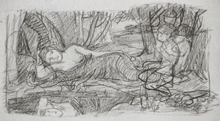
 J. W. Waterhouse gets an amazing amount of feeling in this sketch of a Priestess on a Tripod. His final paintings were often reworked several times on the canvas, so this simple sketch was just the first impression.


Old Man on his Deathbed by Gustav Klimt is another sketch that could pass for a finished painting. In this case it was a study, and not the basis for a larger work.


Simone in a Blue Bonnet by Mary Cassatt is actually a full sized unfinished portrait, but it shows all the characteristics of a sketch.


 Another sketch by Waterhouse, Listening to My Sweet Pipings, presents all the elements of the finished painting without getting involved in any details.


Architects and Architectural Illustrators also sketch to develop a strong design for their work. These sketches can range from the size of a postage stamp to a letter. The medium runs from the simplest pencil doodle to watercolor.


The Dubai Aquamarina by Mohammed Bilbeisi is a fascinating conceptual sketch of a proposed development, suggesting context, trees, people and the hot climate.


Patricia Poundstone’s sketch entitled Fog Ocean Avenue Santa Monica is deceptively simple, while accurately delineating the atmosphere of the place.


Another evocation of place and time is this watercolor sketch, Strawbale House Theoretical by Toshihiro Suwa.


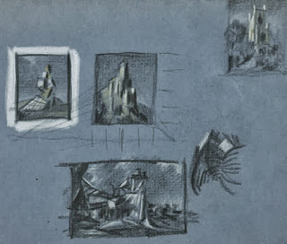
The best advice I can give regarding thumbnail sketching is to simply do it. The following sketches were done at home, in restaurants and at parties. They range from 8” x 10” to postage stamp size, and were done with pencil, felt-tip pen, color pencil and pastel.


Every once in a while a sketch will just turn into an image that can’t be improved on…


This pastel sketch of a proposed interpretive center has been a favorite of mine for years, but I have never been able to enlarge it to my own satisfaction.