Saturday, May 27, 2017

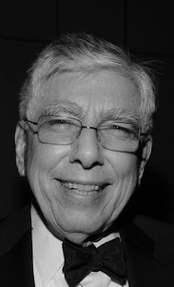
Hugh Hardy


I have been quite busy from the beginning of the year, and so have only now felt able to acknowledge the death of my mentor and friend, Hugh Hardy, on March 17.


The first time I saw Hugh was at a building where his company was vacating a floor, and I was involved in the renovation of that same floor for a new tenant. I found myself in the elevator with him, and was so flustered at being alone with a longtime architectural hero that I stood there tongue-tied. 

That was in 1986. Three years later I had gained some experience doing perspectives for offices where I worked, and I began working as a freelance architectural renderer. Late in 1991 I got a call asking if I had time to work on the Vancouver Library competition. That competition was won by Moshe Safdie, but Hugh liked my work and we got along easily.


I did rendering work for Hugh, as well as his partner Malcolm Holzman, for the next ten years. Although his projects were usually performing arts venues, he was quite capable of designing more prosaic buildings. 


Anyway… 


There are obituaries out there that outline his career better than I can. The following are, instead, a few personal observations.

Hugh was a bright and optimistic man. He always seemed to have a mischievous smile on his face. He was witty, and was always a pleasure to talk to. His intelligence was obvious, but he wore it lightly. He was comfortable with his genius. 

He was one of the few architects I worked for who would step back and evaluate a painting as a whole. He understood the details of a project but knew that the overall impact of a rendering was its ability to seduce from across the room. 

He was an artist-architect though not a petty diva. He designed with the human experience in mind. He did not design personal monuments. He understood the plastic arts yet was sensitive to the function and context of a successful building.


I believe he saw humans as clearly as anyone can but was not depressed or angered by the tragedy of our flawed character. He accepted life’s joys and sadnesses good-naturedly. He combined the smile of reason with the smile of irony.

He was a good man. He will be missed.
Wednesday, January 11, 2017

Hand & CAD - The Wireframe Years - 13


Tokyo International Forum Finals (F)


This is my last post on the final phase presentation for the Tokyo International Forum.


The following images are views that were dropped from the final presentation. They all deal with the Glass Hall or the Plaza, so there was no real lose in understanding from dropping them.


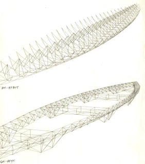
The Glass Hall roof was perhaps the most distinctive feature of the entire design. It was essentially a huge canoe shaped structure, that was rigid enough to “hang” the glass “curtain”. Part of an earthquake-safe structure, it also was a beautiful sculptural form.
Several ideas were explored as the design developed, as shown above.


Above, photos of the resulting form at night.


We tried out views from the bridges over the plaza.


This idea was dropped fairly quickly when it was realized that we would be largely looking at the tops of trees.

A photo of the plaza from the north end. I found few photos from the bridges over the plaza, and, as we expected, they showed more trees than architecture.


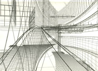
We also tried out quite a number of views from the long ramp built into the curved glass wall.


These images were complex, and needed to be printed and evaluated quickly, so they were not done with the excessively slow hidden line processing.


I drew the major edges on the 8 x 10 print by hand to help us imagine the eventual look.


Although several of these views were promising, we realized that other views were better at revealing the entire space.


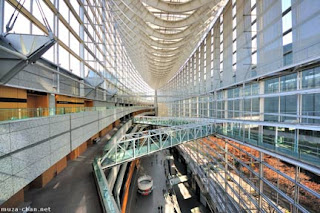
Following are more photos of the existing structure.


They are either shot toward the ramp, or from the curving ramp walkway itself.


 Altogether, an amazing urban space.


Unless I run across a project that I have forgotten, this is the last “Wireframe & Hand Design Process” post. Artistically they are disappointing, but historically they will be quite interesting to reread.


Is there a “moral” to this story? Well… it might be that computers are merely tools. And that without the human touch they lack the…
Human touch?
Yah, I know, old news. But it is worth keeping in mind as you learn how to use new technologies. Anyway, the story goes on with better and better rendering programs, and I’ll get to that eventually.

Tuesday, January 3, 2017

Hand & CAD - The Wireframe Years - 12


Tokyo International Forum Finals (E)


This is the 5th of 6 posts on the Tokyo International Forum final phase presentation work.


I covered the large auditorium in the last post. This post will cover the three smaller halls.


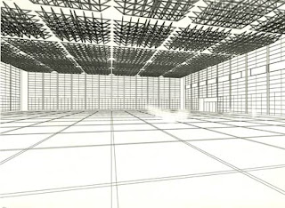
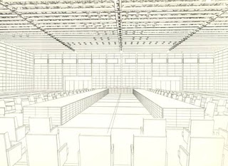
Large reception space (Hall B)
This space was designed to house large meetings, exhibits, ceremonies or fashion shows.


The CAD model of hall B from above.


Preliminary views of the space.


Two different seating layouts.


A sketch-over to direct the hand work.


The final line drawing with screen films applied.


A photo of the space from a similar viewpoint.


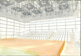
Classical concert (Hall C)
This hall boasts fine acoustics for enjoying concerts, ballets or musicals.


The CAD model.


Preliminary views.


Hidden line view.


With tone sketch.


Final line drawing with people and screen tones. Since the space was symmetrical, we decided to flip the entire image.


A slide photo of the presentation board.


A photo of the space from the stage. I could not find any photos from the audience viewpoint.


Small box theater (Hall D)
This hall was designed as a small but flexible space for nearly any use.


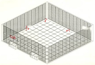
The CAD model.


Potential viewpoints.


The final hidden line rendering, and tone study.


The final line drawing with people and tone.


A slide photo of the presentation board.


A photo of the built space being used for an art installation.


Next: abandoned ideas and drawings, and some interesting photos of the facility.