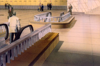
Michael Mehaffy and Nikos A. Salingaros: The Architect Has No Clothes, in Guernica, an on-line magazine of art & politics, analyses the alienation of designers and the society that they serve...
 |
| Empire State Plaza, Albany, NY (wikimedia commons) |
"Have you ever looked at a bizarre building design and wondered, “What were the architects thinking?” Have you looked at a supposedly “ecological” industrial-looking building, and questioned how it could be truly ecological? Or have you simply felt frustrated by a building that made you uncomfortable, or felt anger when a beautiful old building was razed and replaced with a contemporary eyesore? You might be forgiven for thinking “these architects must be blind!” New research shows that in a real sense, you might actually be right."
The authors go on to cite a number of studies that show that architects see the world differently than ordinary people (they call it 'Architectural Myopia'). To any second year architectural student this is obvious (and the parents of said student are seen as kindly but boorish). To any "ordinary" person who has dealt with an architect, it is equally obvious that said architect is interesting and perhaps brilliant, but has a curiously inhuman view of reality.
This is one of those times when "nurture", or the education of a person, makes a profound change that can overwhelm the natural human inclinations. It is also important to note that the most "out there" architects are below the age of 30. Older architects seem to settle back into a design attitude that takes into account the need for architecture to accommodate real people, while keeping an "architectural" sense.
The authors go on to date this Architectural Myopia to the early 1900's, driven by the industrial revolution and the breakdown of the traditional order. "Peter Behrens, the father of corporate branding, was given the challenge of developing the first architectural “branding” for the buildings of the German Electrical Equipment Firm AEG. He did so by using elementary industrial geometries, formed into a romantic and iconic expressive shape. The building itself was now a kind of billboard for the company—an attention-getting new product design in its own right. It was not a coincidence that three of his young colleagues went on to profoundly shape architecture in the 20th Century: Le Corbusier, Ludwig Mies van der Rohe, and Walter Gropius."
I am not sold on their solutions to this problem (community involvement, etc.), but the article certainly nails the problem. Read the whole thing.
 |
| Old New York State Capitol Building, Albany, NY (wikimedia Commons) |
Beauty Now in the Eye of the Algorithm - New image recognition technology judges photographic aesthetics looks at a new computerized way of recognizing "beauty"...
"New technology from Xerox can sort photos not just by their content but also according to their aesthetic qualities, such as which portraits are close-in and well-lit, or which wildlife shots are least cluttered."
This lead paragraph covers the strengths and the limitations of such a program. "Close-in", "well-lit", and "uncluttered" are all good rules to follow in getting a pleasing image. And I'm sure that an algorithm can be created that covers a dozen other rules. This computerized system is especially useful in portraits, where the focus is on a familiar thing, but the "beauty" is in studying the variation in detail.
What is missing here is that humans are drawn to more then a set of rules. Once the rules are established and applied regularly, someone will do the exact opposite, just to stand out. Eventually lots of people will be "rebelling", and you will find a new "style" that is surrounded by its own rules. The new style gets established, new rebels go to work, and the cycle keeps going. The Style magazines of the New York Times are a constant reminder of this never ending rebirth.
As much as I like new technology, I doubt that computers will ever "settle" the definition of beauty. However, using new programs to explore the question sounds like fun.


