 |
| Venus Drawing Room Ceiling, Versailes, by R.A. Houasse |
Look up at the ceiling of any Baroque Church or Palace and
you will see chubby cherubs floating around in a framework of clouds. The other allegorical figures vary, but the cherubs
and clouds are a constant. These
ceilings must have driven the artists crazy because, although the viewer was
looking up, you didn’t want to see only feet and tush, or conversely,
topsy-turvy people. This is not a post
on perspective foreshortening so suffice it to say that figures were oriented
to the walls of the space, while cupids and clouds were allowed more freedom to
float.
This (the clouds, not the cherubs) applies to architectural
rendering in that clouds have different shapes when seen from the side and from
below. The photo above was taken at an
angle of 30 degrees off the horizon. The
clouds at the bottom are near the horizon and the clouds at the top are nearly
overhead. The horizon clouds are, well,
horizontal. The clouds overhead are
freeform shaped.
If you go out to sketch clouds you will get the same effect
as the camera – well, you should if you don’t let the paper and pencil get out
of hand. And to tell the truth, letting
things get out of hand in a sketch is not such a bad idea. After all you are trying to capture a
feeling, not record in high fidelity.
Even the most curious cloud formations are believable when
they conform with perspective reality.
The above clouds are a curious chevron zigzag, but they are perfectly
normal to any viewer. You could almost
locate a couple of vanishing points using the parallel “zigs” and “zags”.
As with any simple perspective grid a “sky grid” can be
constructed with a central vanishing point and an off screen diagonal vanishing
point. One warning I should point out here
is the potential for distortion at the top edge of the grid. This can be easily corrected by shifting the
diagonal vanishing point further out to the side, flattening the squares a bit
more. When dealing with clouds by
themselves this distortion can be ignored – after all, a freeform cotton ball
looks fairly normal whether distorted or not.
In the above photos the building is viewed at such an angle
that the clouds could be any sort of free form without looking out of place
(image at left). Only a set of receding
parallel lines similar to horizon clouds would look unusual, as you can see in
the same building image to the right.
When you are viewing a non-rectilinear object such as a
tree, the orientation of the underlying perspective is less sure and the
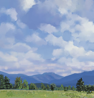
correctness of any specific cloud formation is harder to determine. The photos above are looking up toward the
top of a ridge. The left image suggests
a low ridge because of the flattened clouds which are normally found near the
horizon. The center image suggests a
steeper ridge because the cumulus cloud peaking out between the trees on the
right would normally mean you are looking up at a steeper angle. The right image is rather confusing in that
the clouds suggest that you are looking up at a very high angle.
Following are some renderings and sketches showing various
approaches to high angle skies.
 |
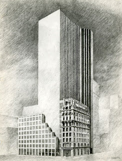
| Century Hotel NYC (detail) |
 |
| Guangzhou Tower Sketch |
 |
| 645 Fifth Avenue, NYC (detail) |
 |
| Petronas Tower Sketch, Kuala Lumpur, Malaysia, (detail) |
 |
| Republic National Bank, NYC (study) |
 |
| Times Square North, NYC (detail) |
 |
| Union Square North, NYC (detail) |
The reverse of looking up is…
…looking down.
The aerial, or bird’s eye view, is essentially a flipped sky
view. And the same perspective grid can
be used as a framework for any aerial layout.
This rendering of Canary Wharf in London is just one of many
aerial views I have completed over the years.
It is unique in that it includes a sliver of sky at the top. The clouds are as flattened as the distant
countryside, which is reasonable since the viewpoint is at an elevation of half
a mile or so.
I will have to write a post on the various problems in
creating aerial perspectives; but that will have to wait for later.


This comment has been removed by the author.
ReplyDelete