Showing posts with label Air brush. Show all posts

Tuesday, August 25, 2020

COLOR DEMONSTRATION


Long ago I created this tiny pastel sketch of a church. I called it “Burning Church” for obvious reasons and filed it away.


Years later I was playing with ideas for “landmarks” along Broadway in New York City, and realized that my “Burning Church” might work on a site at the north end of Manhattan on 170th Street.

In designing the church I ran with a simplified gothic style with a blank base raising the sanctuary above the street level.


I then built an Autocad 3D model and tried out a number of viewpoints. This hidden line view was chosen for the final drawing.


This magic marker sketch gives a preliminary idea of the values I was aiming for.


A base drawing was produced using freehand ink on mylar.


The final drawing was 30” x 40”, so there was plenty of room for detail and texture.


Reproduced above is a color wheel. It shows the full range of colors going around the circumference, with saturation going from the center of the circle (desaturation = grey) to full color saturation at the circle edge. This is fully discussed on the outstanding “Gurney Journey” blog. 


The original “Burning Church” sketch uses a very tight range of yellows and browns marked by the diamond shape of the color wheel. The sketch derives its strength from the limited palette.


The last color sketch above and accompanying color wheel show a complimentary palette ranging from yellow to blue. The combination of color contrast and value contrast makes the tower pop out strongly.


The last color sketch above and color wheel show an orange to grey-green palette. The color contrast is less strong, and the value contrast is created with a tower running from light on dark at the bottom to dark on light at the top. I’ve always loved the red-orange contrast with a grey-green sky; it reminds me of a portrait trick of contrasting warm flesh against a grey-green background.


The two sketches above have low saturation color palettes. Essentially, they are low contrast grey studies with pastel tone here and there.


The strong blue and yellow sketch above is going in the right direction, but seems a little bit too simple.


By adding a graded reddish tint top and bottom I pushed the focus to the center of the tower suggesting a cross composition


The sketch above was done full size with pastel and pencil to study the detailed coloring of the church entry.


 And here is the final art (30” x 40”). Note the darkened foreground and sky which adds to the drama and makes an excellent background for the white line elevations and plans. The final was done with transparent ink airbrushed on a photographic print of the ink line drawing. The title was done with white acrylic applied with (tiny) brushes. The ghosted plans/elevations/sections and quotes were color pencil.


Detail at the bottom of the painting.


Detail at the top.


Tuesday, September 27, 2016

Hand & CAD - The Wireframe Years - 7


This post is a continuation of my look at Cooper Robertson’s design for Disney’s Buena Vista Studios in Hollywood, California (1990). The previous post covered 8 mundanely informative views. This post will cover two of the more interesting views.

The first view is a ground level view of the food bar proposed for the base of the water tower. All drawings are an 8” square format.

The first wireframe sketch started with the rough CAD model that I used for the aerial shots (see previous post). The shading provides a vague idea of the space and structure.


In this second round sketch I’ve created a much more understandable image. I copied the CAD model and used the copy to eliminate all parts of the model that couldn’t be seen from this viewpoint. I then used pastel and pencil to evoke a sunlit spot.


In the third pass the viewpoint was adjusted slightly, and the design was developed and detailed.


After some minor adjustments this ink line drawing was produced on mylar…


… and color was added with transparent ink applied with an airbrush.


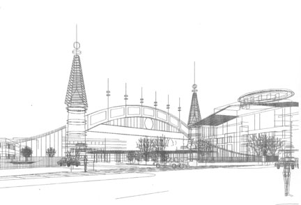
The second example is a view of the main entry gate; which was essentially a three dimensional logo/sign for the Disney property. The design was fairly set, so I expected a straightforward drawing process, with the viewpoint as the only unknown.


A close view seen on a diagonal was preferred, but the near tower was cut off.  Note the lack of line hiding or shading. These were quick shots to establish viewpoint.


Here we are further back, but still at an angle to the gate.


This view is almost directly in front of the gate.


Finally, this view, which is slightly off center, was chosen.


Minor design changes and detailing was added.


Additional minor details were added, and the confusing hidden lines were eliminated on the print with white out.


Shade and shadow was added on a Xerox print with pastel and pencil. At this point I thought we had an interesting basis for a finished rendering.


Unfortunately, the design was considered insufficiently “Disney”. A new design was worked up, and I revised the CAD model. This time a medium close-up view was tried on a diagonal, so as to include the “Team Disney” building (Michael Graves and the Seven Dwarves).


A bit of pastel and pencil helped separate the gate from the background forms.


It was decided to move the viewpoint back. This would allow a full view of the “Team Disney” building as well as a better understanding of the undulating fence.


In working up this pastel and pencil study, I realized that the major challenge would be separating the gate from the façade of the building behind. Both were rather complex and “busy” forms, so I was going to have to punch up the gate and grey out the building.


I decided to use stippling on the building and solid lines on the gate. It was a rather tricky business on such a small drawing (about 8” square), but I thought (and still think) it worked.


The client never asked for a color rendition of this view, but I later did one for fun. I softened and lightened the stipple on the far building with sprayed opaque white paint. Then I airbrushed transparent ink color. The result is pretty successful, although there is an awful lot of depth and detail in a very small finished painting. The only discordant bit in the drawing is the perspective of the “Team Disney” building, which can’t be helped since it is not perpendicular to the street and the rest of the buildings.

Monday, September 26, 2016

Hand & CAD - The Wireframe Years - 6


Late in 1990 I got the chance to work for Cooper Robertson, one of the premier design/planning firms in New York City. They were doing master planning for the Disney Corporation, Buena Vista Studios in Hollywood, and wanted quick but accurate drawings illustrating the plan. 


Following are a sampling of the drawings I produced for the job (A second post immediately following this will present a couple of views that were developed further). Each view was potentially a finished presentation rendering, but several were left at the black and white ink line stage. The development of each view will be in chronological order; that is, wireframe followed by shade & shadow, finished ink drawing, and transparent color. I’ll add comments as seems fit.


The first view is an aerial showing one of the cross streets used by the employees for access, food and recreation. A copy of the main CAD model was made with this viewpoint in mind (eliminating lines not seen), and the unwanted lines that were left were erased by hand with whiteout. 


The expanse of flat studio roofs is pretty bland, but this view does tie together some of the “landmarks” on the site.


Next is what might be called the “ceremonial” axis; an entry plaza just inside the main gate. It was planned with the goal of impressing visitors. I decided to skip the whiteout on the wireframe, and instead let the shade and shadow define the space.


Here we are getting a taste of the plaza by looking over the shoulder of the iconic “Team Disney” building designed by Michael Graves.


It is a nice understanding of the transition between front office in the foreground, and back office in the right distance.


One of the employee entrance gates with a ramp down to a proposed underground garage. 


As you can see from the changes from the previous image, this view became a design tool as it progressed.


Another employee entrance with an underground garage.


I never liked this view; it always looked awkward. 


This is one of the simpler ground level views. The preliminary wireframe is a bit confusing in spite of the pencil shading.


The design changed as I worked up the sketches…


…and developed further as I drew the final.


One advantage of CAD modeling is that you can get a realistic and accurate viewpoint of the project seen from any distance.


This shot was from the Ventura Freeway.


 This is what it looked like driving passed on Buena Vista Street.


This being a planning exercise, the buildings are nearly all generic blocks.


I used an airbrush  to “spatter” the sky and street, so as to define the clouds and the street’s traffic lines.


Walt Disney’s original bungalow is on the site.


And is lovingly preserved.


Note: this is largely a history lesson showing the moment in graphic history between hand drawn renderings and fully rendered computer images. It was a time when CAD computers could produce wireframe layouts, but were not good for computer rendering (that is, they were exceedingly slow and expensive). In addition to its historical value, I’m hoping that it provides some technical perspective to a future computer artist.