Monday, August 6, 2012

Self Portraitstan


My server is on the blink, blocking access to something I was working on.  So I thought I’d dump some desktop images into the blog for fun.  I have occasionally tried drawing or painting portraits, but being shy, I have usually based any work on photographs.  This allows me to work on my own schedule, and be as relaxed and boring as I want.  Self portraits are perfect since the subject is just as shy and boring as I am, eliminating any embarrassment to all concerned.  Also the subject is docile and follows instructions perfectly (and never needs a break until I do).  Smells like teen… whatever.
Normally I would drone on about technique, color and composition, not to mention the need to draw, draw, draw.  But this is for fun, so a line or two will do.
Ink, Xerox & watercolor.  My hair was never that red.
… and this is your self portrait on drugs.  So sad.
First attempt at a real oil portrait.  Thought it was genius at the time, now not so much.
Oil from a photo…  blood from a stone.
No, I didn’t over do it in the tanning solon; it’s just the lighting.  Oh, well…
First chance to try out my Wacom tablet.
Watercolor from a photo.  Overworked as usual.
Isn’t that one of the henchmen in a Bond flick?
The tour guide from hell.
Pensive?  Meditating?  Or, dozing off?
Another Wacom job.  Not bad… for an architect.
That is sunburn on the nose, not a drinking problem.
A fascination with metal and glass; the hobgoblin of all architects.
The Dutch shipwright… or some such fantasy.
This makes me think 19th century.  Maybe Civil War pencil pusher.
Battle of the bulge was the afterthought on this one.
A failed attempt at edge lighting.
All palette knife.  Silly technique if you ask me.
A recent pencil sketch for an upcoming foray into the wild world of…
SELF PORTRAITSTAAAANNNNNN

Friday, August 3, 2012

Sky - Looking Up and Down


Venus Drawing Room Ceiling, Versailes, by R.A. Houasse
Look up at the ceiling of any Baroque Church or Palace and you will see chubby cherubs floating around in a framework of clouds.  The other allegorical figures vary, but the cherubs and clouds are a constant.  These ceilings must have driven the artists crazy because, although the viewer was looking up, you didn’t want to see only feet and tush, or conversely, topsy-turvy people.  This is not a post on perspective foreshortening so suffice it to say that figures were oriented to the walls of the space, while cupids and clouds were allowed more freedom to float.
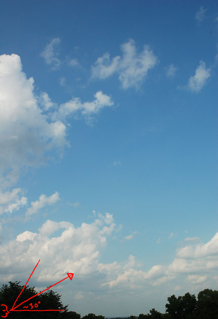
This (the clouds, not the cherubs) applies to architectural rendering in that clouds have different shapes when seen from the side and from below.  The photo above was taken at an angle of 30 degrees off the horizon.  The clouds at the bottom are near the horizon and the clouds at the top are nearly overhead.  The horizon clouds are, well, horizontal.  The clouds overhead are freeform shaped.
If you go out to sketch clouds you will get the same effect as the camera – well, you should if you don’t let the paper and pencil get out of hand.  And to tell the truth, letting things get out of hand in a sketch is not such a bad idea.  After all you are trying to capture a feeling, not record in high fidelity.
Even the most curious cloud formations are believable when they conform with perspective reality.  The above clouds are a curious chevron zigzag, but they are perfectly normal to any viewer.  You could almost locate a couple of vanishing points using the parallel “zigs” and “zags”.
As with any simple perspective grid a “sky grid” can be constructed with a central vanishing point and an off screen diagonal vanishing point.  One warning I should point out here is the potential for distortion at the top edge of the grid.  This can be easily corrected by shifting the diagonal vanishing point further out to the side, flattening the squares a bit more.  When dealing with clouds by themselves this distortion can be ignored – after all, a freeform cotton ball looks fairly normal whether distorted or not.
In the above photos the building is viewed at such an angle that the clouds could be any sort of free form without looking out of place (image at left).  Only a set of receding parallel lines similar to horizon clouds would look unusual, as you can see in the same building image to the right.  
When you are viewing a non-rectilinear object such as a tree, the orientation of the underlying perspective is less sure and the correctness of any specific cloud formation is harder to determine.  The photos above are looking up toward the top of a ridge.  The left image suggests a low ridge because of the flattened clouds which are normally found near the horizon.  The center image suggests a steeper ridge because the cumulus cloud peaking out between the trees on the right would normally mean you are looking up at a steeper angle.  The right image is rather confusing in that the clouds suggest that you are looking up at a very high angle.
Following are some renderings and sketches showing various approaches to high angle skies.
Century Hotel NYC (detail)
Guangzhou Tower Sketch
645 Fifth Avenue, NYC (detail)
Petronas Tower Sketch, Kuala Lumpur, Malaysia, (detail)
Republic National Bank, NYC (study)
Times Square North, NYC (detail)
Union Square North, NYC (detail)

The reverse of looking up is…
…looking down.
The aerial, or bird’s eye view, is essentially a flipped sky view.  And the same perspective grid can be used as a framework for any aerial layout.
This rendering of Canary Wharf in London is just one of many aerial views I have completed over the years.  It is unique in that it includes a sliver of sky at the top.  The clouds are as flattened as the distant countryside, which is reasonable since the viewpoint is at an elevation of half a mile or so.
I will have to write a post on the various problems in creating aerial perspectives; but that will have to wait for later.

Friday, July 27, 2012

Sky Perspective


At first glance this image looks like a rather boring aerial photo of western Kansas.  But the sky is queer, with rectangular clouds.   Actually, the sky is a chunk of land from Google Earth, desaturated, cooled and flipped.  It illustrates the similarity between land and sky in that each follows the rules of perspective, diminishing and flattening as field or cloud approach the horizon.

A one point perspective grid using a diagonal vanishing point can be the basis for any simple landscape view.  Not only clouds, but roads, rivers and ocean waves can be worked out over such a grid.  Actual scale is unnecessary in such a grid; just mark off a horizontal line, connect each mark to a central vanishing point, and a diagonal will mark the receding horizontals at the intersection points.

Of course the grid is simply a general framework to keep the image believable.  Clouds vary in size and shape.  They may be lined up in some orderly manner, or they may be scattered willy-nilly over the sky.  The ocean might have regular waves near the shore, but complex weather conditions can form chaotic waves in mid ocean. 

Undeveloped land is often a Jackson Pollack abstract of meadows, trees, lakes and rivers, which have only a passing acquaintance with a perspective grid; but the grid still rules in perspective.  The balance between rules and free expression is the foundation of our perception of reality, and is also the basis of realistic art.

If you are dealing with natural land and sky forms a strict grid is a waste of time.  The rough perspective that gives any landscape painting a sense of reality can be expressed with simple sketched lines.  The serpentine mirrored lines above suggest a vista without any detail or effort.

A seascape such as the sketch above is essentially a cloud study.  Many artists have sketched clouds, and I long ago promised myself that I would dedicate my retirement years to the subject.  I imagine that the release from hard geometry and finicky detailing will be a return to childhood.

H. F. Farney, an artist of the American Indian, captured the horizontals and acute diagonals of the plains landscape in his Toilers of the Plains.  Note that his clouds compliment and mirror the low sweep of the landscape; a landscape that was quite familiar to me from my early years in the Midwest.

Canaletto is famous for his views of Venice, but it is obvious that he studied the structure and moods of the sky.  The Church of La Salute shows the perspective of flattening clouds at the horizon, as well as towering cumulus and color gradation across the sky.  Canaletto tends to be ridiculously detailed, but also entirely believable and (appropriately for Venice) serene.

John Stobart is a contemporary marine artist and a favorite of mine.  Like Canaletto he creates a perfectly reasonable cloudscape which complements the subject in terms of color, composition and narrative.  His Entrance to the Chicago River Looking West in 1876 is one of innumerable examples of his skill.

This rendering of the Casa Italia at Columbia University gave me no latitude for creativity outside of the sky.  I may have been a bit buzzed when I drew the clouds, because they have a curious abstract relation to a music score.

My rendering of the new town of Celebration in Florida is more conventional in its handling of sky and clouds.  The most interesting aspect is the fading of the sky and clouds compared to the landscape and buildings, an effect that is typical for a sunny day with scattered clouds.  Closer clouds have a certain form and volume to them, while the distance renders them flat and eventually melts them into the haze.

Sunday, July 8, 2012

Truth and Artistic License


A review of the truth, or lack of truth in architectural renderings.

Truth in Advertising...  We are always “spinning.”  Humans tend to exaggerate, massage and forget the past, and the same applies to the way we present ourselves and our work to others.  I once knew a couple who always acted insanely happy with their marriage, children, house, careers… everything.  I later learned that they had all the same trouble and disappointments as the rest of us; they simply “sold” it all as wonderful.  There have been few projects I have worked on that were strictly honest.  The preliminary sketch below was part of a legal presentation to prospective owners, and was truthful in all aspects from the brick color to the placement of streetlights to the typical angle of the afternoon sun.  It is hardly my favorite rendering, but accurate it is.


A typical honest lie is the use of axonometric drawings.  There are times, such as the long street shown below, when a street level perspective simply can’t show the entire space.  An axonometric drawing can present information but at the same time be completely unreal.


Similarly, if something is standing in between you and the object you want to see, an illustrator can eliminate it.  The preliminary sketch of my rendering of I MPei’s Louvre shows the underground architecture by dissolving the foreground plaza.  The glass pyramid is revealed to be a brilliant solution to an old circulation problem, as well as a brash architectural statement.


Interior illustrators have always wrestled with the problem of looking through walls.  This corporate headquarters staircase would have been distorted if I hadn’t backed up through an existing wall.  The outline of the wall opening can be seen in the faint dotted line on the left.

Computer renderings deal with the same interior wall problem by having cutting planes that can be placed in various places in the model.  The lobby below is being viewed from outside the glass curtainwall.  The mullions and glass have been eliminated in the original model.

 
The smaller the space the more distortion you can expect.  Elevator cabs are a special case in that any normal perspective would distort the ceiling or the floor or both.  A computer rendering would have a problem with this, but a hand layout can solve the problem easily by simple using a sliding vanishing point.  If you locate the vanishing point for the ceiling and floor in the drawing below you will find that they don’t correspond, but are slightly shifted vertically so as to lessen the distortion.


Sometimes the client will want to see something which is useful to know, but which is not a real situation.  The color sketch below shows a private terminal at JFK airport.  It is all perfectly accurate, but the silhouette of the Manhattan skyline (just below and left of center) cannot be seen from there.  You would have to level parts of Brooklyn and Queens to have a line of sight, and even then it would be smaller.  However, for people unfamiliar with New York City the silhouette provides a useful landmark to orient themselves and the terminal.


Finally, there is the problem of glass, and how much you can see of an interior during daylight.  The answer in the real world is “not much”.  In the layout below you can see that I wished away the glass (and some of the structure) so as to see straight through the building.  In the photo of the finished building you can see into the building, but it is at dusk, when the artificial light can challenge the dying daylight. 


Viewers of an illustration will go far to believe an interesting story, and will forgive much fudging to experience more of a building than is normally possible.  It is a delicate balance which becomes easier as you experience and observe the different buildings, materials and lighting.  An old artist friend once said to me, “if it’s right but looks wrong it’s wrong, and if it’s wrong but looks right, it’s right”.  My own motto is “establish the facts first, then lie and manipulate as needed.”  Or more delicately stated, “get out the old Artistic License”.