__________________________________________________
Most renderings of architectural projects are done on a tight schedule. The building is modelled, the view chosen, and the composition of the image settled with a quick sketch.
With more time you can rethink the composition at every step of the process. The following project demonstrates this process.

In my ongoing “hobby” of designing new “landmark” buildings along Broadway in New York City, I came upon a fine site facing north toward Straus Park, a small landscaped triangle at the intersection of Broadway, West End Avenue and 106th Street.

The most notable feature of the park is a bronze 1913 statue of a pensive nymph that commemorates the deaths of Isidor Straus and his wife, Ida, who perished together aboard the “Titanic.”

In designing a high-rise for this site, I decided to play with a setback tower in the Art Deco style of that era. I worked out a rectilinear plan set onto the trapezium-shaped site with the rest of the block a pocket park. A geometry of circles and arcs informed the setback locations.


Both elevations above (E/W & N/S) were developed from geometric forms reflecting the plan geometry.

Above, a massing block from the early AutoCad block model.


Above is a series of preliminary perspective sketches of the principal viewpoint.


The four views above are AutoCad viewpoints from 106th Street (looking east and looking west), from Broadway looking north, and from West End Avenue looking north. I did not expect to find a “money shot” for the final art in these views, but it is best to explore all the angles if you have the time.

Above, a “worm’s eye” view (for the fun of it).


Above are three possible views looking south across Straus Park. The first seemed too flat, the second too distorted, but the third felt just right (hat tip to Goldilocks and the Three Bears).
With a range of views available, I decided to create value studies in pastel of a number of them.


Although several of these pastel studies worked for me, the last had the drama that I favor.

Above, a hidden line perspective view of the complete model.


The same view rendered in different styles in Accurender.


Above, top, the preferred hidden line view with context and greyed reflection. Above, bottom, a pastel sketch over line print. Just to see what a straight rendering might look like in a double square format.
It is fun playing with a single image that has lots of compositional possibilities….
But wait, there’s more!
I often paint a multi-image “composite” board when I design something for fun. Most of the time it is of a high-rise on a vertical oriented board: pretty straightforward.

This time I thought I’d try a vertical building on a horizontal board.
In balancing multiple images on a single board, composition can be rather complicated. The focus is sometimes lost, and balancing the various secondary images gets tricky. On a horizontal board the vertical building is even more likely to be lost.
Below is a series of pastel sketches showing the main drawing which will fill the final board and function as background for all other drawings. Each variation uses a different geometry to explore the shift to a “composite” board.


The first three variations didn’t have enough space for all the secondary drawings I wanted to include, and the last image was just too expansive. In desperation I roughed out an idea which included trees in Straus Square to the left, and the corner of a building that would show up in the right foreground.

Rough as this was, it seemed a good direction to explore, and I worked it up in AutoCad, Accurender, and finally Photoshop. The sequence of permutations below ends with the final art.

This raw Accurender image places the line drawn elevation of the building entry on the right.

Here the trees and sky are Photoshop layers to facilitate adjustments and change.

The building plans/elevations are creating a frame at the bottom and left edges.

Shade and shadow have been added to the building entry elevation on the right, and the building geometry lines are floating before the central image (green lines).
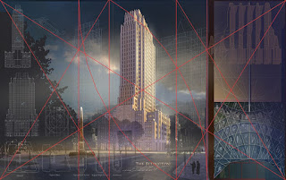
The line drawn plans/elevations are desaturated and faded. An after-rain mist is on the street, and the elevation of the building top is now in the upper right corner. A golden section based board geometry in red is layered on the image.

The same image as before, but with a different board geometry in red. Note that the perspective image at the center of the board has black line detailing that helps it stand apart from the rest of the board images.
________________________________________________________________________

Here is the final art. As you can see, the secondary drawings have been uniformly faded into the background while remaining legible. Meanwhile, the central image has been strengthened with color saturation and value contrast.
I was and still am satisfied with it, but there were probably a dozen other approaches that would have been as good.
Again, the use of golden section or any other compositional geometry is a tool, nothing more and nothing less. Training your eye to see (and then hide) patterns, as well as simple repetitive sketching, is more important.
Other posts on composition can be found:
- Composition Part 1 - Architectural Illustration
- Composition Part 2 - The Golden Section & other crutches
- Composition Part 3 - Dark Spot
- Composition Part 4 - Light Spot
- Composition Part 5 - The Cross
- Composition Part 6 - The Pyramid
- Composition Part 7 - Circle
- Composition Part 8 - Diagonal
- Composition Part 9 - "L" Frame
- Composition Part 2 - The Golden Section & other crutches
- Composition Part 3 - Dark Spot
- Composition Part 4 - Light Spot
- Composition Part 5 - The Cross
- Composition Part 6 - The Pyramid
- Composition Part 7 - Circle
- Composition Part 8 - Diagonal
- Composition Part 9 - "L" Frame


