Thursday, December 31, 2015

Hand & CAD - The Wireframe Years - 1


Columbus Circle, Steamboat Springs & the Queens Museum.


When computers began to be used in architectural offices, they were unstable and relatively primitive. I lived through that period of frustration, elation and work-a-rounds.  This is just one of a number of posts I want to write about it – partly, just to leave a record of the work, but mainly as an example of mixing the digital with the hand.

In the early 1980s 3D computer modeling was not an option in architectural offices. Just buying a computer with the requisite memory and graphics was way too expensive. But in 1985 the office in which I worked bought an early CAD computer and a very early version of AutoCad, which was used for Building Department submission drawings. Simple diagramatic drawings were created, with much computer crashing and gnashing of teeth.  The simplest 3D modeling was a faint glimmer in the recesses of that early software.  


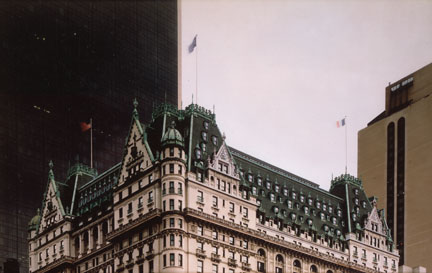
The layout above was done for the Columbus Circle Competition in 1985. The red curves show where I used a print out of circles in perspective from that early CAD computer. Without those print outs, the semicircular façade of the proposed building would have been a frustrating job of sketching and re-sketching. With a large plot of these curves the layout was not much harder than a run-of-the-mill hand layout.


In 1987 I bought my own CAD computer, and played with it whenever I could find the time. I spent my nights working on small rendering jobs, and very occasionally I found that I could use the (at that time) primitive AutoCad program to help speed my work. The sketch above mixed a photo of an existing building with a CAD view of rotated cubes and some hand layout work.


This interior view of the same job used a crude wireframe of the ceiling and floor (now lost), and hand layout work. The computer made the curved lattice and joints easy. In both drawings the paste-up layout was made uniform by redrawing it using ink on mylar.


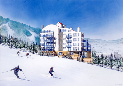
Another project that used complex curves was a ski resort condominium in Steamboat Springs. In general, the building could have been worked out via hand or computer, but the ski-slope-like roof posed a problem.


By limiting the model to the visible walls I only needed to construct a few 3D “faces” for balconies and railings. I worked out shade and shadow on a letter sized printout, and used that as the center of a hand drawn setting in the ski resort area.


A pencil sketch of the final was Xeroxed and worked over with pastel…


…and a more finished sketch was tried over the ink final.


The final art was finished with airbrushed transparent ink on a photographic copy of the ink drawing.

___________________


Early in 1989 I had the chance to do a rendering of the renovation of the Queens Museum, on the site of the many World’s Fairs that were hosted by New York City.  Built for the 1939 Fair, and used as the home of the United Nations from 1946 to 1950, the museum is now a venue for arts and educational programs, as well as being the permanent location for the “Panorama of the City of New York”. 


The renovation architect was Rafael Vignoly, who has since gone on to much bigger projects. It happened that he had organized a small 3D CAD group in his office, and they produced the wireframe that I used. You can see the actual wireframe lines (created on a “pin printer”) to the right of the pastel sketch.


Another pastel and pencil sketch exploring a brighter approach. The lines of the building in the reflecting pool were created by copying the building as a “block”, and placing the copy upside down directly below the building itself. The plaza layers were turned off, and a print made of the museum and its mirror below. It was then cut into the rest of the image, producing a “reflection” in the water of the pool. 


The final layout was printed full size, and then reproduced on photographic paper. I airbrushed opaque white over the entire image to grey out the black lines. Then I masked and airbrushed each area with black India ink, starting with the sky. Streaked areas in the reflecting pool were produced by erasing back the airbrushed ink (a technique that worked well with some inks, but not with others).


Next: the Tokyo International Forum.

Friday, December 4, 2015

Pre Photoshop Retouching


Before Photoshop there was photo retouching or “airbrushing” (named for the best tool for retouching photos). Photography was an expensive and iffy business, and expert artists did “post-production” by hand, cleaning up the mistakes which showed up in the darkroom. Blemishes had to be removed from centerfolds, backgrounds had to be cleaned up, and commissars had to be, ahhh, liquidated.


I never did photo retouching for a living, but there were a few architectural rendering jobs that ended up being just that. I was once approached to paint a couple of preliminary views of a hotel to be built on Broadway just north of Times Square. The client needed a night view of illuminated signs, and it seemed impossible to do it on their tight budget. However, they had a couple night photos of the site, and I suggested that I paint the new building into the photographs, saving the time and effort needed to create the context. Since the point was to illustrate generic signage (this WAS Times Square after all), the details could be fudged. 

In the first view the existing signs and the time-lapsed streak of car lights was a perfect context for a quick approximation of the new building’s sign covered façade. The building on the far left was under construction, and no signage could be suggested (it being another client/architect with a different approach, and an aggressive lawyer); thus it became a dark and dull frame to the hotel signage.


The second photo was less satisfying. Little of the existing Times Square signage was visible, and the street activity on the left was blocked in the photo by a truck. The streaking car lights of the first photo are here less exciting and distinct. Nevertheless, I blocked in the new hotel with as much realism as I could, using the preliminary design. The dull building from the first view is here part of the background to the glowing hotel.


Another opportunity to “airbrush” arrived when Hardy Holtzman Pfieffer took on the renovation of the famous Plaza Hotel in New York City (1907 photo above). The idea was to open up usable space under the huge mansard roof while simplifying the roof line. New windows had to be added, ugly roof structures eliminated, and ornamental elements that had been removed had to be replaced. At the same time the historic effect of the hotel could not change.


The original photo shows a deteriorating roof with unsightly penthouse structures poking out. Many of the original ornaments are gone, and the overall effect is less than it could be.


The retouched photo can hardly be distinguished from the original, which was a plus in presentations to  the Landmarks Preservation Commission.  On closer inspection one is rewarded with a feeling of renewal and completion. 


This detail of the old Plaza can be compared to…

… this same detail of the proposed new Plaza. 


The next time I was faced with a retouch architectural job some years later, I had Photoshop on my computer. I will be posting actual demonstrations from those days sometime in the future.

Saturday, October 31, 2015

Graphical Parallel Projection & the Endless Modern "New"


I expect that someone following this blog has wondered why I’m wasting my time exploring graphical projections. They are not central to professional rendering. They are certainly not in the mainstream of architectural illustration. Graphical projection is not what springs to mind when you think about selling a design: it isn’t very dramatic or emotional; in fact it is a rather cold, abstract technique.

But, I don’t think you can understand the modern movement of architecture without understanding graphical projections; and understanding the modern movement has been on my mind for a long time; and is what I’m after right now.

Back in the hay-day of Beaux Arts building, architects used orthographic drawings (plans, sections and elevations) rendered in shade and shadow. They avoided graphical projection drawing. If a three dimensional view was necessary, a perspective was created. Even a simple diagram such as this vault study from Joseph Gwilt's Civil Architecture (1825) was drawn in perspective!


I have previously reviewed the “questioning” era of perspective drawing that occurred about a hundred years ago.  The perfect reflection of reality in art and architecture upheld by Renaissance thinking became mixed with a modern need to blur and re-imagine the drawn reality of linear perspective. My last post shows examples of the extreme edge of that trend. But, why did we opt for confusion? Has society gone mad? Are the “taste makers” crazy? Is it confusion, or is it simply a different view of reality? I would guess that it is not madness (or some subtle mass hysteria) or uncontrolled confusion; it is too long running for any of those things to be the cause. The reality is that people do whatever they need to do to survive and gain power and pleasure. 


So why did it happen, and why did it happen when it did (the decades following 1900)? “When” is the key. It happened as the industrial revolution became wide spread in Europe and America. 

So what is the connection between the industrial revolution and the rejection of classical beauty?


Note: Society was changing in many ways at this time (long running stability and peace in western countries, a high point of humanism, a jump in population density, the rise of mass media, etc.). I’m taking the industrial revolution as the primary mover, even though other factors must be involved in the process.


The Carpet Bazaar in Cairo by Charles Robertson 1887

Technological Change = Cultural Change
The industrial revolution changed the way luxury goods were produced. Previously, a highly trained craftsman took several weeks or months to produce a highly ornamented object (like a fork, a portrait or a clock). With factory mass production and machine precision, the same object could be produced with equal quality at a fraction of the cost. This revolution brought cheap, high quality goods within reach of the average family. You might think that this would have been seen by all as an unalloyed good, but you would be wrong.

Rug Making Machine

The flood of cheap goods did not eliminate wealth inequality; there were still very rich people – the elite. This was not new; what was new was that the elite still needed to “show” that they were richer, or at least “different” from the mass of people. But how do you do that when everyone can afford traditional luxuries?  

Young Lady with Her Maid by Aimee Brune

Sumptuary Law
This was a “social” problem. The elite have always needed ways to signal their superiority to the average citizen. This usually took the form of expensive clothes and jewelry which were beyond the budget of the poor, and were often forbidden by law to the middle classes. The “royal purple” was reserved for the emperors of Rome by law, and sumptuary laws were meant to keep the nouveau-riche of medieval Europe from showing up the nobility.

But if expense and law could not hold the “class” line in the newly democratic order, how could the elite distinguish themselves from the rabble?

Elizabethan Fashions

The Endless New
The answer that developed in the late 19th and early 20th century was to create new fads, new styles, and new “languages” of criticism. This sounds like a conspiracy theory, but really, who doesn’t like a new fad? And, what young person doesn’t love to create slang to get around the stogy rules of their parents? All it took was a natural loosening of traditional norms. The elite trend-setters just had to stop supporting the old order, and the fashionable new would do the rest.

Hemline Lengths in the 20th Century

The establishment of good universal education in this same period, allowed some in the lower classes to move up and emulate their “betters” with fashionable mansions and fine clothes. But this only advanced a few. The greater threat to elite “marking” was the free market system. Any schmoe with brains, guts and drive (and a bit of luck) could make it into the upper middle class, complete with BMW and suburban McMansion. Not a big deal; the nouveau riche have been around for a long time – eventually becoming “old money”. The problem is that even the poor in the U.S. have cars, flat-screen TVs, and iPhones. Not only can everyone pretend to be someone, but anyone can record it all in “selfie” style!


So, the super rich created through their patronage, a whole industry of “new”. An army of artists, critics, curators, flaks and hangers-on who’s only business was producing new art, fashions, and ideas on a yearly, monthly, even daily basis. If necessary they would keep coming up with new things at a pace that an overworked middle class Joe would find hard to keep up with. Above all, they were tasked with promoting anything that contradicted what the plebs held dear; just to make it less likely for Joe Schmoe to mimic his “betters”.

The Scorners of Vanity Fair by Henry C. Selous 1844


Interestingly, with the spread of cheap technology and the internet, huge numbers of people are getting in on the production and consumption of “new”. Blog writing, podcasting, Facebook celebrity and Twitter stardom are available to everyone. It is still the upper strata of celebrity, power and money that steer the cultural flow of all this, but the control is not absolute.

Shooting the Rapids by Arthur Heming 1938

In the end we are left with a culture careening off into the nihilistic future. It seems to be all fluff and spray and momentary “memes”, but, like a drug or an ear-worm, you can’t get it out of your head. I’m afraid that the unseriousness of it all will lead to collapse when the surrounding physical reality comes back (I’m talking violence, war, disease, starvation, chaos, etc.). After all, someone has to keep the lights on and the water running.

The Four Horsemen of the Apocalypse by Benjamin West 1796

…but even that apocalyptic image looks like a cool superhero flick.


OK, OK…
And this led to the popularity of graphical projection drawing?

Well, yes!

Architects began illustrating their “machines for living” using “anti-traditional” techniques. The result could often be striking and beautiful, but the human element was lost in the love of the machine.

Analytic Drawing by Peter Eisenman


“Machine for Living”; what a curiously cold phrase! If it had been coined by a scientist I might be grimly unsurprised, but, being suggested by a thoroughly artistic artist (Corbusier), it seems appalling. 


Philip Larkin said that all art “is inextricably bound up with giving pleasure,” and although human pleasure is a wide category (including novelty), it doesn’t usually include pain and confusion.

Three Studies for a Self Portrait by Francis Bacon

But are we using art to replace the lost sense of mystery in life? Is art now merely a riddle, used to entertain people who live in too safe (and boring) a society? An emotional/visual roller coaster of the mind; exciting as the abyss, but safely theoretical.


“And if thou gaze long into an abyss, the abyss will also gaze into thee." – Nietzsche


Symptoms of Love by Daniel Libeskind 1981

And...


In case you were thinking the same thing...


Isn’t it easy to fake complexity and mystery? A stain on a wall can look like the Virgin Mary. A Rorschach test image can look like a butterfly.


Has the combination of “art as riddle”, obfuscating critics, undemanding collectors, mercenary investors, and an “anything new” cultural milieu, made the modern movement(s) dry and fruitless (not to mention ugly).


Don’t ask me; I haven’t a clue.
We may (or may not) know in another decade or so.