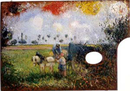
I browse through books and web sites about art a lot.
No… no social life to speak of.
But seriously, I love to pick out and collect images that
are memorable. It is a gut reaction thing,
but afterwards I like to try to analyze the source of my “like”. For instance, the image above, Fra Burmeister og Wain’s Foundry by Peder
Severin Kreyer, immediately caught my eye.
Before I knew what it was illustrating or had registered the color, lighting
or perspective, I needed to keep it.
–Why?
You can’t talk about composition without talking about
proportion. And you can’t talk about
proportion without talking about the “golden section”. And the golden section fits quite nicely into
Kreyer’s painting.
The golden section (or golden mean, golden ratio, divine
proportion or simply the Greek letter phi) can be easily constructed, and by
constructing it you define it. Essentially
you are creating a rectangle (or other mathematical form) with a ratio of 1 to 1.6180339. Geometrically, it is the ratio which
describes the Logarithmic Spiral,
which keeps the same shape no matter how large it grows.
This can approximate a spiral, and is the ratio found in a
pentagram. It is closely tied to mathematics
(the Fibonacci sequence) and is found in nature to varying degrees, such as
flower petals and the spiral patterns in pine cones and sunflowers. In fact people have been “seeing” the golden
section in just about everything since the Renaissance. In mathematics the ratio is exact and
elegant, but nature is fickle, and variation in natural examples of the golden
section is the norm.
So, is great art always a reflection of the golden section?
Sort of…
Kinda…
Close…
Possibly…
Hmmm….now that I wasn’t expecting from Picasso…
But really, as a measure of beauty the golden section need not
be exact.
In fact I would say that a too
exact match to the golden section or to any proportional
system is always boring.
And there ARE
other measures of beauty out there.
The Romans regularized and added to the Greek “orders”, but
their actual construction relied on circles, squares and rectangles.
From the Greeks to the Romans to the medieval architects,
regular geometric shapes were used to produce order. The Catholic Church added the equilateral
triangle, while the Renaissance brought all their rediscovered and invented
ideas to bear on visual art in a very overt, one might say overbearing way.
Le Corbusier developed his Modulor system around the golden
section in the 1920’s. It is elegant,
but like the Renaissance theories, could lead to a certain feeling of grotesque
scale and repetition.
Leon Krier developed his proportional system in the 80’s. It was another system that is very attractive
to the designer, but leaves an unsettled taste in the plebian mouth.
So… Does any of this
matter?
I think it does, but only as examples leading toward a general
truth. All of the systems (and there
are many more than I have mentioned above) are ways of relating the work of art
to human scale and human nature. Human
scale is more related to architecture, and I’ll ignore it here. Human nature however is central to creating
beauty or rather, getting the attention of people.
Humans seem to have a preference for images that have
balance, derived from our love of healthy (symmetrical) human faces. We also have a preference for images that
simulate the dynamic complexity of the real world. The golden section seems to fulfill the need
for both preferences: it is essentially a matter of dynamic balance. However, people have one other quirk you
should keep in mind; they are fickle.
People like lots of things – but the order of preference
changes depending on what you have experienced before. They like order and symmetry, but too much symmetry is boring. They prefer a balance between extremes, but
even “balance” can get old, and imbalance and chaos can become stylish. Beauty cannot be perfect, the unique must
have a touch of the familiar, and the new must reflect the old in some way. Too
much beauty, uniqueness or newness is bad, even though people are naturally
drawn to the beautiful, the unique and the new.
Applying this to composition, the “gravity” of human nature
always pulls things back to the center.
In any painting there is a balance of interest, which is reflected in
the golden section. But it can be
simplified by imagining a center of gravity on the picture plane; the points of
interest may be scattered, but they average out somewhere around the middle of
the picture.
A novice illustrator should try to compose with focus points
in mind. A more advanced artist should
simply keep in mind the principle of balance.
A master illustrator will be tempted to break all the rules, and may
succeed brilliantly. But even the master
artist must keep in mind that the viewer is human, and that it won’t work if he
is zigging while the rest of society is zagging.
A few years ago I showed one of my favorite renderings to a
fellow illustrator. I placed a golden
section on the painting to show how well it fit classical perfection. He nodded, and then asked me if I had had the
section in mind when I had constructed the painting.
I laughed, and said “No”.
A caveat for all posts on composition.
You don’t
want to produce total chaos.
You don’t
want to create banal order.
You do want
to entice, hint, and suggest.
You want to
create mystery, even if the subject appears to be obvious.
- Composition Part 17 - Value Studies