Dynamic Diagonal
The slope of mountains
The shape of sailing ships
The sweep of the Nike “swoosh”
But buildings are usually rectilinear; the cross is a more
architectural pattern… Yes?
Actually, no.
Look down your street.
The tops of the buildings recede into the distance at an angle, a
diagonal. The urban environment is chock
full of diagonals: streets running into the distance, sky scrapers receding
into the sky, roofs angling up like mountain slopes.
But let’s rewind everything here. Diagonals have been found
in compositions for centuries. The diagonal line suggests movement or
perspective. In this regard it is a conflicted pattern; movement is obviously
dynamic, but perspective is the orderly reality of the built environment. The subject of the painting or rendering sets
the tone.
Madame Raymond de
Verninac (above) by Jacques-Louis David mates the diagonal with Hogarth’s
curved “Line of Beauty”, creating a calm, designed look. The lady is not about
to zoom out of the picture frame.
Self Portrait with
palette in hand and wife Martha by Viggo Johansen utilizes the diagonal as
a hidden line on which to hang the faces (and noted palette) of the double
portrait. As with any of the composition patterns, hiding the actual shape is a
good idea.
The painting of Jockeys
in the rain by Edgar Degas uses the diagonal specifically to enhance the
sense of speed and space. It suggests the starting line and the receding
perspective of the race track.
Frederic Remington uses the diagonal shoreline in Moonlight Wolf to counter the centered
subject. The jagged edge of the diagonal gives the scene a certain eerie sense
of foreboding and danger.
Piz Bernina,
Switzerland by Albert Bierstadt, is well balanced and convincing in spite of
the stark abstract quality. The diagonal of the dark foreground is almost as
geometric as a ship’s signal flag, but works as a foil to the brilliant
abstract of the snow covered peaks.
Sticking with the “uplifting” theme, this mountain view by
Edward Theodore Compton marries the typical diagonal with the subtle
atmospherics that I remember from my misspent youth.
This photograph of Grand Central Terminal in New York City
is a perfect example of a static scene creating a dynamic feeling through
perspective. Without the sunbeams, the view would produce a refined, almost
sedate convergence, but with the addition of the angled sunbeams the
perspective becomes an unstoppable march of power.
A similar approach to an image is this rendering by Hugh
Ferriss of a long line of pylons in sharp perspective. It is the Permanent
World Capitol at Flushing Meadow Park in New York City; and if you never heard
of it, you’re not alone.
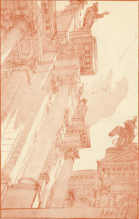
Otto Rieth was a German architect and photographer of the
late 19th century. His ink and wash sketch uses an unusual
perspective to create a curious composition; partly diagonal, partly ‘L’ frame,
all “sturm und drang”.
My small oil sketch of sculpture over a building entry uses
the natural shadow to suggest a line dividing the painting into two equal
triangles.
This architectural rendering of a Residential Building on Logan
Circle by Kai & Ming Hu illustrates the normal streetscape diagonal.
This enticing watercolor of Shindagha in Dubai, UAE by
Michael Reardon uses the perspective diagonals to establish a counterweight to
the detail on the right. The repetition of wedge shapes makes it a fascinating
image.
Michael Reardon also created this aerial of the Officers
Club at Abu Dhabi. He strings a series of sculpted buildings onto a diagonal
seashore. As with his Shindagha rendering, the repetition of shapes, in this
case crescents, makes the image especially interesting.
This unusual “worms-eye” view of the Mabarak Center in
Lahore by Jaroslaw Bieda invites the imagination to wander into fantasy, while
the details bring you back to reality. I see a close-up of a human eye myself.
The linear patterns of our transportation infrastructure
will always show up as a diagonal sweep across an image. This pencil sketch of
the Taipei Pop Music Center Competition by Anthony Grand nests a strong
diagonal into a complex matrix of angular lines.
With diagonals scattered all about the man-made world,
finding the pattern is easy. The trick is to disguise the angle with the busy
detail also found in human construction.
A caveat for all posts on composition.
You don’t
want to produce total chaos.
You don’t
want to create banal order.
You do want
to entice, hint, and suggest.
You want to
create mystery, even if the subject appears to be obvious.
- Composition Part 1 - Architectural Illustration
- Composition Part 2 - The Golden Section & other crutches
- Composition Part 3 - Dark Spot
- Composition Part 4 - Light Spot
- Composition Part 5 - The Cross
- Composition Part 6 - The Pyramid
- Composition Part 7 - Circle
- Composition Part 9 - "L" Frame
- Composition Part 17 - Value Studies
- Composition Part 2 - The Golden Section & other crutches
- Composition Part 3 - Dark Spot
- Composition Part 4 - Light Spot
- Composition Part 5 - The Cross
- Composition Part 6 - The Pyramid
- Composition Part 7 - Circle
- Composition Part 9 - "L" Frame


No comments:
Post a Comment