About a
hundred years ago the Beaux Art movement was at its height. Practically all
architects were either trained or influenced by the process and style of the
French school. Typically, designs were presented in plan, elevation and section,
drawn in ink with watercolor rendering of shade and shadow. These drawings were
at best austerely impressive, but at worst dull and repetitive.

About a
hundred years ago the Beaux Art conventions were being revised and stretched, questioned
and ignored. One of the architects trained in the Beaux Art tradition, but
willing to try something entirely new was Hugh Ferriss. Born in St. Louis in
1889, Ferriss became an architect as the first era of skyscrapers was coming of
age. Louis Sullivan’s Auditorium Building (considered the first tall building
which developed its aesthetic from its height) was opened the year that Ferriss
was born. 1913 saw the completion of the Woolworth Building, in New York City,
by Cass Gilbert, the architect whose office Ferriss joined in 1912.
Ferriss’s
genius lay in delineating architecture, and he became the first freelance
architectural renderer in 1915. His early renderings present an extreme
contrast to the conventional Beaux Art elevation, being perspective views
rendered in strong but loose black and white, using pencil, pen and charcoal.
His Wanamaker's Bridge from 1917 (above)
shows his ability to create a strong graphic composition while giving a sense
of depth using the simplest methods.
Mist, Union Square, taken from The Architectural Review magazine of 1918 shows his penchant for
drama, even at the price of limited detail. The Beaux Art authorities would
have been appalled at the fuzziness, but it fit right into the artistic sensibilities
of the time.
His Interior, House of the Forest of Lebanon
presages the approach he preferred during the rest of his career: dramatic, focused,
powerful and emotional.
By his
mid-thirties Ferriss was extremely busy with large projects; he was well
regarded by architects, and internationally famous. His ability to mesh
architecture and art gave him a unique place in the building industry.
His work
space in midtown Manhattan (above) seems more an artist’s studio than an
architect’s office. The size of the renderings are a curious hold-over from the
Beaux Art tradition, but the strongly abstract quality of them is completely in
line with the artistic bent of the time.

The above
images show the stages of a typical rendering by Ferriss (from Drafting Room Practice by Eugene Clute,
1928). The first stage is a detailed layout of the Bush House in London (at the
end of the street), and a rough layout of the streetscape and the foreground
traffic. The second image shows a general defining of the forms by establishing
values throughout. The third image shows the final rendering with the various
tonal areas detailed. The rendering was produced with carbon pencil on a fairly
smooth drawing board. As you can see he drew and erased as needed to get the
needed effect. Beaux Art rendering was a matter of adding transparent
watercolor layers over each other, which is a totally different process when
compared to Ferriss’s technique.

This pencil
sketch of Madison Square Garden was produced before the building’s demolition
in 1925, but includes all of the major aspects of a typical Ferriss rendering
over the next 25 years. Most notable are the use of value to establish
foreground and background, and the transition of a “light on dark” building
base, to a “dark on light” contrast at the towers top.
Although
Ferriss’s renderings appear to be rough and impressionistic, you can see from
the detailed layout above that he started from a realistic and precise
beginning. The rendering is a view of the Philosophy Tower in his imaginary “Metropolis
of Tomorrow” project produced in 1929.
Another image
from the “Metropolis” project is the Business Center which suggests in its
façade treatment Rockefeller Center, which was built over the next ten years.
Above is
another series of drawings showing the stages of a Ferriss rendering which
appeared in the Encyclopedia Britannica. In this example he limits the layout
to the general forms, and works up the tonal composition before completing the
image with more detail. This approach resembles the gouache opaque renderings
that became popular in the 50’s, in that it was largely additive, and had to
work out additional detail as the work progressed.

The series of
images above are Ferriss’s iconic development of the physical possibilities of
the 1922 zoning laws for New York City. The top image shows the building mass
following the exact letter of the law with a vertical street wall rising to a
point and then sloping off at a specific angle. The second stage shows notching
of the building mass so as to admit natural light into the building. The third
stage reduces the angles to terraced setbacks which conform to normal
construction and usable interior spaces. The last image at the bottom eliminates
the unusable volumes and simplifies the multiple setbacks into more
conventionally buildable forms.
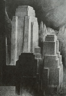
Another
theoretical drawing is “The Four Stages” which imagines that the four “stages” presented
in the previous “zoning law series” are seen in a single view. The early forms
using the “letter of the Law” approach are seen in the distance, while the
nearest building illustrates the final, realistic forms. Even in this
“technical” composite Ferriss elicites a sense of drama and depth.
Concurrent
with all these theoretical projects, Ferriss was producing paid renderings for
prominent projects. One rendering that I have always loved is the Convocation
Tower designed by Goodhue in 1924. The rendering focuses on both the base street
scene and the top pinnacle, while letting the mid section dissolve into the
background. This is both reflective of the design itself, and creates a sense
of mystery; a recognition that we are dealing with a concrete object, and a
thing that inspires awe.
This image of
the Chicago Tribune Tower, by Howells & Hood was produced as the building
was being constructed, and was not the competition rendering of 1922. It uses a
dark foreground mass to give depth, and suggests a bright street lighting that
almost eliminates the perception of details at the base of the building.
The Los
Angeles City Hall, by Parkinson, Austin & Martin is a beautiful sculptural
landmark even 85 years after its completion. Ferriss’s rendering gives it a
setting more in tune with his New York sensibilities: dark and dramatic. Still,
it is one of Ferriss’s more interesting compositions.
The Chanin
Building by Sloan&Robertson (1929) is a straightforward skyscraper modeled
after the 1922 zoning laws. Ferriss’s rendering seems scattered, but does
emphasize the complex of setbacks in an abstract way. In a way it is true to
its date of execution, being an overdramatic example of the “roaring 20’s”,
which came to a halt in that same year.
Ferriss did
relatively few aerial perspectives. This one is for the “Metropolis of
Tomorrow” project, and shows the relationship of the “centers” which he envisioned.
Note his use (even at this scale) of the shadowed foreground to give depth.
The Chicago
Board of Trade building by Holabird & Root (1930) is closer to a framed
elevation than a perspective, due to the limited viewpoints in downtown
Chicago. It works in spite of the strict symmetry.
William Van
Alen’s Chrysler Building has been an iconic skyscraper for over 80 years.
Ferriss’s rendering from 1930, stretches credulity to the limit by making the
base white (in spite of the light direction), allowing the top to read
(correctly) as a near silhouette against the rising sun.
The Bank of
the Manhattan Company Building is one of many towers that have defined the
style of downtown Manhattan for decades. This rendering uses all the old tricks
to highlight the drama and scale of the building. It is worthwhile to compare
the very similar view and building type rendered by John Wenrich at about the
same time.
The Master
Building (above) is one of the few Ferriss renderings that create his signature
contrast switching without resort to artificial lighting or curious sky
conditions. The peaceful night snowfall provides all the contrast needed for the
dark base and the brighter top to gently make themselves known.
Ferriss’s
technique and sensibilities seem to work best with monumental stone or concrete
forms. So it is unsurprising that his rendering of the Hoover Dam is dramatic
and abstract, in its depiction of the unusual geometry. If an alien race were
to build in large, bold, opaque volumes, Ferriss would be able to capture the
essence of those strange beings and their works.
In 1946 the neoclassical
Metropolitan Museum of Art (originally built in 1880) was renovated. Although
Ferriss revolted from such Beaux Art fashions, he captures the grand, heroic
atmosphere of large scale construction perfectly in his sketch.
Ferriss
worked best with large scale exterior projects. The Daily News Building Lobby is
one of the few successful interiors he created. The success is largely due to
the unusual and dramatic design that Raymond Hood brought to the space. The
light coming from below the globe is tailor-made for his sense of visual
emotion.
With the
dominance of the Bauhaus’s modern style of architecture, Ferriss began to meet
a built reality that was not congenial to his technique. The reflective
surfaces of the Eastern Airlines Building (1939) simply do not have the
necessary crispness when reproduced with the soft pencil and charcoal favored
by Ferriss.
This
rendering of the Lever House (1952), is about as close as Ferriss got to his
iconic night drama renderings of the 20’s and 30’s. It does the job, but the
dissolved forms and spindly structure do not seem substantial enough to support
the emotions of his usual work. This illustrates a truth that I recognized
years ago; that one rendering technique cannot encompass all types of
architecture. Some buildings are best rendered in pencil or watercolor, while
others demand the high contrast and deep values of a digital rendering.
Although a
thoroughly modern design, the proposal for the Permanent World Capitol at
Flushing Meadow Park NYC provided Ferriss with the masses of masonry that he preferred
to record. Indeed, I consider this to be one of his most successful renderings.
Ferriss is
certainly not forgotten. The highest prize in architectural rendering is the
Hugh Ferriss Memorial Prize given out each year. This year, the American
Society of Architectural Perspectivists used Ferriss’s rendering of the Pacific
Telephone & Telegraph Co Building as a competition invitation. It is not
his best work, but it certainly illustrates his giant influence on the graphic
representation of architecture.
The published
work used in this post:


