Humans have
been drawing and painting for thousands of years. Making two dimensional art
look like three dimensions has been in the mix nearly as long. Indeed, seeing a
three dimensional object popping out of a flat surface is still a bit magical.
There are many
artistic tricks to help simulate three dimensions. Ancient cultures placed
objects, animals and people at different heights on the surface to denote
distance. Figures were made larger or smaller to show importance or position. Sometimes
the shading and contrast would be varied suggesting distance. However, the
strongest way to create the illusion of depth on a flat surface was, and still
is, the use of perspective.
One of the
more interesting aspects of human development from nomadic hunters to settled
farmers and urban dwellers is the shift from round dwellings to rectilinear
dwellings. We don’t know what early humans were thinking, and sometimes the
shift was inconsistent (the Pantheon) and retrograde (Roman camp to medieval
town), but we did go from round to square. And, the more organized and urban
the society, the more square it got.
This isn’t a
post on anthropology (or architectural history), so suffice it to say that once
buildings were rectilinear people started to see that the edges of one façade
went one way, while the edges and joints around the corner went another. That’s
not scientific, but it is something that was noticed by artists, and utilized
in their work. The Romans and the ancient Chinese practiced an approximate form
of perspective (see: One Point Perspective History)
As usual,
the leading research into systematic perspective drawing slowly filtered down
to the average artisans. Brunelleschi’s famous 1413 demonstration in Florence
took some time to make an impact beyond the elites of that city. For instance, Leon
Battista Alberti’s book On Painting
(1435; twenty years after Brunelleschi) was written in Latin for the highly
educated Florentines, and the original was not even illustrated!
Looking at finished paintings through
history is one way to trace the development of perspective. Fra Angelico’s 1433
The Deposition from the Cross (detail
shown here) is definitely “one-pointish” in the foreground, but shuffling
toward a rough two point in the back. It was painted while he was at the
convent at Fiesole, in the hills above Florence. Being close to, but not in
Florence might explain the inconsistent perspective (20 years after
Brunelleschi’s demonstration). The clouds that look like grapes on a plate
don’t help, but it’s a valiant attempt nevertheless.
Another book about perspective was De Prospectiva Pingendi (On Perspective
for Painting), by Piero Della Francesca.
Being born near Florence and being related to a noble family of the area, Piero
was familiar with the work of Brunelleschi and Alberti. His book was written
between 1474 and 1482 (about 65 years after Brunelleschi, and again, in Latin!),
but was unpublished until 1899! The fresco painting above (attributed to Piero)
is called Architectures d'une Cite Ideale,
it was painted for the Duke of Urbino, Federico da Montefeltro. The fresco is an
idealized city constructed using an exact linear perspective. Everything is on
a rectangular grid except the central round building, and no people, animals or
trees are to be seen.
The invention of linear perspective
encouraged freehand perspective sketching of imaginary structures. Leonardo Da
Vinci’s notebooks are filled with inventions and buildings drawn in rough perspective.
The top illustration is a plan for an underground canal in a town, while the
lower one is an ingenious use of a waterwheel to power fountains in a
loggia. He also illustrated De Divina Proportione by Luca Bartolomeo de Pacioli
(1498), which includes a section on perspective.
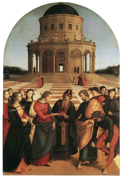
Raphael doesn’t have any excuse for not
understanding perspective, being the son of a painter at the Urbino court and a
wonderkind in Rome. His 1504 painting, Marriage
of the Virgin is an example of the best methods at that time. It reads as a
realistic one point construction in the plaza paving, but uses multiple
vanishing points to model the building behind. Not my favorite artist or
painting, but an early (well, maybe not so early) tour-de-force of perspective.
This cut away
perspective sketch of Saint Peter's in Rome, by Baldassare Peruzzi, is a great
example of the complexity that an accomplished artist/architect. Dated 1530, it
makes one wonder at the slow progress made in perspective drawing among artists
and architects in a fairly small region! Here is an interesting analysis of Peruzzi’s
drawing.
In 1545 one of the most influential
books on architecture was published. Sebastiano Serlio’s The Five Books of Architecture included instructions for producing
perspective drawings, and illustrated examples. The top illustration (above) is
of an arched passage, the middle illustration shows a simple staircase, and the
last shows a spiral stair. The only mistake I can find is in the basic geometry
of the spiral stair: a cord drawn across equal segments of a circle is not
divided equally. The illustrations shown are in the English addition, which was
not published until1611.
Francesco Borromini was a well known
architect of the Roman Baroque period. His perspective sketch of the Oratorio
of Saint Filippo Neri in Rome is an intriguing freehand rendering of an
extremely complex façade.
This grid, showing the diagonal relationship
between one point and two point perspective, is from Vredeman de Vries 1604
book, Perspective. Northern Europe is
finally publishing a rational system only (!) 190 years after Brunelleschi, and
seven years before Serlio’s English edition.
This painting titled Interior of the New Church at Delft, by
Gerard Houckgeest from 1651, shows the perspective system applied to a church
interior. The three vanishing points (similar to the diagram by de Vries) are
shown in red. By showing too much of the church on the right, Houckgeest is
creating distortion that confuses the reading of the painting. To begin with, the
square floor tiles at far right and left are obviously stretched. Worse than
that, the three columns at the center of the painting are the south half of 6
columns delineating the end of the semi-circular church choir. In other words
you have mind-bending distortion (a semi-circle looking like a square corner)
hiding in this gorgeous painting.
Giovanni Battista Piranesi was born near Venice, but spent most of his life in Rome.
He created his famous Prisons etchings
from 1745 to 1761. The earlier ones are rough sketches, and are important in
that they show the working of a mind/hand that has completely internalized the
system of linear perspective. He seems to have had a vision of vast threatening
spaces, and drawn it in a way that made the vision a real place. The image
above is the preliminary sketch for plate XI.
In the 17th and 18th
century warships were designed using plans, elevations and large models. This
perspective section of an English warship from 1680 is therefore quite unique.
The artist, Edmund Dummer, Surveyor of the English Navy, must have gone nuts
trying to work out the warped surfaces found in such an object.
The German architect Peter Speeth (1772 – 1831) is not known now, but was a leading
populizer of Neo-Renaissance architecture in his time. His drawing, Anleitungsblatt zur Perspektive Konstruktion from 1827 is
interesting in revealing the working lines of a perspective layout.
The 1800s were not particularly known
for using perspectives in the design of buildilngs, but they were known for published
illustrations of proposed designs. These engraved perspectives were
disseminated in books, pamphlets, magazines and newspapers. Anonymous artisans
would take rough sketches and plans, and produce detailed perspective images. Claude-Nicolas
Ledoux and Karl Friedrich Schinkel
became famous through the publishing of their œuvre in this manner. This is not to say
that perspective was a perfected art. The ink wash drawiang above, a palace scene for an unknown opera by an Anonymous set
designer, is rather crude.
Interestingly, the 1800s produced many
general handbooks for architects, but the teaching of perspective was
apparently not a high priority. Neither my 1867 Encyclopedia of Architecture by Joseph Gwilt, nor the 1896 A History of Architecture by Banister
Fletcher, have any explanation of perspective, though they both have occasional
perspective drawings. The L'école des Beaux-Arts in Paris taught the skill, but actual
perspective drawings are hard to find in my “Concours d’Architecture” books
from the turn of the century.
This drawing, Truro Cathedral Competition entry by Richard P Pullan (1880), is a
nice example of a design being worked out in perspective. On close examination
you can see freehand revisions to elements throughout the building.
The Kidder-Parker
Handbook of 1884 is a practical “how-to” for architects and builders, but
includes this page comparing perspective projection, and orthographic
projection.
I include this intricate drawing of the Rathaus in Augsburg,
Germany, by Theodor Fischer, to suggest the level of expertise that was reached
by the end of the 1800s.
Fischer was also an accomplished illustrator. His Denkmal am Meer (1888) exemplifies a
tradition of fantasy sketching in the mode of Piranesi. Otto Rieth, a German architect and contemporary of Fischer,
also did fantasy sketches (he should get a separate post sometime).
In spite of the emphasis on rendered elevations, perspective
layout continued to be taught at the L'école des Beaux-Arts and
elsewhere. This 1892 view of a cloister and well is by Auguste Perret who
taught there.
I always find it fascinating to see the process that
talented architects use to develop a design. This study of a column capitol for
the Guaranty Building is by Louis Sullivan (1895).
Joseph Buhlmann was a German architect who specialized in
historic reconstruction. His Buhnendekoration
fur Kunstlerfest In Arkadien, is unfinished, and shows some of the working
lines he used in the layout.
The following series of drawings are from Traite Perspective Lineaire by J. J.
Pillet (1901). It is an extremely complicated paper on perspective, and is
crumbling in my hand as I scan it. The technique is applied to quite a few
problems, and I include 8 of them just to show the high point of perspective as
a “science”.
This symmetrical vaulted chamber is worked out entirely from
a string of horizontal and vertical dimensions noted in the middle distance.
This column base is developed from the small plan/elevation
shown above it (the detailed notations don’t seem to be shown on the
plan/elevation).
The same approach applied to a column capitol.
A cross developed in the same way as the vaulted chamber
above.
A section of floor tile using a trick eliminating the need
for a vanishing point far to the right.
Another tile pattern created sans vanishing points.
A curved pillar from a small plan/elevation (more detail
here showing the transfer of information).
A simple entry stair made from a perpective plan below, and
a small elevation at upper left.
Pillet also includes a few isometric drawings, which were
very useful in civil engineering at the time. The pinnacle of such measurable
drawings was, and still it Auguste Choisy.
Traite Perspective
Lineaire ends with examples of layouts developed
into rendered illustrations.
I have to admit that I am often more impressed with the
layouts than the final drawing.
Above, Kurhaus
Wiesbaden, section perspective by Friedrich von Thiersch (1903). Another
example of the masterful level of perspective drawing at this time.
Perspective was used by architects exploring modern design
ideas, perhaps because it suggested a reality in a project that was never going
to be built. This 1914 drawing from Cite
Industrielle by Tony Garnier, is a precursor of the full throated rebellion
which gained popularity during the interwar years.
A Manual of
Engineering Drawing by Thomas E. French
(1911), included a section on perspective layout.
This erecting diagram (a “how to assemble in the field” plan)
for the B E 2C aircraft, produced by the Royal Aircraft Factory during World
War One, explains the interacting parts of the assembled airplane.
Above, an elevation and perspective sketch of the Cathedral of New Delhi by Sir Edwin
Lutyens (1917); another example of perspective sketching as a vehicle of design
ideas.
This preliminary sketch of a cottage by Arthur L. Guptill
shows that perspective by 1920, had become a tool for even small domestic projects.
Arthur Guptill included a section on “Perspective
Considerations in Sketching” in Rendering
in Pencil (1922).
Alvo Auat was a designer/illustrator who specialized in architectural
fantasies at this time. He is largely forgotten now, but I have a copy of his
book Architectural Visions.
Perspective seems to be the preferred technique of architects with imagined
designs.
Finally, here is a diagram in The Study of Architectural Design by John F. Harbeson (1927). It is
a simple explanation of the various vanishing points (and “vanishing traces”)
found in a simple house shape. No detailed notation. No complex shapes. No
shade and shadow. Just the basic idea of linear perspective.
At this point (the “Roaring Twenties”) perspective had
become a well known technique, used in architecture, engineering, illustration,
and the decorative arts. In a word, it had become “old hat”. It was the old
world; and the late 20s being on the eve of the Great Depression, World War
Two, and the modern world, “old” is (or will be soon) OUT!
Perspective layouts continued to be used, but more and more
often the rules were broken by the avant garde, and, just as quickly, petrified
by the new order. The cycle of destruction and creation, which had moved at a
glacial pace 500 years ago, was now beginning to run at a dizzying speed.
With apologies to Cole Porter…
Once was
architects followed their muse,
Used perspective imagining views…
But now, God knows,
Anything goes.