Showing posts with label Detail vs Suggestion. Show all posts

Monday, August 5, 2019

Inspiration - Schell Lewis


I happened on an old Harvard Magazine (March April 2009) yesterday while sorting out moving boxes in the attic. (No, I’m not Ivy, my son is). It had an article on the Supreme Court with a rendering of the Supreme Court building in Washington. The rendering was by Schell Lewis, an excellent but now forgotten architectural delineator.


It struck a chord with me. First, it was sad that such a talented artist was now completely forgotten. And second, it reminded me that I had gathered images for a blog post on him; a post that was filed away when I found so little biographical information.

Since I’m more interested in the art than the artist, I’ve decided to post what little I’ve got.


According to the 1920 census, Schell Lewis was born about 1887 in Moline, Illinois (I found a site suggesting that he was born in 1875, but that seems improbable). By 1920 he became known for his skill in architectural delineation. He worked in the office of Charles A. Platt for years, but by the late 1920s he was doing professional renderings for other architects. He was active into his 60s, with little evidence of age. The latest image I could find was from 1960.

The following is from Pencil Points magazine, vol. 2, 1921
“Though Mr. Schell Lewis has made many excellent perspective drawings and sketches he has not specialized in rendering… His charcoal drawings, made as a means of studying the designs in the office and not as presentation drawings, convey the character of the designs admirably and are done with great facility.
Mr. Lewis was born in Moline, Ill., but his family removed to New York when he was a youth. After acquiring the rudiments of drafting he entered an architect’s office in New York. Then, after a few attempts, he secured a place in the office of Mr. Charles A. Platt, in whose organization he has been continuously excepting six months with the U. S. Shipping Board and six month with Trowbridge & Ackerman.
All of Mr. Lewis’ work shows an appreciation of architectural character as well as a knowledge of architectural design.”


I first saw Lewis’s work in Drafting Room Practice by Eugene Clute (Pencil Points Press 1928). I found an old copy in a used book store years ago. There was no biographical information, but they reproduced a number of wonderful architectural detail studies done in charcoal.


The only other story I found concerning Lewis’s work is in The President as Architect: Franklin D. Roosevelt's Top Cottage, By John G. Waite Associates, Architects. In 1938 President Roosevelt sketched out the design for a “cottage” on his Hyde Park property north of New York City. Lewis, who did regular work for Henry J. Toombs, FDR’s favorite architect, was brought on to do a couple pencil renderings for a publicity brochure. Being a “traditional” renderer familiar with traditional architecture, he fit in perfectly with FDR’s love of the old country style of building.


Here are a few additional images which show something of Lewis’s rendering process. His preliminary sketches are nice examples of value studies produced by all artists of the time. The preliminary working out the light and dark areas ensures an image that presents the subject in a pleasing way. See my post on Gustave DorĂ© for more of the same, as well as all of my posts on composition.

Prelim sketch for Cadet Barracks at U S Military Academy
Finished rendering of Cadet Barracks at U S Military Academy

Prelim study for an aerial view of a Church

Prelim sketch for a rendering of a Church

Finished rendering of a Church

Unfinished Prelim study for a Church
______________________________


The following images are all of the Schell Lewis renderings that I could find on the internet. They are arranged in roughly chronological order. Comments are included as I felt the need.

1088 Park Avenue New York City, 1924

This and the next 6 renderings are nice examples of subtle value manipulation used to enliven otherwise dull forms.

Apartment Block in New York City, 1926

Proposed Development at Warm Springs, Georgia, 1926

111 John Street, New York City, 1927

15 East 39th Street New York City, 1928

1441 Broadway, New York City, 1929

Bronx County Jail, New York City, 1931
_________________________

Proposed Chapel at Kent School, Kent, Connecticut  1929

The image above was the only interior rendering that I found.

Georgia Building, 1933

Chapin School in New York City, 1935

The following 4 renderings are from the 1939 World’s Fair, held in New York City. Both Hugh Ferriss and John Wenrich did illustrations for the fair.

Court of the States Building, Inner court collonnade & tower

Court of the States Building, Inner court

Court of the States Building, Spanish grouping

Court of the States Building, West court
___________________________

Band Building, 1947
Mallory Gymnasium, Rhodes College, 1949

Toronto City Hall proposal, 1955

Trezevant Hall, Rhodes College, 1959

Moore Moore Infirmary, Rhodes College, 1960

Proposal for Mahan Hall at West Point, 1967

Lewis seems to have preferred pencil throughout his career, but was clearly a master of ink as well, as shown in the last two images I found. The first is copied from the internet and is very low resolution. The second image (noted simply as "brick house") is scanned from Arthur L. Guptill's classic Rendering in Pen and Ink, and is detailed enough to show both the overall composition and the satisfying details.

Burrow Library, Rhodes College, 1951


So, what do I take away from all this?
Schell Lewis is inspiring because he blends the large, conceptual view with the rendering of crisp detail. “Fine” artists can often get away with a broad-brush splash of emotion or symbolism (the rest is commentary). Architects, on the other hand, are usually obsessed with the details: “God is in the details”. But both scales of view are necessary.
The architectural illustrator must needs do both. Yet, it is unusual to find someone who can mix the two extremes so seamlessly as Schell Lewis did.


Monday, May 27, 2019

Learning from Traditional Painting

The Connoisseur by Henry Herbert La Thangue 1887
An artist’s brushwork is a fascinating personal marker to collectors of traditional paintings. The size and character of the brush strokes, create an underlying pattern in a painting which is interesting to see up close. As an architect and self-taught illustrator, this was not something I had considered until it was pointed out to me by I.M. Pei. 

Following are examples from traditional painting that show unification via texture and brush strokes (click on image for enlargement).

Dew-Drenched Furze by John Everett Millais has a rather obsessive texture which is appropriate in depicting vegetation. The fairly narrow value range is suggestive of wallpaper. And yet, I find it mesmerizing.

Autumn Afternoon by Frederick McCubbin is an impressionist sketch that uses the rough brush strokes as a baseline. I don’t think that the painting would have been as successful if any element had been detailed and finished. 

Many of the artists from the turn of the century (that is, last century) were focused on treating the surface of the painting as an artistic thing itself. Creating a recognizable image while highlighting the blobs of paint produces an enjoyable tension in the viewer’s mind. Surf and Rocks by Frederick Childe Hassam (1906) is a clear example of that approach.

The simple use of rough painting surface can give a certain unity on its own. The canvas tooth of Summer Sunshine by Gyula Agghazy shows this. The fabric grid is hard to see, but it permeates the entire image.

Most of these examples are of limited use to architectural illustration because a client wants to see in detail what he is buying with his millions. Even so, a good renderer can choose a media or support paper that allows both detail and texture. 
Opus Headquarters by D.E. Jamieson 1999

Canary Wharf by Steve Oles 1985

Aeon - The Architecture of Time pg. 4
 by L. Woods 1982

Still, it is a lesson that I gratefully learned.

Tuesday, December 9, 2014

The Fabulous Flat


Being an architect, and having spent an inordinate amount of time being a professional purveyor of 3 dimensional illusions, the following post might seem odd…


I just stumbled across the drawing above in my files. It is from a July 2012 Wall Street Journal review of a Gustav Klimt exhibit at the Getty Center. It fascinated me then, and does now; but why? It is simple to the point of being crude. The face is nearly invisible, and the black clothing dominates without informing. It isn’t particularly beautiful, or balanced, or even entertaining. But it still speaks to me.
The answer, on reflection, is the creative tension between the flat surface and the three dimensional illusion. Yes, there isn’t much 3 dimension to go with here, but between the shape of the black dress and hat, and the suggested face, it is a complete likeness.


Klimt was quite capable of creating a three dimensional illusion on paper or canvas, but he was fascinated by the flat, graphic qualities of church icons. The contrast between stylized illusion and flat sheets of gold foil was a new and exciting idea in the established (dare I say dull) world of Beaux Arts painting, with its emphasis on the illusion of three dimensions. 


The result (Portrait of Fritza Riedler, 1906) is striking. It is a realistic portrait, but the overall effect is abstract; like a designer’s material board with a color photograph of a woman pasted in.  


Now, this of course was not the first time that serious artists had used flat expanses of color. Rembrandt left many paintings unfinished. His Portrait of the Artist’s Son Titus leaves the background as a dark scrumb, and rendered the body with a few brush strokes over an undifferentiated brown base. This however, was not a revolt against three dimensionality, but a short cut in an artistic experiment.  


Pierre de Valenciennes was a landscape painter of some skill in the late 16th century. His Villa Farnese - Two Poplar Trees features a flat blue sky along with flat shapes for the walls of the villa. But it is an exception to his usual painting style, so I wouldn’t call him a precursor in any way.


With the high point of the Beaux-Art influence came the birth of artistic protests. Berthe Morisot With a Bouquet of Violets by Edouard Manet (1872) is a surprising match for Klimt’s drawing above. The black of the hat and dress are barely modeled, the background is largely blank, but the face is realistic. And, the effect is created on purpose.


Self Portrait by James Whistler, at about the same time, is also flat by design. In this case the painting calls to mind Rembrandt’s hurried brushwork. The idea was to elicit the sense of reality while being blatantly two dimensional.


On the other hand, The Cowboy by Frederick Remington (1902), is a purposeful use of flat color to set off the well modeled horse and cowboy. And there are plenty of other paintings by Remington which use the same trick.


Sargent, about whom I have already posted, used a similar technique in Reconnoitering (1911).


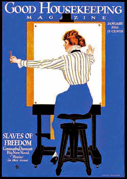
It was natural that illustrators latched onto the idea of flat color. Reproduction of color art was in its infancy a hundred years ago, and blocks of solid color were easier to reproduce. This magazine cover is by Cole Phillips.


And, the game of optical illusion could catch eyes and sell magazines. This cover is by Valentine Sandberg.


As with all stylistic developments (or fashions), Architects copied the look in their renderings. Frank Lloyd Wright seemingly could not resist a new look; and this shows in this rendering of Ravine Bluffs Bridge (1915).


Cyril A.Farey was the most famous English architectural illustrator in the early 1900s. His rendering of the House at Silver End (Thomas S. Tait, architect) combines the naturally flat tones of a moonlit view with the realistic detail he was otherwise known for. 


I have occasionally played this game myself. A night view such as that above can include flat gray skies and dark silhouettes. I never loved oil pastel for finished renderings, but it works if you want to play around with a vague idea.


A computer rendering, with its detailed shade, shadow and reflection is often improved with a little simplicity. The extreme intricacy of this design by Hardy Holzman Pfieffer was eventually simplified even more by eliminating color entirely.


I have done quite a few montage boards in my career. Flat expanses of color are perfect surfaces for adding plans and elevations, even if there is some gradation. In this board the sky and street provide the background, but a vignette rendering can have plans or elevations surrounding the building on all sides.
Just as an unadorned wall is a good foil for ornament, a flat surface can emphasize and highlight a 3D illusion. In the “old days” I had to rough out the possible shapes on a pastel sketch, and usually had little time to make a decision. Today, with computer files you can try out dozens of shapes and colors in no time. Don’t be afraid to play with it; the results are worth it. 


Postscript (in regard to simple and complex): I attended a performance of the Ensemble Organum and Christos Chalkias last weekend in the Fuentiduena Chapel, at the Cloisters in New York City. It was a celebration of Saint Nicholas in Byzantine chants. What struck me was the contrast between the simple background drone and the extremely complex chanting of the text. The one without the other would have been boring, but together they kept my attention. Indeed, there were times when the effect was mesmerizingly beautiful.