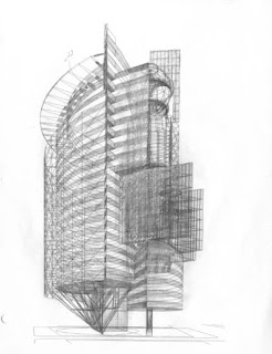
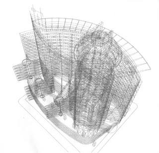
I constructed perspectives by hand until I got my first CAD
capable computer early in 1990. I started playing during my free time with
wireframes and learning the AutoCad system. I very quickly tried to model an
Idea I had for the north end of Times Square.
The first hand sketches I did for the project are lost, but
the following images show the rest of the process, from the point I started to
model in the computer.
As I viewed the model from different angles, I made
revisions by hand.
Using a rough wireframe model, it was easy to try on
different elements, such as this radiating “crown” cornice.
As the model progressed, I added a little pencil shading to
help pick out the massing.
A too small element could be easily resized…
… and checked out from all angles.
As the design finally began to coalesce, I started adding
shade and shadow to views.
Adding new ideas…
…and details as I went.
This building was for Times Square, so the jazzier the sign
opportunities the better.
Once I’d developed the model as if it were an object seen
from afar, I started to look at it from the sidewalks nearby.
Sometimes the wireframe became a swirling mass; beautiful,
but less than useful for design purposes.
Since Times Square is surrounded by a dense urban fabric…
…views from other similar buildings…
…and true skyscrapers were needed.
One of the great advantages of computer modeling was that
you could easily develop plans and elevations from the model. Above is the
conceptual plan sketch (rendered as a computer drawing), with the resulting
plan schematic below.
By working out the core, and then placing it into each of
the different plan types, you can create a traditional set of tower plans.
Elevations are even easier to produce. Simply take a view
from any side, and eliminate the hidden lines.
_____________________
And now for the FUN part.
To create a quick, but powerful presentation, I blocked in
the surrounding buildings of Times Square. I then chose a viewpoint that showed
the project’s position and “feel” in the urban space.
This is the wireframe view from the north…
…and this is a quick pastel/pencil sketch of that view.
Here we look up from the east side…
…and… drama!
The west side…
…shining in the sun.
More from the east side…
…and the revolving signs.
A wonderful cropped view from the south…
…blew me away when I was finished.
So I made it into a full blown painting (airbrush and
brushed acrylic, 18” x 18”).
I finish this post with the primary view; street level from
across the “square” (from south). This is what you would see walking up Broadway
at 42nd street; the whole ensemble from sidewalk to cornice.
Here is my habitual attempt to place the perspective view
into the board’s (and building’s) geometry.
And, here’s the pastel and pencil sketch with a suggestion
of plans and elevations on the left.
Technical note: On the rendered sketches: I printed (Xerox)
the wireframe on a good letter sized bond paper. I then covered the sheet with
grey pastel, rubbing it with my finger to create a smooth grey base tone. Next
I added darker pastel to pick out the forms, and erased the grey base where I
wanted to reveal the white paper, creating a lighter area or a highlight (this also
allowed the line drawing to show though the pastel). I finalized the building
details with a black Prismacolor pencil. The final drawing was sprayed with
fixative to stabilize the pastel.


Architectural 3D Rendering 3D Rendering don’t need to be expensive, Reality-forge offers photo-realistic rendering services for a very affordable price. You can get a render of your project for as low as $180, and you can even see your designs come to life even before you pay!! Architectural 3d rendering is not a job for amateurs; it takes professionals to do it accurately. It requires hard-earned experience and skills to transform something into a 3 dimensional illustration. No other service on the web that offer a more cost-effective price with high end quality.
ReplyDelete