Showing posts with label Color Palette. Show all posts

Tuesday, August 25, 2020

COLOR DEMONSTRATION


Long ago I created this tiny pastel sketch of a church. I called it “Burning Church” for obvious reasons and filed it away.


Years later I was playing with ideas for “landmarks” along Broadway in New York City, and realized that my “Burning Church” might work on a site at the north end of Manhattan on 170th Street.

In designing the church I ran with a simplified gothic style with a blank base raising the sanctuary above the street level.


I then built an Autocad 3D model and tried out a number of viewpoints. This hidden line view was chosen for the final drawing.


This magic marker sketch gives a preliminary idea of the values I was aiming for.


A base drawing was produced using freehand ink on mylar.


The final drawing was 30” x 40”, so there was plenty of room for detail and texture.


Reproduced above is a color wheel. It shows the full range of colors going around the circumference, with saturation going from the center of the circle (desaturation = grey) to full color saturation at the circle edge. This is fully discussed on the outstanding “Gurney Journey” blog. 


The original “Burning Church” sketch uses a very tight range of yellows and browns marked by the diamond shape of the color wheel. The sketch derives its strength from the limited palette.


The last color sketch above and accompanying color wheel show a complimentary palette ranging from yellow to blue. The combination of color contrast and value contrast makes the tower pop out strongly.


The last color sketch above and color wheel show an orange to grey-green palette. The color contrast is less strong, and the value contrast is created with a tower running from light on dark at the bottom to dark on light at the top. I’ve always loved the red-orange contrast with a grey-green sky; it reminds me of a portrait trick of contrasting warm flesh against a grey-green background.


The two sketches above have low saturation color palettes. Essentially, they are low contrast grey studies with pastel tone here and there.


The strong blue and yellow sketch above is going in the right direction, but seems a little bit too simple.


By adding a graded reddish tint top and bottom I pushed the focus to the center of the tower suggesting a cross composition


The sketch above was done full size with pastel and pencil to study the detailed coloring of the church entry.


 And here is the final art (30” x 40”). Note the darkened foreground and sky which adds to the drama and makes an excellent background for the white line elevations and plans. The final was done with transparent ink airbrushed on a photographic print of the ink line drawing. The title was done with white acrylic applied with (tiny) brushes. The ghosted plans/elevations/sections and quotes were color pencil.


Detail at the bottom of the painting.


Detail at the top.


Wednesday, May 27, 2015

Rendering Rules


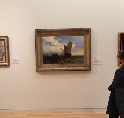
I was at the Georgia Museum of Art in Athens recently, and saw a painting that jogged my memory: I’d been meaning to write a post on my personal “rules” for architectural rendering. Some rules are obvious, like “Always finish before the deadline” (I say “before” because there are always last-minute adjustments to be made). Another obvious rule is “Don’t overpromise, but always fulfill any promise.”
Anyway, the painting that got me going was Shipwreck by Charles Hoguet (1859). The reason it caught my eye was that it fulfilled one of my rules; that being, “Make the image compelling at all scales.” What I mean is that an illustration should look enticing from across the room as well as when the viewer is within easy viewing distance, and also when its details are viewed up close. 


Seen from across the room, the dynamically balanced composition leads the viewer forward to have a closer look at the painting. As you can see, the dark part of the painting covers the bottom third of the canvas plus a curious shape just to the right of center. The light part of the painting includes some interesting shapes on the left.

Once you are close enough that the painting nearly fills your view (eight or 10 feet in this case) the dark areas start to resolve into separate shapes and recognizable objects. The water and sand suggest a seascape, but the sails, which are now clear, look rather awkward. There is much detail in the center foreground, but at this distance it is a jumble of horses, men and unknown objects. Mystery and emotion were added to the original compositional interest. All of this was enough to make me want to spend more time scrutinizing the thing.


Now that the viewer is focusing on various spots on the painting, a story begins to be told. The ship is obviously run aground, and people are removing various stores and hardware, either as a salvage operation or in an attempt to lighten the ship and refloat it at high tide. Four horses are counted within the tumble of shapes. A wagon with three men loading was almost a silhouette before, but is now clear and interesting. Among the horses there are two blobs barely recognizable as men, and three foreground figures in idiosyncratic poses. The scene is so entertaining that one could go on picking out details in the narrative for some time. 


In architectural illustration you don’t usually have a chance to tell a story, but you certainly can construct a compelling composition, and inject some drama. The example below is a bit of “paper architecture” that I did for a site in New York City that was around the corner from where I lived in the East Village.


I tried several pastel thumbnails of this view, varying the values and the palette. I quickly hit on a pencil sketch that contrasted the building’s dark top with the light sky, and the lighter base to the dark mass of the neighborhood. 

I found that this complementary brick-red and olive palette popped out even as a mini thumbnail (much of the original pastel color rubbed off before I could photograph it; moral: fix pastel immediately).


From across the room the final rendering is rather enticing, if a little too stable in composition.


Closer up the building starts to show detail and scale. The context begins to look like the aftermath of a late-day summer shower, which is always magical in Manhattan.


Checking the details shows the turn-of-the-century subway entrance on the left, and the rotating cube sculpture (titled “Alamo”!?) at the center of Astor Place. The foreground would have to show more “street theater” to match Hoguet’s painting, but that was my decision (giving too much emphasis to the street activity can be a mistake when your object is the selling of the actual building). 
At this distance you can also see that the image was rendered in freehand ink, with airbrushed transparent color. There is always a certain magic when a realistic picture merges into ink lines or daubs of paint.

All right, so maybe that was all too obvious… of course you want to make an illustration interesting. But this becomes very serious when you are rendering for a competition entry. Competition juries have to make snap decisions, especially if there are many entries. Getting the jury to choose your design for later consideration is important; it’s like getting your foot in the door. During the second round they will give your design a chance to win the prize. If you don’t make it to the final review, you have no chance to win. A project illustration that compels the viewer to look closer will position a project for success.

Thursday, August 15, 2013

Inspiration - Waterhouse & Color


John William Waterhouse was a Victorian era painter (1849 – 1917). Both his father and mother were English born artists, and so his professional path should not have been a surprise. Born in Rome, he returned to England with his parents while still a child, and eventually spent the remainder of his life in London. Although early on he was interested in Engineering, he did not follow that profession, but began working in his father’s studio. His father, curiously, did not want him to become an artist, but was eventually persuaded to help John enter the Royal Academy. At the age of 21 Waterhouse was accepted into the Academy as a student in sculpture, but instead of attending classes, he practiced and perfected his painting technique by continuing to work in his father’s studio. Yes, that sounds like a lot of contradictions and “U” turns, but in the end he showed genius that was recognized in his own time.


Sketch of Waterhouse for The Bank and Royal Exchange by W. Logsdail 1886
Many of the specific events of Waterhouse’s career are unknown because his wife, who survived him by several decades, destroyed much of his correspondence. However, we have his paintings, which can be read and studied to good effect. Waterhouse is an unlikely inspiration for an architectural illustrator in that he was a painter’s painter. He preferred to illustrate ancient myths in a figurative, realistic and painterly way, relegating the built environment to the background. And he created his images in a layered adjustment of opaque paint, which is a technique anathema to the detailed and transparent tradition of architectural rendering.


In spite of this, Waterhouse offers many clues to the handling of color and drama that can be applied to architecture. For instance, the oil sketch above, done for the painting The Love Philtre shows the development of a careful balance between red-browns and green-browns, with the composition being held together by the strongly contrasting flesh tones. 


The Lady of Shalot is one of Waterhouse’s most famous paintings. It depicts the despondent Lady Elaine, who loved Sir Lancelot in the Arthur legend. Lancelot’s rejection of her love drove her to despair and death. The picture seems perfectly balanced and harmonized, but there is a palpable sense of despair in every part of the canvas.
This detail shows the wide range of colors that he has placed in the focal point of the painting. Note that the pure colors of the fabric are limited to relatively small spots, while the contrasting orange-browns dominate. The background consists of dull greens, and the figure is revealed in variations of white.


Ophelia, one of a series of paintings on the Shakespearian subject, is simple in composition, but complex in its expressive use of color. The almost black trees suggest the madness that is coming with Hamlet’s rejection of her. Her supine position suggests her watery grave, and the inverted face suggests her world, which has been turned upside down by Hamlet’s madness.
Waterhouse’s use of contrasting color insures that in spite of the centralized composition, the viewer’s eye will be drawn to the warm face and burning hair of Ophelia, enhanced by the surrounding green. Note that he flirts with a strong yellow-green, but always moderates it with olive and brown.


This detail of Waterhouse’s painting, Sweet Summer, illustrates his ability to moderate colors so as to emphasize the composition. In other hands the green of the grass, along with the red and blue of the dress would dominate the painting. Indeed, in the modern world the clash of primary colors would be “de rigueur”.


Similarly, in The Crystal Ball Waterhouse moderates the red dress so as to let the swirling composition animate the scene. The repeating arcs, suggesting the crystal ball of the title are brilliant.


I’ve always found the death of Orpheus to be a rather curious tale. A severed head which floats down a river and over the sea to the island of Lesbos, singing all the way strains credulity (and induces hilarity), but that’s myth for you. The reason for including this painting, Nymphs finding the Head of Orpheus, is once again to note the carefully modulated colors. As before, they form an undertone to the more obvious, and again, swirling composition. 


Cleopatra is a painting that reverses his usual “light on dark” composition, with the queen’s head as a dramatically dark spot on a lighter field. On the other hand, it is very typical in terms of color; the light “field” is made up of a number of different colors which are harmonized and “dulled” so as to set off the darker hair and face.


Here is another Ophelia by Waterhouse. In this rendition he emphasizes the madness that is rising in the girl, and foreshadows the death that awaits her by drowning in the river at her feet. The color handling is much moderated, especially in the lower part of the dress where the red and gold seem to melt into the grass and tree trunk.


Circe, in the Odyssey, is a witch who turns men into swine. In Waterhouse’s conception she is a mixture of seduction and danger rendered in a beautifully amorphous fabric which conceals and reveals mysteriously. This painting is less clear in its composition then his other paintings, but that is in keeping with the subject.


The Toilet is a painting with no ancient myth or truth to convey, but it is a lovely study in browns and greens (with the touch of blue in the foreground). Waterhouse could have allowed the colors to dominate more in this composition, but still, the effect is charming to the viewer, and illuminating to the student.


Mariamne, the beloved second wife of Harod the Great, was falsely accused and convicted of attempting to murder Harod. In this painting she is pictured going to her death, while Harod, who still loves her, grieves. On first glance the painting seems to be monochromatic, but as usual with Waterhouse, it has considerable color in a muted form.

Resting is another domestic scene with less drama and compositional strength. It is included here to reiterate the delicate color sense that Waterhouse brought to his work. It is also typical of the overcast light that Waterhouse favored in all his paintings.


Of all the settings shown in this post, this is the most directly applicable to architectural illustration. The martyred Saint Eulalia is shown in a snow scene which lets the subtle colors and forms of the classical buildings stand out. Note how the colorless marble shifts from cool grays to warm grays throughout the painting.

And the moral of the Waterhouse oeuvre? That color needn’t be garish and bright, but can be powerful even when muted. Also that muted color can strengthen a good composition. An important point to remember is that Waterhouse justified his muted palette by choosing a diffuse light, and the rejecting the brilliant, direct sunlight. Modern architectural illustration, and especially computer rendering tends to default to direct sunlight because of the simplicity of layout and efficiency of the process. But, using diffuse light and overcast conditions can produce amazing results. 


Inspiration- The Dreams of Lebbius Woods

Inspiration- Sargent & Structures

Inspiration- Louis Sullivan & Ornamentation

Inspiration- Bertram Grosvenor Goodhue

Inspiration- Winslow Homer

Inspiration- Dore & value studies

Inspiration- Hugh Ferriss

Inspiration- Waterhouse & Color

Inspiration- Bierstadt & Atmosphere

Inspiration- John C. Wenrich

Inspiration - Cyril Farey