When I started writing about
perspective drawing nearly a year ago I noted that
ancient and medieval artists were trying to make paintings that looked like 3
dimensional reality. They did this by drawing adjacent sides of a building
using differently angled grids.
To quote from that first post describing
the above image: “The fresco above from the Villa of Fannius Synistor allows
every building to have its own vanishing point (or rather, every building has a
rough approximation of a vanishing point).” The Roman era fresco could just as
easily be a precursor of graphical parallel projections: the horizontal lines
on one façade are (roughly) parallel to each other, and are different from all
the (roughly) parallel lines on the adjacent façade.
This illuminated manuscript called Pericopes of Henry II (1002 – 1012 AD), shows
a tower on the left of the center panel. It is a nice example of a proto
parallel projection, with each façade having a consistent pattern of parallel
horizontal lines.
In approximately the same time period
Chinese artists were also struggling to depict rectilinear buildings on a flat
surface. They avoided the single individual viewpoint and converging lines of
Linear perspective practiced in Europe, but went beyond simple parallel
projection. The Chinese handing of rectilinear objects is an immense subject on
its own which involves the practicality of drawing, as well as philosophy and
religion; and is something I myself will not get into here. OK… maybe in a
future post.
All this suggests that graphical parallel
projection was just a crude precursor to linear perspective; an inexact approximation
of the perfect illusion.
So, once linear perspective was invented,
what was the use of parallel projection drawings?
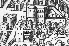
Well, one use was in aerial drawings of
large areas such as cities or (in the case above) a palace complex. The
viewpoint was typically so far away from the objects on the ground that perspective
convergence could be ignored. This non-perspective view of a design for the Stuttgart
Court by Thouret (1830) was much easier to layout than a perspective would have
been. It looks like a realistic aerial perspective, but was produced with half
the trouble.
Parallel projections are perfect for
showing the 3 dimensional form of an object, and allowing the viewer to measure
the drawing. Indeed, in the premodern design world, the whole point was to
have a measurable drawing from which to build. Although it lacks a scale, Rob Krier’s Grand Staircase in Vienna’s Kunsthistorisches Museum is a good example. The
complex drawing explains the stair’s shape and function, and would be a very useful
addition to the typical plans, elevations and sections. The measurability of parallel projection drawings has made them
a favorite of engineers over the years.
In the next three posts I’m going to
explore the three most popular forms of graphical projection: Isometric, Plan
Projection, & Elevation Projection. After that I plan on addressing the
subject of graphic projection’s use in modern architectural presentation drawing.
There are many ways to distort an object so as to reveal some aspect of it.
There are also unlimited ways to distort an object so as to obscure the object.
We “moderns” have gone a long way toward exploring all of the curious possibilities.
Note: I am not going to explore every
sort of parallel projection drawing out there. Just tripping through the
various names and subcategories is a bother. But if you are
interested, Wikipedia does a good job of noting the taxonomy and the more
esoteric variations.


Thanks. Your articel helps me with my homework. :)
ReplyDelete