Monday, August 9, 2021

Inspiration – Zorn: Water and Light


Anders Leonard Zorn became Sweden’s foremost artist of the late 19th and early 20th centuries. Like his contemporary John Singer Sargent, he was famed for realistic portraiture which conveyed spontaneity and character. In this post I will focus on his handling of light and water, and the lessons that can apply to atmosphere in architectural illustration.


Anders Leonard Zorn was born in rural Sweden to a German brewer and a farm girl. Although illegitimate, his father set aside money for his education, and he was raised by his grandparents on a farm near the town of Mora. Because of his exceptional talent at drawing he was sent to the Royal Academy of Fine Art in Stockholm. Once he established his career he married Emma Lamm, the daughter of a wealthy family with useful contacts. Most of his busy career was spent in the cultural capitols of Europe and the United States, although he always spent the summer in his hometown.

Zorn made his mark with wonderful portraits of the rich and powerful (he painted portraits of 3 presidents). My interest in Zorn is his handling of light and water. 


LIGHT ON FACES


This portrait of fellow painter Bruno Liljefors might seem spookily wrong, but it catches the strong reflected light coming from a field of snow to the left of Liljefors; something I experienced growing up in Minnesota.


These two portraits use a more conventional light coming from the right. Most traditional portraits use a light coming from over the viewer’s shoulder (“Beaux Art”).


Above are a couple variations of light that leaves the subject’s face in partial shadow, a form of “Saarinen Light”. Zorn was quite adventurous with modeling a subject’s face in middle value shadow.


This cigarette girl in “up” lighting illustrates Zorn’s skill in using an extreme light in a complimentary way (enhancing her beauty).


Zorn’s self-portrait captures not only the complex light of two light sources, but does it with the unforgiving technique of etching.


LIGHT AND BUILDINGS


Zorn painted surprisingly few views of buildings or cities. He graduated with a degree in perspective and anatomy, but I could not find any example of perspective layout in his drawings (The paintings do not however, show any blatant mistakes).


It seems that Zorn saw the built environment as scenery; there to “look” right and serve as support to the people in the painting. The paintings above exemplify this, a foggy London (Ambient light) and dancing in a farm village (Dusk lighting).


Interior views can be more exacting regarding perspective. This view of women baking shows that Zorn understands perspective. The light is straightforward except for the woman a far left who is lit by both the daylight on the right and the red oven on the left.


Curiously, Zorn seemed to have a preference for unusual viewpoints which is reflected in the assumed vanishing points at the top of the two paintings above. Note also that he is playing with multiple light sources, the second painting showing the color change between daylight and firelight.


These paintings, one of an informal rural dance, and the other a formal society affair, show Zorn’s love of contrasting light effects and color. They also represent the two worlds that he moved between most of his life; the simple farming community and the sophisticated urban world of social elites.


This self portrait uses conventional lighting for what could have been a conventional portrait. The mostly obscured model in the background sets up a tension which makes this painting so fascinating.


LIGHT AND WATER


The combination of light and water is one of the most difficult things to draw or paint. Zorn 
mastered water's translucency and movement, perhaps because he spent much of his student 
years in Stockholm, a city surrounded by inlets, lakes and rivers.


He uses the simplest of means to capture reflection, refraction, transparency and color in any situation. The result is always a fascinating and mysterious composition that draws the viewer into a closer exploration of the paint on paper or canvas.


A preliminary color sketch. Note: Zorn was very traditional in the extensive research, sketching, value studies, color studies and refining that went into what seems a spontaneous painting.


The final.


And detail. Amazing illusion of the play of light on the water surface.


Now I don’t expect architectural illustrators to paint like Zorn, but as inspiration he is worth checking out.


For a short bio with lots of images…

https://mydailyartdisplay.wordpress.com/2019/01/09/anders-zorn-part-1-the-early-years/


For a detailed biography…

http://www.artgraphica.net/free-art-lessons/anders-zorn-oil-painter/anders-zorn-oil-painter.htm


Monday, July 5, 2021

LIGHT DEMONSTRATION – HERALD SQUARE

Being both an architect and an architectural illustrator, I have always been fascinated by the play of light on different materials. 

The mainly stone churches of Europe create a nice and simple pattern of shade and shadow.


The modern technology of reflective glass is nearly as simple: reflectivity and transparency combine to describe the building form.


The Beaux Art “palette” of stone and punched windows is an old variation on stone and glass.

In my own playing with “landmarks” along Broadway, NYC, I often used a mix of stone and glass. For my proposal on the block south of Greeley Square Park (32nd Street and Broadway) I used large areas of reflective glass set into a frame of stone.


Since the building would be “facing” north toward the adjacent park, direct sun would have little chance to show off a sculpted stone façade. See Full Length Portraits & Tall Buildings.


By using reflective glass facing north, you can make the mirrored play of the northern sky contrast with the southern sky behind the building. The horizontal pattern of the southern sky would also make a nice contrast with the vertical lines of the stone framing. The finished painting above was featured on a 1994 calendar of architectural art.

At the north end of the same elongated space formed by the intersection of 6th Avenue and Broadway is Herald Square, fronting on 35th Street. The square was named for the adjacent headquarters building of the New York Herald newspaper, designed by Stanford White in 1908, and demolished in 1921. 


Years after painting the Greeley Block, I dropped a computer rendering of the same design onto the Herald Square site. Looking at the result made me imagine a more sculptural design along the lines of White’s eclectic 1908 style. It would give me a chance to explore a variety of light conditions via computer renderings. This was done 10 years ago, in 2011. Computer renderings were cheap and ubiquitous, but still did not have the touch of artistic magic that I have always looked for.


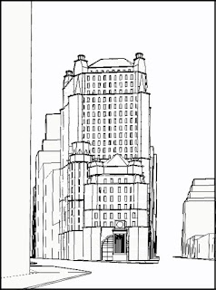
I modeled the idea in AutoCAD and established views from the south, as seen in the wireframes above.


Then, for the fun of it, rendered it in Accurender and pasted it into a photo of the site in Photoshop.

______________________________________________________________________________

So now that we have a design and a site, let me bring on the “Light Taxonomy” from my previous post. I will not use Spot Lighting or Confetti Lighting, as they are more specialized than I want here.

1.     Beaux Art

2.     Frontal

3.     Dusk

4.     Saarinen

5.     Ambient

6.     Ferriss

I now spent numerous photo sessions in Herald Square shooting the site under different light/atmosphere conditions and different times of the day. I eventually had reasonable photos of the site under all 6 light conditions.

Next, I created 6 renderings of the computer model from the same viewpoint, each differing only by the light type and corresponding atmosphere. Each rendering (via Accurender) took into account light angle, time of day, sky, sun and context color, reflected view, etc. 

Using Photoshop I pasted the building rendering into the corresponding photo, setting it behind the trees in the square itself.

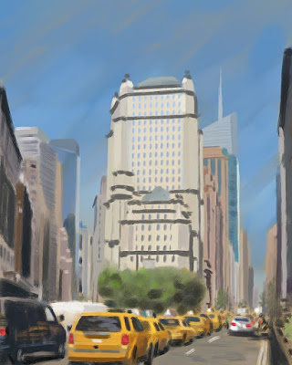
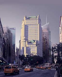
Finally, I rendered (on my computer tablet) the final Photoshop’d image to make it more unified in terms of value, color and composition. If I was actually producing a finished rendering, I would take this “sketch” rendering as the general goal for the final image.

Below you will find each view’s light direction, rendered building, site paste-up and “sketch” rendering.


BEAUX ART


FRONTAL


DUSK


SAARINEN


AMBIENT


FERRISS


At this point, having a number of interesting possibilities, I would have gone on and painted a large, detailed illustration with plans and elevations. I did not. Life got in the way, and I am on to other projects. 
However, I hope the reader gets some ideas and inspiration from the exercise.


Addendum: the idea for a light taxonomy came from John Hedgecoe's The Photographer's Handbook, 2nd Ed. The 8 photos taken from dawn to dusk show an amazing range of color and light.