You may have notice in the previous post that many of the
one point examples were of urban street scenes. This is because one point
perspectives are not very good at “seeing” the complete shape of a building.
You typically see only one elevation, while the others are hidden or
foreshortened to illegibility. If you shift the vanishing point far enough to
one side to reveal the side of the building, you start to introduce distortion
(discussed HERE).

Interior views, on the other hand, are well suited to one
point perspectives. The drawing above shows a surprisingly complete and
undistorted view of the interior rooms. As long as the space is not too deep
this technique is both quick and effective.

This elaborate rendering of the Paris Opera Grand Stair by Charles
Garnier, is basically a simple box. The box is decorated like a wedding cake,
but the perspective work is straightforward.
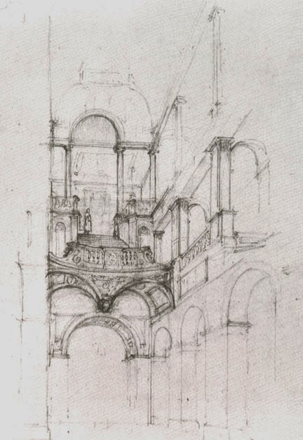
This sketch of Ickworth House staircase by F.C. Penrose
illustrates the sketching utility of one point. The complexity of the staircase
has been set into the far wall elevation. The result is inexact, but gives a
good feeling of the space.

Theatre Set design is a natural use for one point. This
design by P. Chaperon creates a sense of serious drama both in the formal
detailing and the symmetrical view. Since most theaters are built to put the
audience on one side of the stage, a variation on one point is almost always
used.

Mies van der Rohe was famous for being a miserable draftsman,
but even Mies could master the simple one point in this pencil sketch of the
Hobbe House.

Paul Rudolph is famous for sharp rectilinear designs, and
equally sharp rectilinear renderings.
This rendering of Flap House uses the one point to create an abstract
grid within a realistic drawing.

The Yale Architecture Building by Rudolph is a bit too
brutal for my taste, but the finely hatched rendering above is a masterpiece. I
have at least one rendering from way back on which I uses the same technique;
and yes it was a fairly shallow building section seen in one point.

Foster Associates have followed in the steps of the
modernists in both design style, and in the use of crisp one point
perspectives. The Olsen Center in London is a perfect subject for this drawing
style, being a large open space based on a strict grid.

This pencil drawing by J.G. Campbell of an academic
courtyard lends itself well to one point.
Indeed I would guess that a courtyard is the iconic use of one point
perspectives.

A linear design is also a natural for one point. The Con Edison building in Buchanan, N.Y. by
Mitchell Guirgola (1970), illustrates the ease of construction and efficacy.

Although leading to a curve, the narrow hallway in James
Stirling’s Town Center Derby is also a natural.

While attending architecture school I was blown away by this
drawing by Friedrich St Florian. The graphic simplicity contrasted with the
spatial suggestiveness sparked my imagination. You could say that his drawing
pushed me toward the drawing side of architecture.

(Ignore the two-point perspective view at the bottom of this
image). The one point section perspective, and Rossi’s Trieste Administrative
Building are a perfect match. (Actually, DO look at the exterior view below it
to see why a one point could never have captured the full shape of the
building).

Quartier de la Villette by Leon Krier is another example of
the courtyard one point perspective. The insane grandiosity and the unappealing
colors aside, it is an excellent and information filled drawing.

I have to admit that one point perspectives of barrel vaults
do a lot for me. This drawing of an Exhibition Hall in Frankfurt am Main by Oswald
Mathias Ungers is a favorite,
and, is obviously seen best in one point.

Serious, dramatic and symmetrical, the Guernica Museum by
Iniguez & Ustarroz plays the one point perspective for all it’s worth.

Only one of the drawings in this post could be called a
masterpiece. The Houston Design Center
by Steve Oles fits that description. Not only is a perfect example of the
section perspective, but is finesses the office spaces, and highlights the
cascading atrium space, making a beautiful and informative piece of art I’d
love to see on my wall.

Here is another section perspective using the one point. Al Lorenz
of Lorenz & Lizak is a well known delineator, artist, designer and teacher
in the NYC area.

Although one point section perspectives were hot in the 60s
and 70s, they have been brought to a more refined level in more recent times.
This view of an auditorium by Robert Becker is just one example.
And the moral…
You may have noticed that nearly half the examples were
section perspectives; which is hardly surprising since a section perspective is
nearly always a one point perspective. In addition, any of the non-sectional
drawings could easily have been converted to a section perspective.
The examples that don’t easily work as a section are ones
that might fit into the exterior “court” examples of the previous post. So why
did I include them here? Just gut feeling.
There is one example that is an object in space, the Flap
House by Rudolph, and It is included because of the unusual design. With the
“flaps” up, it is a platform open on all sides; essentially the drawing
is part exterior and part interior. A solid box with windows would not have revealed much in a one point. The very open nature of the
architecture makes it suitable for the interior category.
NOTE: These posts are NOT meant to be a tutorial on
one-point perspective. There are plenty of websites that do that. I want to
illustrate some of the interesting examples, and point out the major problems
and opportunities out there.
Other posts on Perspective:
Perspective - Two Point Perspective -
Distortions & ComplicationsPerspective - Three Point Perspective- Hand & CAD
Greetings.
ReplyDeleteI'm glad to discover your site, and this interesting article. But one thing puzzles me: your writing that "Mies van der Rohe was famous for being a miserable draftsman..."
Whether looking at his early, charcoal perspective drawings (like the concrete office building), or his exploratory plans for courtyard house projects, or formal drafting for construction documents (I've seen all types of these drawings, in the original, at various MoMA shows), it seems like Mies was a master draftsperson. So I'm curious at how your arrived at your assessment?
Thank you!
Thank you.
Seth Joseph Weine
sethweine@aol.com
Nice blog and design.
ReplyDeleteTo know more about interior designing visit The best college for interior designing in Indore – Virtual Voyage College with various interior designing courses promises you that you will learn much more than you expect.
Great article with excellent idea!Thank you for such a valuable article. I really appreciate for this great information.. Here
ReplyDeleteIt is not everyone's business to write such a great post, one person in a million can write such a beautiful post and you are one of those millions. I hope that you will write more beautiful posts in life and also hope that you will keep climbing the ladder of achievement in your life, very few people do this but I have full hope from you.
ReplyDeleteDLF Phase 3 Escorts Service
Call Girls In Sector 65
escort gallery in gurugram
escorts services in phase 2
Escorts Service in DLF Phase 4
Escorts service in Calangute Beach
Escorts Service in Palolem Beach
gurgaon call girls
neemrana call girls
call girls in gurugram