When you look at something you are often looking through or around something else; a window, a door,
under a tree, or through your glasses (my constant view frame). People also
like to frame pictures and objects; it makes the picture more focused, and the
object more important in some way. Paintings and photographs often use a frame
within the image itself: for instance the view of King Charles Street, Whitehall,
London (top, above) or the Tower Bridge (both from the Picture Book of London
published by Country Life in 1951).
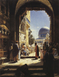
Painters have always played with framing devices, using some
foreground object to give scale and frame the view. The painting above by
Gustav Bauernfeind called, At the
Entrance to the Temple Mount, Jerusalem, is a straight forward “through the
arch” approach, mirroring the photograph at the top of the page.
Of course conveniently located arches are not always
available, so the usual fallback tactic is the side of a building, or looking
out from under a part of a building, such as Egyptian Landscape with a Distant View of the Pyramids by David
Roberts.
Paintings of a town or city provide windows, doors, arches
and other manmade foreground opportunities. In the country you need to use an
entirely different set of objects. Albert Bierstadt used mountains, trees and
clouds to frame his Landscape, above.
In the Deer at Sunset,
Bierstadt used what I call the “L” frame, a contrasting form following the
bottom and side of the image. Such a “frame” helps focus the image using a
fairly commonly occurring form. In this case it is the rocky base of a cliff
and the shadow cast by the cliff.
In The Conquest of the Amazon by Antonio
Parreiras, the shadowed tree trunk and people in the foreground form the frame
to the ceremony taking place in the sunlit clearing.
Frederic Edwin Church was always able to capture the drama
of any landscape. His painting called The
River of Light uses not only natural lighting effects, but the foreground
frame to heighten the effect.
Terra natal by
Antonio Parreiras includes enough detail in the darker “frame” area, to make it
the focus of the viewer’s interest.
Winslow Homer didn’t use framing very often (tending to
center the focus), but when he did, as with At
the Window, he broke the rules in the most interesting way. In this case he
contrasts the frame with the view out the window, giving the frame the primary
emphasis.
La Siesta, Memory of
Spain is a typical composition by Gustave Dore, using strong foreground shadow,
and high contrast and detail to draw the eye.
Architectural renderings can be easily improved by using an
“L” frame. Green Study by Aleksander
(Olek) Novak-Zemplinski takes an already interesting abstract sculpture, and
adds immediacy by framing it with interior space.
ASB Bridge Kansas City
by Dick Sneary puts the bridge in context, while giving depth to the rendering.
W-Project Theoretical
by Tomoaki Hamano creates a frame and a balance using trees and foreground
objects. The inclusion of the “professorial statue” gives a nice narrative to
the otherwise dry subject.
Frames can be made from almost any object. People are always
around just begging to be placed in a rendering, and most locations have trees
and adjacent buildings. Don’t worry too much about the accuracy of the placement
of foreground objects; there is a surprising degree of forgiveness when you get
a composition right.
A caveat for all posts on composition.
You don’t
want to produce total chaos.
You don’t
want to create banal order.
You do want
to entice, hint, and suggest.
You want to
create mystery, even if the subject appears to be obvious.
- Composition Part 1 - Architectural Illustration
- Composition Part 2 - The Golden Section & other crutches
- Composition Part 3 - Dark Spot
- Composition Part 4 - Light Spot
- Composition Part 5 - The Cross
- Composition Part 6 - The Pyramid
- Composition Part 7 - Circle
- Composition Part 8 - Diagonal
- Composition Part 17 - Value Studies- Composition Part 2 - The Golden Section & other crutches
- Composition Part 3 - Dark Spot
- Composition Part 4 - Light Spot
- Composition Part 5 - The Cross
- Composition Part 6 - The Pyramid
- Composition Part 7 - Circle
- Composition Part 8 - Diagonal


